XUL:Panel Improvements:Docks
Contents
Dockable Panels
A dockable panel is one that the user may choose to have appear as a floating panel or embedded into the window. Mechanisms allow the user to switch between these states and adjust the position and size of the dockable panels.
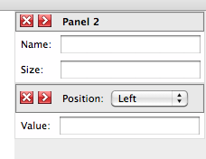
This image shows a sidebar with two dockable panels placed in a dock. The second one has a custom caption with a dropdown.
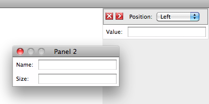
This image shows the first panel undocked into a floating window. The close button will dock the popup again.
Panel Captions
A docked popup by default will have a caption with a label and an undock button. A floating popup will have a native titlebar with a close button to dock the popup again.
The caption bar when docked should have a native look, possibly similar to a list/tree header row. The content defaults to the popup's title, but may include other content instead.
An open question is whether the caption bar should have native-like buttons
Three possible buttons could optionally be placed on the caption bar when the panel is in a docked position:
- an undock button to turn the panel into floating popup.
- a close button to hide the panel.
- a collapse button to hide the content but keep the caption bar visible. This would be used if there were several panels in a dock. It could also be used as a generic non-popup expanding box.
Resizing Panels
When a panel is floating, it can be resized with the border or corner resizer widget depending on the platform.
When docked, it would fit better to use a splitter along the edge of the panel to resize it. This would be a more natural fit when several panels appear in a dock, stacked vertically, for example.
Moving Panels
When a panel is floating, it can be moved around by dragging the titlebar, as with other windows. It can optionally be configured to be movable by dragging its background as well.
When not floating, the panel can be undocked. An option is the future would be to allow the panel to be undocked and moved around by dragging its caption bar. This would also allow a panel to be reordered within a set of docked panels.
Dragging out to undock is dependent on bug 533460 and other issues may come up with this, so this is currently a feature for the future.
Docking Panels
To dock a panel again, press the dock or close button on the floating panel.
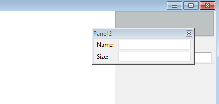
On some platforms (Windows only probably), a panel can optionally be set to allow it to be docked by dragging its caption onto a docking area in the main window. An outline of the approximate area that the panel would occupy when docked will appear. If the user stops moving the panel, it will dock itself into that position. The user can leave the panel floating by moving the panel away from the docked position such that the outline disappears.
This image shows a panel that is being moved. An outline appears over a potential dock location.
Developer Information
A dockable popup may be created by setting a panel's type attribute to 'dockable'.
Docking positions may be created with the <dock> element.
A dockable panel may appear in two different forms, either floating as a normal panel, or attached into a window as if it wasn't a panel at all. It can also be hidden entirely. The default state of the popup is to be hidden.
To open the popup as a floating panel, use the 'openPopup' method as normal. To open the popup in a docked position, use the 'dock' method.
dock(dockElement)
Show the popup in a docked position.
- dockElement
- A <dock> element to insert the panel into. If this is null, then the current parent element of the popup is used. This latter situation would be used for panels that can only be docked into one place.
The dock method will work if the popup is hidden, floating or docked into an existing position.
undock()
Show the popup in an undocked, floating position. This is a convenience method which is similar to openPopupAtScreen to show the popup in its current location.
Dockable panels can also be shown and hidden using the openPopup and hidePopup methods.
Events
The popupshowing and popupshown events are fired when the panel switches from a docked state to a floating state. This is an opportunity to show or hide UI that should only be visible when in one of the states.
Similarly, the popuphiding and popuphidden events are fired when the panel switches from a floating state to a docked state.
A move event is also added all panels (whether dockable or not) when they are moved.
Creating Panel Captions
When docked, the panel has a small caption bar with several UI elements. The caption bar has, by default, one button, an undock button which shows the panel in a floating popup. In the addition, the popup's label will appear on the caption bar.
When floating, the caption bar is hidden, and a normal platform-dependent titlebar is shown, however, the label attribute is still used for the title when the popup is floating.
To customize the caption bar, use a <paneltitle> element placed directly inside the <panel>. If one is not present, then a default caption bar with a label and undock button is used.
The dock popup caption bar may be customized with several attributes (exact names to be determined):
- label
- the title to appear on the caption.
- undock
- set to true to show the undock button or false to hide it. The default value is false.
- close
- set to true to show the close button or false to hide it. The default value is false.
- collapser
- set to true to show a collapser button which collapses the content to just the caption. The default value is false.
Floating Panels
A floating panel will show a native titlebar if titlebar="normal" or titlebar="thin" is used. Pressing the close button on the native titlebar will close the popup, or dock the popup depending on which buttons are visible on the caption bar. If a native titlebar is displayed, the popuptitle element is collapsed while the popup is floating. If no titlebar is used, the popuptitle is visible.
If the undock button is shown on the popuptitle but no close button, then the close button will dock the popup into its original position again. If the close button is shown on the popuptitle, then the close button will simply hide the popup.


