Update:Remora UI Review/Mockups/Home Page/2007-09-12 revisions/
Contents
Notes on the mockups
- The purpose of all of the mockups is primarily to demonstrate layout -- colors, branding, and icons are just placeholders
- By their nature (as slightly higher-fidelity than wireframes), these mockups are a little "cartoony." Areas, type, and icons are probably larger than they need be in a the real final version, and, because of this, more should fit on the screen in the end
- Many of the mockups make use of icons from the Silk icon set from FAMFAMFAM
Earler Versions
Flow Overview
Old

Revised

Front Page

Category Page
The category listing which is permanently present in the upper left-hand corner of the front page is accessible on interior pages as an overlay that drops down from the "Current Category" box.

Category page with category list displayed:

The current category is visibly unselectable.
Full listings page

This page follows the same basic layout as the Search Results Page (further down this page) with a few important distinctions. The differences are as follows:
- the grey bar before any results that lets the user choose how to order the add-ons (by name (a-z), by date (newest first), by popularity, and by rating. These options do not make sense on the search page because there is an explicit order already -- how well they match the search criteria.
- the addons are not numbered
- the category drop down lists the current catetory (upper left corner). There is no category associated with search results because they can span all categories
- the search field here still says "Find your add-ons" (or whatever the final wording is there). The add-ons listed are not search results -- there is no serach currently in progress.
- the text in the footer lists says "# [category name] addons" rather than "# matching addons"
Tiles or rows?
At one point there was some discussion about whether we should go with a tiled or search-results-style layout for the full listings:
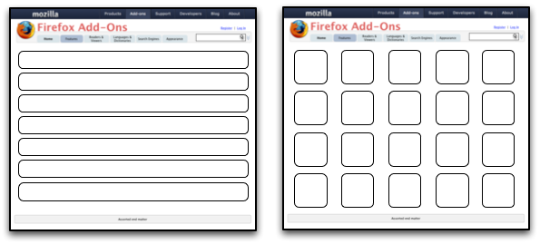
For AMO 3.2, we're going with the search-results-style layout.
Details Page

Notes:
- Advance details (ie. things of interest to developers) should be in an expandable area below the reviews. The area will will be closed by default if the user is not logged in, and, conversely, will be open by default if the user _is_ logged in.
Rating UI

Search Results Page

When we want to intervene
Occasionally, when the site notices that a keyword that it's watching for is one of the search terms, it may intervene and put a message before the first search result. This can be used when, for example, one of the search terms is "tab" -- we can point out that there is a whole category of tab-related toolbars. Or if the search contains the name of a language for which there is a language pack, we can offer to take them directly to the language pack. This would look like the following:

Recurring Features
Image Viewer

Some examples of what these could look like:
- Apple now has the kind of viewer with thumbnails I was thinking of on a number of their pages. See here for example: Example page (click on preview at right)
- Click on a thumbnail image for a great transition effect: http://www.panic.com/coda/
- Slimbox, a Lightbox clone: Slimbox Look at the multi-image version
"Smart" Download Buttons

An alternative if bundling is not possible:

Would we really be able to do this? It would require exposing the list of installed extensions to content, which is probably not a good idea. — db48x 09:13, 3 November 2007 (PDT)
Longer-term ideas
Theme Browser
Two-Pane Design

Three-Pane Design
