Update:Remora UI Review/Mockups/Home Page/2007-08-18 revisions/: Difference between revisions
Jump to navigation
Jump to search
| Line 44: | Line 44: | ||
[[Image:subcategory_page.png]] | [[Image:subcategory_page.png]] | ||
'''What about the overflow page?''' | |||
[[Image:overflowvariants.png]] | |||
== Add-on Details Page == | == Add-on Details Page == | ||
Revision as of 21:55, 24 July 2007
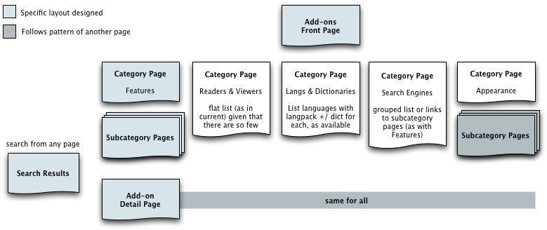
Flow Overview
Notes on the mockups
- The purpose of all of the mockups is primarily to demonstrate layout -- colors, branding, and icons are just placeholders
- By their nature (as slightly higher-fidelity than wireframes), these mockups are a little "cartoony." Areas, type, and icons are probably larger than they need be in a the real final version, and, because of this, more should fit on the screen in the end
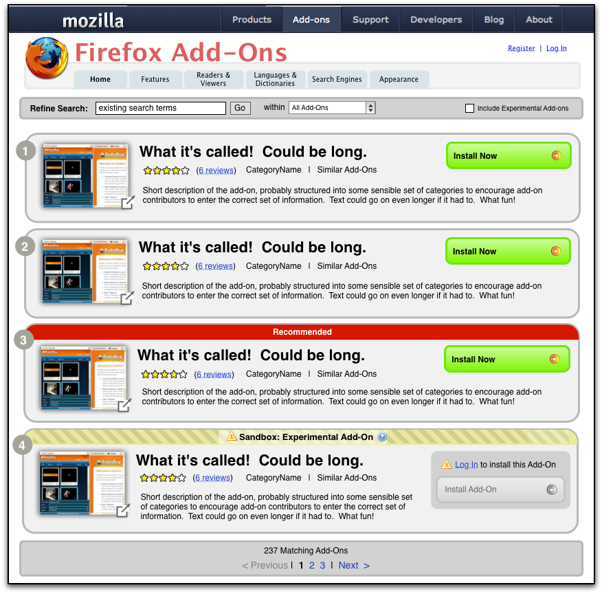
 - I've used this icon, in the lower right-hand corner of image thumbnails as a placeholder for some visual indication that more images are available by clicking on the thumbnail
One of the basic questions regarding the front page (and the navigation of the rest of the site) is what top level navigation it shares with the rest of the mozilla.com site.
AMO, as a site with its own internal structure, can sit comfortably within the Add-Ons section of the mozilla.com top level navigation, with a couple of changes to the current scheme (see items in orange, below):
All three issues are within the grey area hanging off of the top-level blue bar.
- Breadcrumb trail - this area is insufficient to allow as many levels and the complexity of the AMO site; navigational context can be provided through AMO page content
- Search Field - this search looks like it is for searching the entire mozilla.com site, which is not what we want here. The field is also not nearly as prominent as we'd like to make search for AMO.
- Register | Login - again, with these links here, it looks like the user will log in to or register with the entire mozilla.com site, which is not the case.
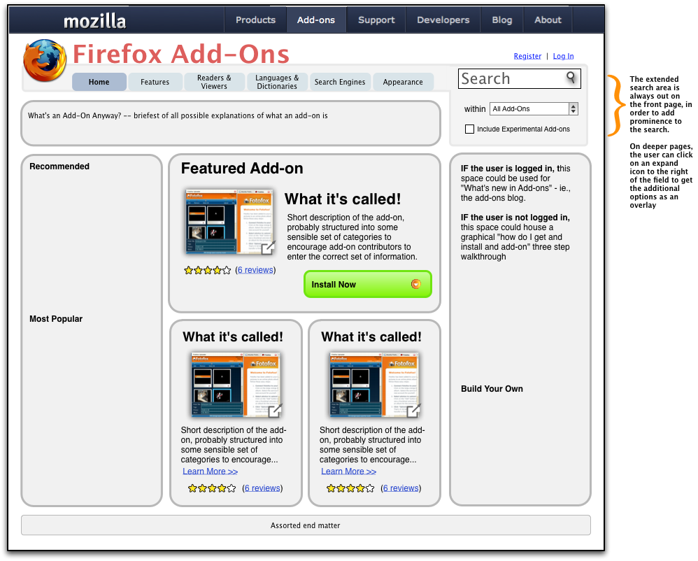
Front Page
Some notes at far right >>
Notes:
- The existing mozilla.com navbar continues across the top of the screen, but all of the AMO nav is independent and sits within the top-level "Addons" category
- Search: as noted in the mockup, search is extra prominent on the front page; search is, primarily, how people are going to want to find add-ons. On other pages, the intent is that the search field along be displayed by default, but that a user can show the more advanced options (which would come up as an overlay) by clicking on an icon to the right of the field -- see a mockup further down this page.
- At the suggestion of pkim and jslater, the page is more of an add-ons homepage or portal rather than simply a mechanism for getting add-ons; thus the inclusion of the (still fairly minimal) "What is an add-on" concept description across the top and the "how to get add-ons walkthrough" or "add-ons blog" entry point, depending on whether the user is logged in.
- The AMO top-level categories are as suggested here: Update:Remora_UI_Review/Mockups/Home_Page/categorization_2007-07-10/
Category Page
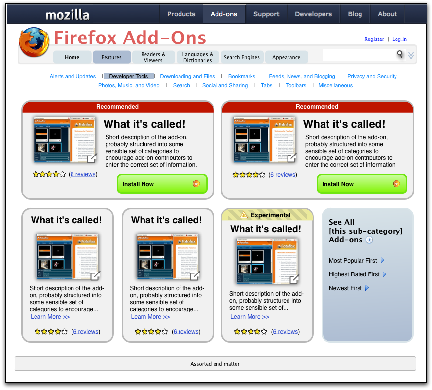
Sub-category Page
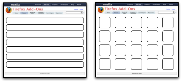
What about the overflow page?
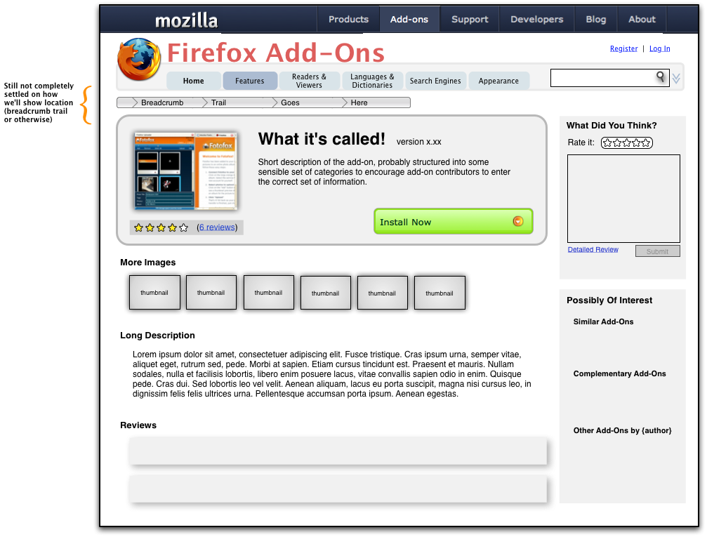
Add-on Details Page
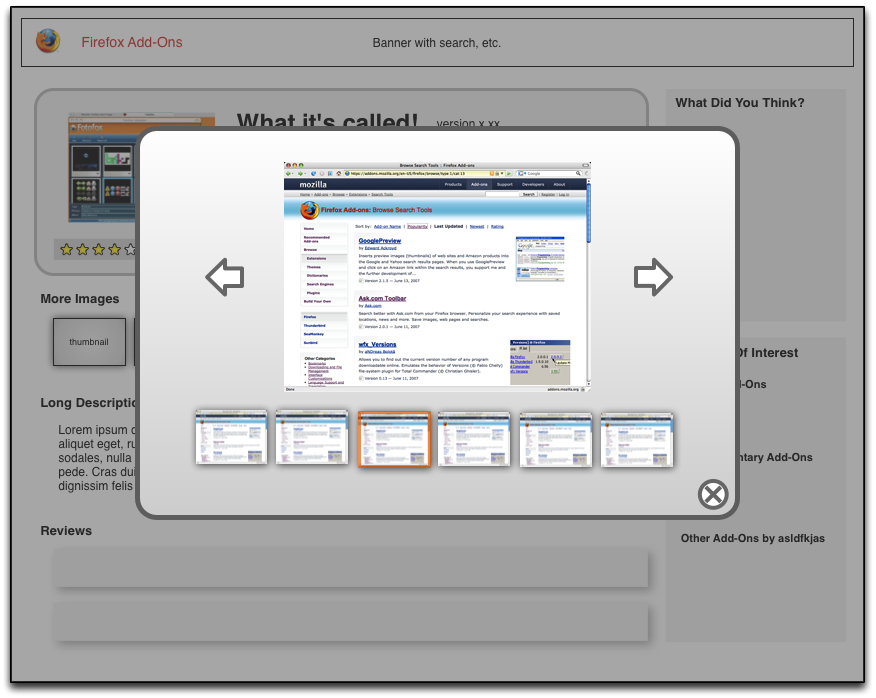
Image Viewer
Some examples of what these could look like:
- Click on a thumbnail image for a great transition effect: http://www.panic.com/coda/
- Slimbox, a Lightbox clone: Slimbox Look at the multi-image version
Neither of these contains thumbnails of the other images in the set when an image is displayed -- this is something that we'd want to do, though.
