QA/Community/QMO Design/Airbag: Difference between revisions
< QA | Community | QMO Design
Jump to navigation
Jump to search
(→Notes) |
|||
| Line 152: | Line 152: | ||
* juanb (2.19.2008): It's more difficult to describe what you want to see in a page starting from written descriptions like the ones you have above. Events and Calendar should be as simple as a short list of items we are working on on a particular day. ... | * juanb (2.19.2008): It's more difficult to describe what you want to see in a page starting from written descriptions like the ones you have above. Events and Calendar should be as simple as a short list of items we are working on on a particular day. ... | ||
** jay (2.20.2008): Juan, I meant to ask that you tell me what you would expect to see on those pages if you came to visit on any given day (without relying too much on my detailed descriptions)... pretend you are designing the pages, share what you feel would be important to make available to our team and community on those pages. | ** jay (2.20.2008): Juan, I meant to ask that you tell me what you would expect to see on those pages if you came to visit on any given day (without relying too much on my detailed descriptions)... pretend you are designing the pages, share what you feel would be important to make available to our team and community on those pages. | ||
<pre> | |||
Marcia Knous wrote: | |||
> A few comments: | |||
> | |||
> | |||
> Comments on the format: | |||
> | |||
> Should the calendar take up the largest piece of real estate on the entry page? Should it possibly be moved to the right hand side of the UI? | |||
> | |||
Since the upcoming events are immediately below, I think this is ok. People like to see the events in calendar format so they quickly get a glance of when things are happening. Let's see how this works out... and if folks feel strongly about making the calendar smaller, we can have the Drupal devs do that for us. Another reason the calendar is taking up the entire width and top of the page is because in Drupal you can change the "view", which will allow you to switch between monthly, weekly, daily, and table list views for the events. | |||
> Should the navigation be tabs on top like spreadfirefox.com site? | |||
I asked if we should do that, and decided against it after talking to the designer. One reason is that we want to make use of the left column for a couple of other things, and moving the menu there will save us some real estate up top. I can explore this further with the designer to see if we can at least see what something like this will look like. | |||
> | |||
> Where can we have a "Featured Community Member of the Month?" I see you have the member gallery, I guess that is it but where would it be in the UI? | |||
The "QAC of the Month" on the frontpage (left column) is where this will be featured... with just a basic photo, name, and short description of what the person did. On the "Member Gallery" page, there will be a more detailed box in the upper right column to showcase this person. In Drupal, this box will be available for any pages, so we can decide if we want to make it more prominent. | |||
> | |||
> Trying to figure out where we would have the nightly builds listed. It would good to have that referenced in a prominent place, along with the links for Litmus. | |||
The "Quick Links" on the frontpage (left column) is a place holder for this type of thing. We can expand it or make it stand out more, so I will work with the designer to do that. We can also add a sentence and links to the frontpage under the "Test" section. | |||
> | |||
> Possibly consider moving "Need Help" higher up in the UI. | |||
Yeah, I think we will have to find a good place for that and make it more visible. I was thinking of making that a bright star type element on the page to make it stand out. | |||
> | |||
> Try making the UI not extend far down the page like Songbirdnest.com. I like it when the important information is more compressed and you don't have to scroll like a fiend to find the important stuff. | |||
That is hard to do, but we will try to do this on as many pages as possible. The goal is to have most of the important information at the top of the main body and right columns. We will have the ability to move things around in Drupal, so we can optimize this after the Drupal development is done. | |||
</pre> | |||
Revision as of 00:55, 23 February 2008
Template Design
After reviewing v2 of the mockup from Airbag, I am providing them with template descriptions for the following pages for the site.
NOTE (for QA Team): The following pages are just a subset of what QMO will be in the end, so do not worry about missing pages and content. As I said, this is simply a design exercise and we are hoping to get a clear picture of what the QMO site will look like based on a few of the main pages defined below. We will be able to reapply any of these templates for other pages and content.
Events & Calendar
- Rough wireframe:
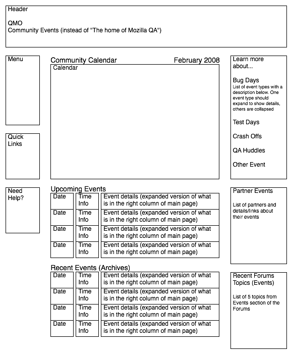
- Title should replace "The home of Mozilla QA" with "Community Events"; breadcrumb should be something like "Home > Events > Calendar"
- Left Column:
- Same as other pages, should include main navigation menu, "Quick Links", and "Need Help?" boxs (Note: We might add something there later, but for now I think those 3 will do)
- Right Column:
- "Learn more about..." box with collapsable list including:
- Bug Days, Test Days, Crash Offs, QA Huddles
- Each item in the list will have a description below it (25-50 words), with links to a dedicated page that has more details.
- "Partner Events" box with list of partners including:
- ClubMoz @ Seneca, Sun China, Songbird
- Each partner will have a short description (20-25 words) with links to their respective partner page.
- "Recent Forum Topics for Events" box
- List of 5 topics from the Events section of the forums
- "Learn more about..." box with collapsable list including:
- Main Body:
- "Community Calender" title with month and year, followed by a monthly calendar that spans the width of the center column. (Note: Drupal will allow users to change the calendar view to weekly, daily, or list, but all of that should fit fine if we make the center column flexible)
- "Upcoming Events" section
- List that uses 3 columns, first being the date, followed by time, and ending with the event type, title and description (14-20 words). (Note: It will be nice to use either the icons or color to differentiate between different event types, like magnifying glass for Test Day vs bugs/angry heads for Bug Day)
- "Past Events" section
- Same as "Upcoming Events", but with a small row below each item with room for event notes and results in smaller text (10-15 words), eg "Over 100 testcases ran; 10 participants"

Events Detail
- Rough wirefame:
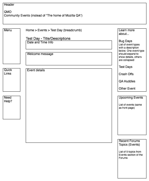
- Title should replace "The home of Mozilla QA" with "Community Events"; breadcrumb should be something like "Home > Events > [Event Type + Description]"
- Left Column:
- Same as other pages, should include main navigation menu, "Quick Links", and "Need Help?" boxs (Note: We might add something there later, but for now I think those 3 will do)
- Right Column:
- "Learn more about..." box with collapsable list including:
- Bug Days, Test Days, Crash Offs, QA Huddles
- Each item in the list will have a description below it (25-50 words), with links to a dedicated page that has more details.
- "Upcoming Events" box with list like on Homepage
- Each event will have a date, type and title with links to the event details pages.
- "Recent Forum Topics for Events" box
- List of 5 topics from the Events section of the forums
- "Learn more about..." box with collapsable list including:
- Main Body (need to make a lot better than http://quality.mozilla.org/en/node/1339):
- Event type, title at top
- Small row for short description and notes (10-25 words)
- Date and time info
- Welcome message in paragraph form (25-50 words); full body width
- Event details
- "How do I get ready?." box or section will be a checklist with 2-5 things for users to do to prepare for the event (eg: 1. Download nightly build, 2. Backup profile, 3. Login to IRC, 4. Press "Checkin" button). Note: We plan to add functionality to QMO that will allow users to click a button to tell us there are participating in any given event, so this button should go in this box. It will be nice to stylize it to fit the theme and make it stand out.
- "This is what we're doing..."
- 2-5 paragraphs (15-20 words) with title for each (eg: 1. What we're testing, 2. We're here to help, 3. If you find something..., 4. More info and tips), with the occasional bullet list (5-10 items) thrown in to highlight major areas for testing, display bug lists, or steps to follow throughout the event.
- "Stay Connected and Do More!"
- "Feedback" message (15-20 words) with feedback form (to be submitted as comments or sent to either forums or email alias)
- Form fields: Subject, Details, Name, Email and Website (similar to comment form for blog page)
- Link to email alias (eg. testday@mozilla.org) below form for those that want to email
- "Do More!" message (25-50 words) with links to Events, Projects, and other relevant links.
- "QA Companion" promotion (15-20 words) to encourage downloading and using the QA extension. Note: We used the QMO logo to brand the extension, so we should probably use it here if possible.
- "Feedback" message (15-20 words) with feedback form (to be submitted as comments or sent to either forums or email alias)
- "Thank You" message: "Thanks for being a active member of the Mozilla QA community! - The Mozilla QA Team."
- "Discussion"
- List of feedback/comments (similar to comments section of blog page)

Projects
- Title should replace "The home of Mozilla QA" with "Community Projects"; breadcrumb should be something like "Home > Projects"
- Left Column:
- Same as other pages, should include main navigation menu, "Quick Links", and "Need Help?" boxs (Note: We might add something there later, but for now I think those 3 will do)
- Right Column:
- "Learn more about..." box with collapsable list including:
- Unconfirmed Bug Triage, Crash Analysis, Litmus Test Cases, Topsite Testing
- Each item in the list will have a description below it (25-50 words), with links to a dedicated page that has more details.
- "Upcoming Events" box with list like on Homepage
- Each event will have a date, type and title with links to the event details pages.
- "Recent Forum Topics for Projects" box
- List of 5 topics from the Projects section of the forums
- "Learn more about..." box with collapsable list including:
- Main Body:
- Display 4 main focus areas from Homepage (perhaps in 4-square formation), with description of the type of projects in that category (15-20 words), followed by a bullet list of the top 2-3 projects for each, with links to their individual project pages.
- "Popular Projects" section
- List that displays project type and title first, followed by a row for the description (15-20 words), followed by a smaller row for info like number of members working on the project, and perhaps a blurb from the latest comment/forum post. (Note: It will be nice to use either the icons or color to differentiate between different project types, like magnifying glass for Test Projects vs bugs/angry heads for Bug Projects)
- "Ongoing Projects" section
- Could be the same as "Popular Projects", but perhaps we can do something different, like use boxes in a row to highlight these projects since they will remain on the page for a long time.
Project Detail
- Title should replace "The home of Mozilla QA" with "Community Projects"; breadcrumb should be something like "Home > Projects > [Project Type + Name]"
- Left Column:
- Same as other pages, should include main navigation menu, "Quick Links", and "Need Help?" boxs (Note: We might add something there later, but for now I think those 3 will do)
- Right Column:
- "Project Menu" at top
- Project Lead box (similar to "QAC of the Month") with pic, name, and focus areas of team/community member leading project
- Project Info box (list with short description below each item, each section below should be collapsible)
- Members, description "People working on this project", followed by a list of members of the project (0-20+ items)
- Tasks link that takes users to the Tasks section of the page, description "What we're doing", followed by list of 2-5 links for major tasks for project (links to various sections of the project page).
- Discussion link that takes users to the Discussions section of the page, description "Talk about this project", followed by list of 5 topics from this project's section of the forums (or the discussion section of the page)
- Join Project button (for users to click to join the project) - need to make this stand out a bit (similar to the Events "Checkin" button)
- "Project Menu" at top
- Main Body (need to improve on http://quality.mozilla.org/projects/automation/talos):
- Project type, title at top
- Small row for short description and notes (10-25 words)
- Welcome message in paragraph form (25-50 words); full body width
- Project details
- Main section where the project lead describes the project and the various areas of focus and tasks.
- 2-5 paragraphs (15-20 words) with title for each (eg: 1. Project Details, 2. Tasks, 3. Tools, 4. More info and tips, 5. Members), with the occasional bullet list (5-10 items) thrown in to highlight major areas for testing, display bug lists, or steps to follow throughout the event.
- "Toolbox" will be a checklist with 2-5 items (15-25 words each) users might find useful to prepare for the project or learn more about the tools and processes to work on the project.
- "Discussion"
- "Mini-Forum" list of 5 latest discussion topics
- "Discussion" message (15-20 words) with feedback form (to be submitted or added to this project's forums)
- Form fields: Subject, Details, Name, Email and Website (similar to comment form for blog page) + Dropdown menu for "New" thread, or any of the existing discussion threads.
- "Do More!" message (25-50 words) with links to Events, Projects, and other relevant links.
- "QA Companion" promotion (15-20 words) to encourage downloading and using the QA extension. Note: We used the QMO logo to brand the extension, so we should probably use it here if possible.
- Main section where the project lead describes the project and the various areas of focus and tasks.
- NOTE: This entire section is open for layout changes and creative design... There is a lot here, so if the designer has ideas on how to simplify or better organize the information, I think this can be one of the best designed pages on QMO. We hope that these Project pages will become "Homepages" within QMO for small groups of community members that are interested in just working on specific projects/tasks... so it's important that we do this right. :-)
Member Gallery
- Title should replace "The home of Mozilla QA" with "Member Gallery"; breadcrumb should be something like "Home > Community > Members"
- Left Column:
- Same as other pages, should include main navigation menu, "Quick Links", and "Need Help?" boxs (Note: We might add something there later, but for now I think those 3 will do)
- Right Column:
- "QA Community All-Star" (like on the homepage, but slightly bigger, with more details about member, including name, location, "badges/points", projects, etc)
- "Most Active" list of 5 members with just name and photo
- "Newest Members" list of 5 members with just name and photo
- "Recent Forum Topics for Community" box
- List of 5 topics from the Community section of the forums
- Main Body:
- "Get to know the Mozilla QA team!" section, with detailed profile view of each member, including photo, name, title, areas of focus, projects, etc. This can be a matrix of boxes that fit the current team, about 10-15 people.
- "The Mozilla QA Community" section, with slightly less detailed profile view of members, including just photo, name, location, projects. This can be a 1 or 2 column list view or if possible, a matrix of smaller boxes. We can fit all members or break it down to about 25/page. Note: I hope to expand the individual member items to show the entire user profile (like http://quality.mozilla.org/en/user/jay, but better organized into a clean, tight box), with js magic (like lightbox for photos). Is that something we can do with one profile in the mockup?
Forums
- Title should replace "The home of Mozilla QA" with "Community Forums"; breadcrumb should be something like "Home > Community > Forums"
- Left Column:
- Same as other pages, should include main navigation menu, "Quick Links", and "Need Help?" boxs (Note: We might add something there later, but for now I think those 3 will do)
- Right Column:
- "Upcoming Events" - List of 5 events (like on frontpage)
- "Community Projects" list of 5 projects (from Projects page)
- Main Body:
- Standard Forums UI, with major Forum Categories, each with various Sections and their respective Topics
Blog Home
- Title should replace "The home of Mozilla QA" with "Mozilla QA Blog"; breadcrumb should be something like "Home > Blog"
- Left Column:
- Same as other pages, should include main navigation menu, "Quick Links", and "Need Help?" boxs (Note: We might add something there later, but for now I think those 3 will do)
- Right Column:
- "Tag Cloud" box with frequency weighted tags
- Potential tags will be: events, projects, community, testing, bugs, tools, automation, data, feedback, Firefox, Thunderbird, etc
- "Upcoming Events" box with list like on Homepage
- Each event will have a date, type and title with links to the event details pages.
- "Current Projects" box with list of 5 projects, with name, lead, and short description (15-20 words); like on homepage
- "Recent Forum Topics" box
- List of 5 topics from the forums; like on homepage
- "Tag Cloud" box with frequency weighted tags
- Main Body:
- Start with 2-3 of the latest posts in normal content form of unlimited words (or perhaps in "preview" mode of about 50-100 words with "Click here for more..." links)
- Bottom left should be a list of "Recent Stories" highlighting the last 5 stories with just title, author, date, and one line preview?
- Bottom right should be a "Community Requests" box that allows users to suggest topics for the QA team to write about or ask questions. It should be a web form with fields: "What do you want to know more about?" subject field, details text box, and email. Note: This feature might only be available to members of QMO, so I don't think the username/email form fields will be necessary. Same goes for the standard comments form (from v2 mockup page 2)... if we decide to only allow members logged in to comment.
Blog Entry
- Template is already created as part of the v2 mockup (page 2)
Notes
- juanb (2.19.2008): It's more difficult to describe what you want to see in a page starting from written descriptions like the ones you have above. Events and Calendar should be as simple as a short list of items we are working on on a particular day. ...
- jay (2.20.2008): Juan, I meant to ask that you tell me what you would expect to see on those pages if you came to visit on any given day (without relying too much on my detailed descriptions)... pretend you are designing the pages, share what you feel would be important to make available to our team and community on those pages.
Marcia Knous wrote:
> A few comments:
>
>
> Comments on the format:
>
> Should the calendar take up the largest piece of real estate on the entry page? Should it possibly be moved to the right hand side of the UI?
>
Since the upcoming events are immediately below, I think this is ok.  People like to see the events in calendar format so they quickly get a glance of when things are happening.   Let's see how this works out... and if folks feel strongly about making the calendar smaller, we can have the Drupal devs do that for us.  Another reason the calendar is taking up the entire width and top of the page is because in Drupal you can change the "view", which will allow you to switch between monthly, weekly, daily, and table list views for the events.
> Should the navigation be tabs on top like spreadfirefox.com site?
I asked if we should do that, and decided against it after talking to the designer.  One reason is that we want to make use of the left column for a couple of other things, and moving the menu there will save us some real estate up top.  I can explore this further with the designer to see if we can at least see what something like this will look like.
>
> Where can we have a "Featured Community Member of the Month?" I see you have the member gallery, I guess that is it but where would it be in the UI?
The "QAC of the Month" on the frontpage (left column) is where this will be featured... with just a basic photo, name, and short description of what the person did.  On the "Member Gallery" page, there will be a more detailed box in the upper right column to showcase this person.  In Drupal, this box will be available for any pages, so we can decide if we want to make it more prominent.
>
> Trying to figure out where we would have the nightly builds listed.  It would good to have that referenced in a prominent place, along with the links for Litmus.
The "Quick Links" on the frontpage (left column) is a place holder for this type of thing.  We can expand it or make it stand out more, so I will work with the designer to do that.  We can also add a sentence and links to the frontpage under the "Test" section.
>
> Possibly consider moving "Need Help" higher up in the UI.
Yeah, I think we will have to find a good place for that and make it more visible.  I was thinking of making that a bright star type element on the page to make it stand out.
>
> Try making the UI not extend far down the page like Songbirdnest.com.  I like it when the important information is more compressed and you don't have to scroll like a fiend to find the important stuff.
That is hard to do, but we will try to do this on as many pages as possible.  The goal is to have most of the important information at the top of the main body and right columns.  We will have the ability to move things around in Drupal, so we can optimize this after the Drupal development is done.