Mobile/UI/Designs/TouchScreen/TouchBar: Difference between revisions
| Line 40: | Line 40: | ||
== History and Tabs == | == History and Tabs == | ||
For both the history and tabs buttons, clicking on them causes a zoom-out effect to show their respective screens. The zoom-out is important because it maintains that sense of place and physicality. | |||
=== History === | |||
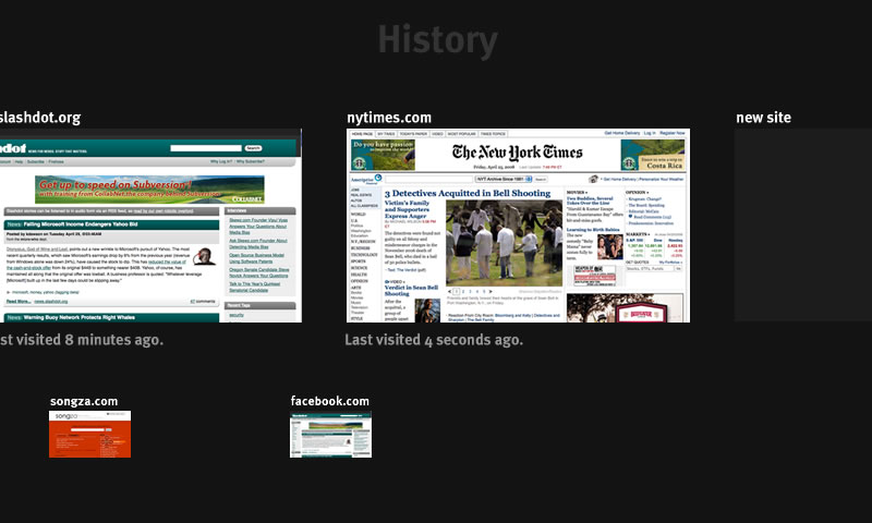
[[Image:Touchbar History.jpg]] | |||
The history is a left-right draggable, visual timeline of history. Left is back in time, right is forwards in time. Clicking on an thumbnail zooms into that page. Clicking on an thumbnail back in your history and navigating to a new page causes that page to be appended to the end of the history. That is, renewing navigation from a site in your history is not destructive to your history. Below the current tab's history is the history of all site's you've opened not in that tab. | |||
=== Tabs === | |||
[[Image:Touchbar Tabs.jpg]] | |||
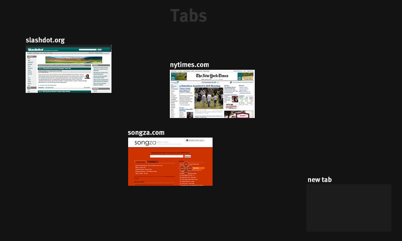
It is important that tabs are not done in a rigid grid, so as to maximize number of spatial cues/landmarks. These spatial cues should be created by the user, so that all "tabs" are draggable in this space. Clicking on one zooms back into that tab. | |||
The steps for switching from one tab to another are as follows: | |||
* Place finger in corner and move finger to the tab button while maintaining contact with the screen. | |||
* Releasing the finger causes a fast zoom-out animation, showing all open tabs. | |||
* Click the tab you desire, and a fast zoom-in animation brings you where you want to be. | |||
The size of the tabs scale to fit the space. Few tabs means that they will be large, while many tabs means that they will be small. Tabs are not allowed to overlap. | |||
TODO: How to close a tab? | |||
Revision as of 11:47, 29 April 2008
Introduction
There are three concepts in this design:
- The url/search bar
- The touch bar
- Overview areas (History and Tabs)
The Url/Search Bar
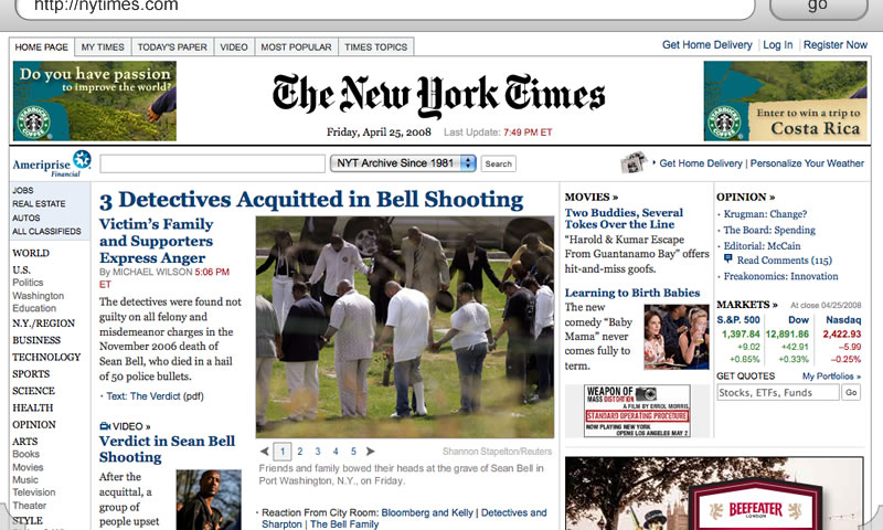
The URL/Search bar is considered to be the very top of every page. Like on the iPhone, it scrolls with the page, and thus can be scrolled out of view. To get to it, the user either scrolls to the top of the page or uses the touch bar to automatically scroll to the url/search bar (I'll come back to this).
The great benefit of this method is that because the location of the url/search bar is part of the page, the interface retains a sense of physicality -- the user always knows where to find it because of the consistency of physical objects.
The bar borrows from Madhava's Proposal8 in that when a url is entered, the button reads "go"; and when a non-url is entered, the button reads "search".
The Touch Bar
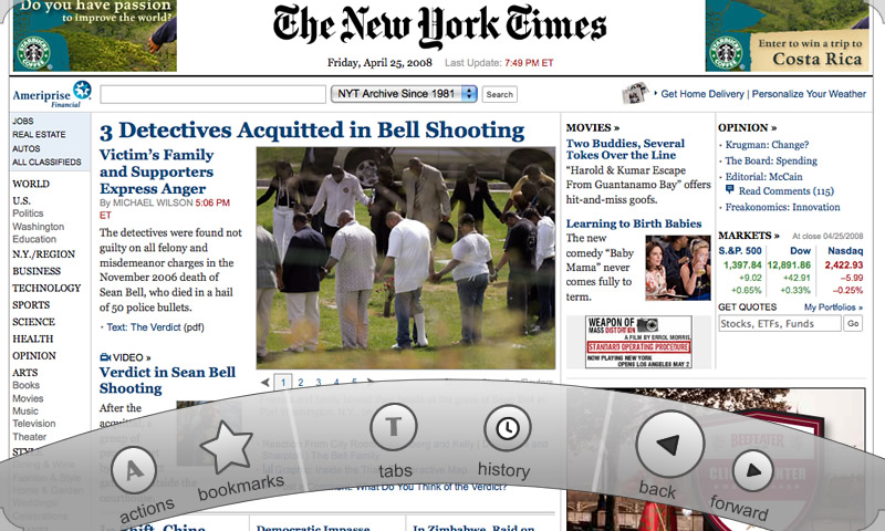
The touch bar is the method for accessing most of the functionality of the browser. Always visible are the touch-bar activation corners (see above picture). Touching either one of them with your thumb causes the touch bar to animate from the touched corner to the other corner, revealing the actions:
The curve (although optional) is meant to follow the natural path that the thumb takes when gripping a device. The action bar can be -- like most menus -- both modal and quasimodal.
Quasimodal: Place your finger on one of the touch-bar activation corners and slide your finger to the desired action, and release. (As the finger travels, force feedback should be provided for each button passed). This provides a very fast way of accessing functionality and is quickly habit forming.
Modal: Tap the corner, and the touch bar is revealed. Touch any of the buttons to activate the action (force feedback should be included here). Using the modal method it is possible to press buttons like "back" and "forward" multiple times. Tapping outside the bounds of the touch bar dismisses it.
Depending on user testing, we may be able to remove the modal option.
The exact buttons on the touch bar are not necessarily as shown above. However, a description of the listed buttons are as follows:
- The action button contains a number of commands that operate on the current page or the browser. For example, "Digg Page", "Delicious Page", "Mail to friend", "Bookmark", and "Manage Add-Ons".
- Bookmarks brings up a list of your bookmarks (I haven't made the mockup for this yet.)
- Tabs and history zooms out to reveal their respective screens (see below).
- Url/Search scrolls the page to the top, brining the location bar into view and focus, so that you can just begin typing.
- Back/Forward do as they sound.
History and Tabs
For both the history and tabs buttons, clicking on them causes a zoom-out effect to show their respective screens. The zoom-out is important because it maintains that sense of place and physicality.
History
The history is a left-right draggable, visual timeline of history. Left is back in time, right is forwards in time. Clicking on an thumbnail zooms into that page. Clicking on an thumbnail back in your history and navigating to a new page causes that page to be appended to the end of the history. That is, renewing navigation from a site in your history is not destructive to your history. Below the current tab's history is the history of all site's you've opened not in that tab.
Tabs
It is important that tabs are not done in a rigid grid, so as to maximize number of spatial cues/landmarks. These spatial cues should be created by the user, so that all "tabs" are draggable in this space. Clicking on one zooms back into that tab.
The steps for switching from one tab to another are as follows:
- Place finger in corner and move finger to the tab button while maintaining contact with the screen.
- Releasing the finger causes a fast zoom-out animation, showing all open tabs.
- Click the tab you desire, and a fast zoom-in animation brings you where you want to be.
The size of the tabs scale to fit the space. Few tabs means that they will be large, while many tabs means that they will be small. Tabs are not allowed to overlap.
TODO: How to close a tab?


