Firefox3/Theme/MacOSX: Difference between revisions
No edit summary |
No edit summary |
||
| Line 80: | Line 80: | ||
[[Image:Jurmous-toolbar-moregen.jpg]] | [[Image:Jurmous-toolbar-moregen.jpg]] | ||
== Some suggestions from discussion page == | |||
* tabs linked to content. I prefer them linked to bookmarks like earlier because OSX standard (Safari and new Terminal in Leopard) and cleaner unified look. | |||
* Favicons on bookmark bar. I think it is too busy. OSX skin should look clean. | |||
* Active reload button. This is how I imagined it. Glowing. (should fade this image in so illusion of activation will be there) For hovers. | |||
* Some color to the search selector. I think it is too windows now... | |||
* Standard RSS icon. It looks slightly out of place I think. Like previous one better and is close enough to standard I think. (lighter look) | |||
Comments are welcome on discussion page. | |||
[[User:JurMous|JurMous]] 10:44, 30 September 2007 (PDT) | |||
[[Image:Jurmous-Firefoxtoolbar3-gen-test.jpg]] | |||
Revision as of 17:44, 30 September 2007
This wiki page is for posting and discussing mockups of Firefox themes for Mac OS X, enjoy :)
The related Bugzilla ticket is Bug 397723.
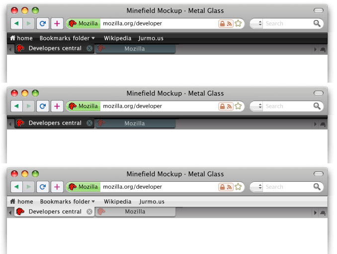
Glass + Metal, 3 proposals (2007 09 29)
Just a rapid mockup, to support visually some discussion on the Bug 397723 topic. I've tried to add some colors to the icons, but I scrapped them since I couldn't find any interesting solution. :P --Folletto Malefico 22:18, 28 September 2007 (PDT)

New buttons on previous proposal (2007 09 29)
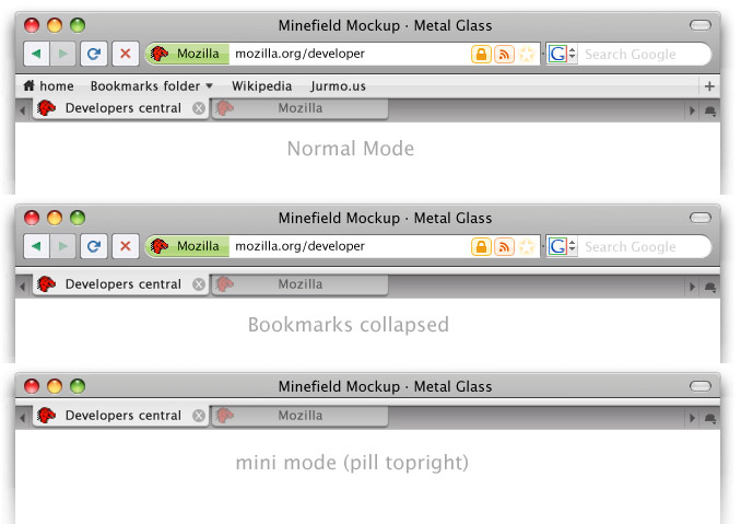
Using previous proposal but with tighter spacing, different buttons inspired by new/macbook apple keyboard, color on buttons for better intuitive browsing and a bookmark bar collapsed mode. Also using leopards new trafficlights. JurMous 03:17, 29 September 2007 (PDT)
Also tried out the more sparse buttons. (combining stop/reload, home to bookmarks and + for bookmarking like safari) Black and white options Black is inspired by the new iMac and iPhone Glass/metal combo. JurMous 05:41, 29 September 2007 (PDT)
Edit: Uploaded new version with correct nav and a black with bookmarks collapsed. JurMous 07:39, 29 September 2007 (PDT)
Evolution of previous proposal
It seems that white is preferred for default skin on which I will continue. Black will be a separate download then.
- Less rounded borders on location: more efficient on space
- draggable thumb to control width of location/search
- separated lock and feed icons. They should animate in when needed for attention (grow pop style)
- the stop button is back (although I prefer stop and reload in one)
- the add bookmark button is placed on bookmark bar as +. More logical.
- Although there is a second option of the invisible glowing star on the location bar. What is better location or sometimes hidden bookmarkbar. And what if you use delicious as I do?
- Pill super minimised mode design for presenters with preopened tabs.
JurMous 14:44, 29 September 2007 (PDT)
Bottom of window with inline find open
- Always black glass for visibility
- Red matches indicator for visibility
- Status text small with blue thumb
- below top of the window was too busy.
JurMous 16:12, 29 September 2007 (PDT)
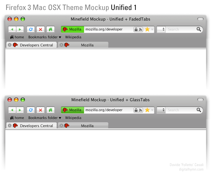
Unified Glass + Metal, 2 proposals (2007 09 29)
A little test on some other type of tabs-bookmarks-toolbar integration. Still not satisfied, while I think that this approach is a bit better.
- Completely unified toolbar.
- A light visual hint to valorize "back" over "next" button.
- Back to square location bar. Seems better and more efficient.
- Home alternative on the bookmarks bar. Thinking about it, why we need a home button at all? It's just a special bookmark.
--Folletto Malefico 16:33, 29 September 2007 (PDT)
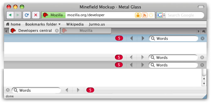
Some inline find options
- Blue, white, brushed metal at bottom and top
- New color for stop and the green.
- Square location bar
- Removed +
- I don't like the prev next buttons yet, should be cleaner. But this is more for general look testing.
More general usage
With all the none rectangle favicons and special icons I tried to create a more generic view. JurMous 03:37, 30 September 2007 (PDT)
- Only RSS on this site
- This site has no confirmed identity.
- Square favicons
- Is a favorite.
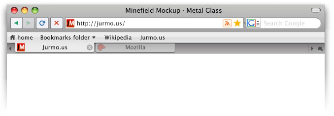
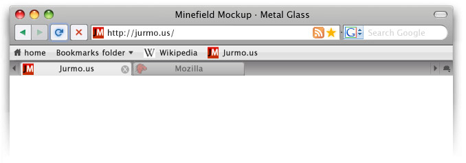
Some suggestions from discussion page
- tabs linked to content. I prefer them linked to bookmarks like earlier because OSX standard (Safari and new Terminal in Leopard) and cleaner unified look.
- Favicons on bookmark bar. I think it is too busy. OSX skin should look clean.
- Active reload button. This is how I imagined it. Glowing. (should fade this image in so illusion of activation will be there) For hovers.
- Some color to the search selector. I think it is too windows now...
- Standard RSS icon. It looks slightly out of place I think. Like previous one better and is close enough to standard I think. (lighter look)
Comments are welcome on discussion page.
JurMous 10:44, 30 September 2007 (PDT)
