Calendar:Improving the Calendar Views: Difference between revisions
m (→Modes) |
|||
| Line 18: | Line 18: | ||
''' Task Mode''' | ''' Task Mode''' | ||
* [[Calendar: Task Mode|Task Mode]] | * [[Calendar: Task Mode|Task Mode]] | ||
''' Events and Tasks''' | |||
* [[Calendar: Improved Events and Tasks|Improved Events and Tasks]] | |||
== Current Issues (Lightning 0.3)== | == Current Issues (Lightning 0.3)== | ||
Revision as of 15:43, 23 August 2007
References
Specifications
- Mail Mode Integration
- Calendar Mode
- Mode Switch Toolbar
- Thunderbird Toolbar Integration
- Thunderbird Menu Integration
Proposals
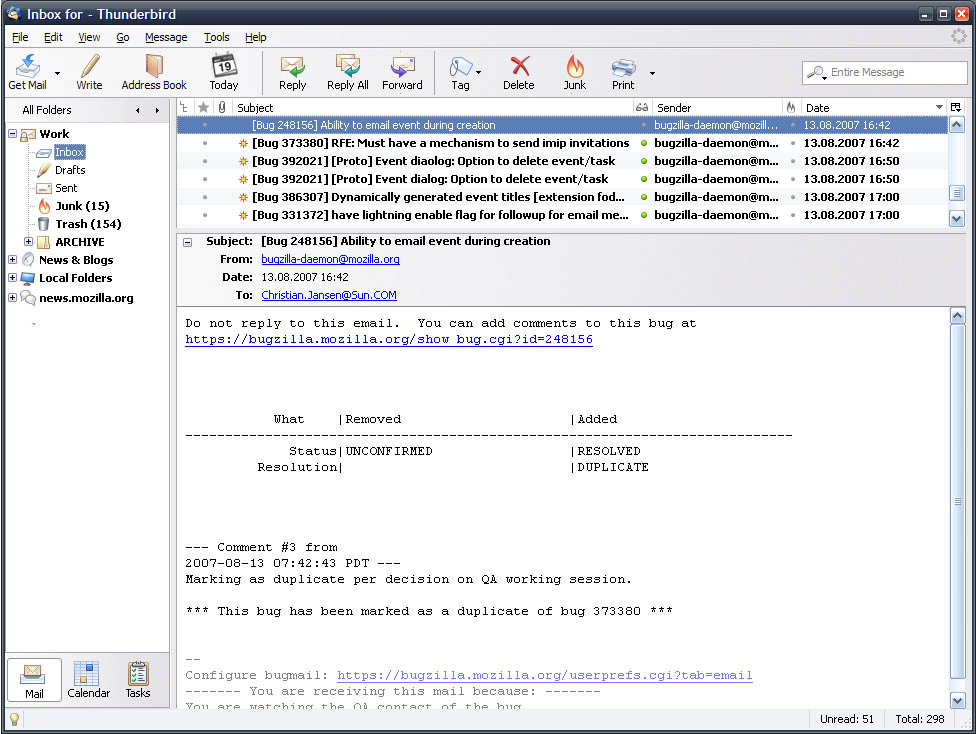
Mail Mode
Calendar Mode
Task Mode
Events and Tasks
Current Issues (Lightning 0.3)
The table below lists users feedback regarding the usability of the main Lightning UI.
Issues:
- The calendar below the email accounts is disturbing and to big if you also use the "contact sidebar" extension.
- After starting Thunderbird I don't know in which calendar I'm working in.
- I can't drag an event from one calendar into another.
- All the different colors in the week view are confuses me. Especially same things are highlighted differentially.
- The three buttons (New../Edit../Delete) are somehow strange. I think these buttons are good for creating/changed/deleting events.
- I want to switch between E-Mail and Calendar easily.
- Why am I seeing the mail tree when I'm working in the Calendar?
- I don't want to see Saturday and Sunday. I use my calendar only for my work.
- The left side looks very cluttered.
- How can I switch into a different view?
- I have 3 calendars. One for work, the other are subscribed ones. Which means that I don't have write access on these. I don't know how many times I tried accidentally to create an event in one of the read only calendars.
Proposal
Most of the issues stated above can be fixed by focusing on the following areas:
Rearranging already existing UI elements
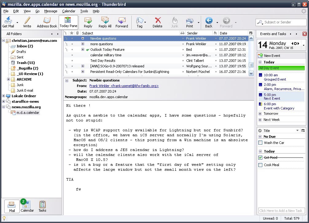
At the moment, Lightning 0.3 combines very important information on the left hand side. From an users point of view these are:
- Access to the E-Mail account (Mail Account Tree),
- Calendar (Mini Moth),
- Agenda List (Agenda Tab),
- Todo List (Todo Tab)and
- List of Calendars (Calendar Tab)
The problem with that solution is that 70% of the visual information is placed on 30% of the screen.
Depending on the task users want to fulfill, each element of the left hand pane has a different importance level.
For the tasks "Write or Read Mail" the order could be:
- Mail Account Tree
- Agenda
- Todo
- Mini Month
- Calendar
For the task "Create Event" the order could be as follows:
- Calendar
- Mini Month
- Agenda
- Todo
- Mail Account Tree
To reduce visual clutter I'd like to propose to split Mail, Calendar and Tasks into three separate modes.
- One view which focuses on mail
- One calendaring.
- One tasks
Modes
Today Pane Switched On
Calendar
Tasks
+--------------------------------------------------------------+
+--------------------------------------------------------------+
| T A S K S - - T O O L B A R                      [Search  ]  |
|--------------------------------------------------------------|
| Calendar    < > ||                                           |
|`````````````````||  [-] Do Car Wash                          |
| February 2007   ||      sdnsdsd fcfdf ffdf dfdf              |
| X X X X X X     ||      ds fcfdf hhj wew                     |
| X X X X X X X   ||                                           |
| X X X X X X X   ||  [+] Do Project Planning                  |
| X X X X         ||                                           |
|                 ||                                           |
|-----------------||  [+] GUI Planning                         |
| 0 This Week     ||                                           |
| 0 My Tasks      ||                                           |
| O Next Seven Da ||                                           |
|                 ||                                           |
|                 ||                                           |
|                 ||                                           |
|                 ||                                           |
|-----------------||                                           |
| Mail Cal [Task] ||                                           |
|-----------------||___________________________________________|
+--------------------------------------------------------------+


