DXR UI Refresh
Jump to navigation
Jump to search
Once upon a time, Schalk Neethling surveyed the userbase and heuristically analyzed the UI, resulting in some nifty mockups.
Then Erik Rose came along and did another round of wireframes adding these simplifications:
- Removing the front page, which not a soul remembers the reason for and which complicates the implementation and visually destabilizes the UI when it goes "poof". (I think the UI was inspired by Google. But, unlike them, we don't have other properties to advertise, so we don't need a place to park a navbar.)
- Teaching the query syntax via live feedback from the advanced search form rather than through written instructions. It's a little more JS, but users won't have to pogo-stick back and forth to a help page.
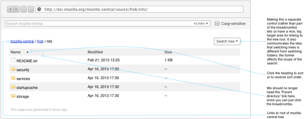
- Making a few improvements to the multi-tree story
Basic Search
The basic search form gets an always-present case-insensitivity checkbox, which checks itself as soon as the user enters any capital letters. I'm not totally sold on that last bit, but it's something a few of the users requested. We should spend more design time on it.

Advanced Search
Currently, nobody understands when the advanced search form shows up. It seems rather random. Now, it'll always be accessible via a disclosure control on the basic search form.

Initial Page
DXR's current front page goes away, replaced with a code-browsing view.

Search Results
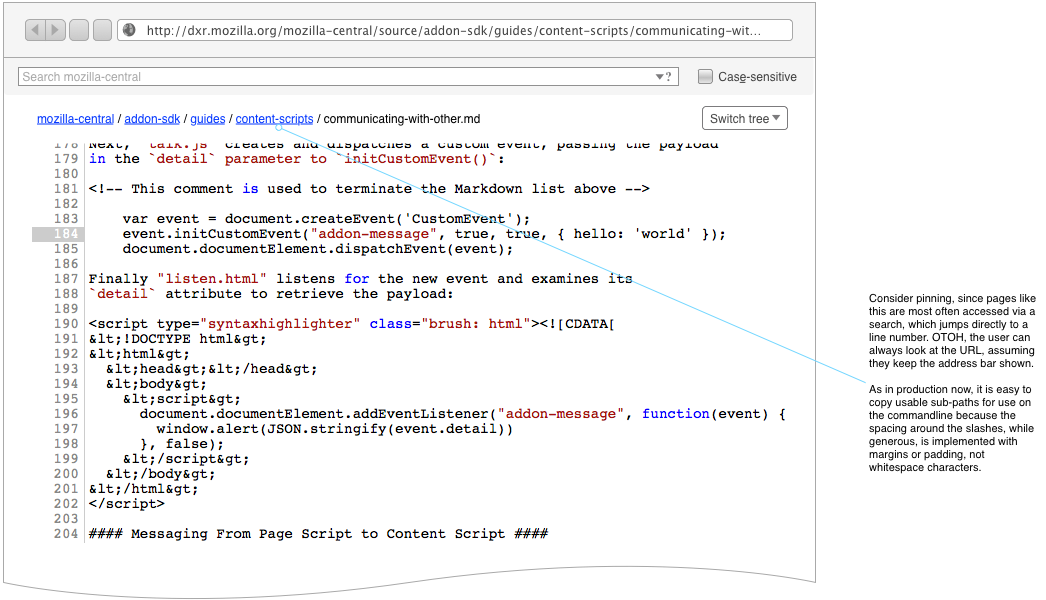
File View
Other Considerations
- The need for the magnifying glass logo is diminished: we now have plenty of other ways to get back to code-browsing mode. Perhaps we can better use the space for something else.
- The Navigation pane, also something which shows up apparently at random, should be more predictable and should have whatever kind of disclosure control we decide upon for the Advanced Search form.

