DXR UI Refresh
Once upon a time, Schalk Neethling surveyed the userbase and heuristically analyzed the UI, resulting in some nifty mockups.
Then Erik Rose came along and did another round of wireframes adding these simplifications:
- Removing the front page, which not a soul remembers the reason for and which complicates the implementation and visually destabilizes the UI when it goes "poof". (I think the UI was inspired by Google. But, unlike them, we don't have other properties to advertise, so we don't need a place to park a navbar.)
- Teaching the query syntax via live feedback from the advanced search form rather than through written instructions. It's a little more JS, but users won't have to pogo-stick back and forth to a help page.
- Making a few improvements to the multi-tree story
Feel free to comment on Talk:DXR_UI_Refresh and factor up the results of discussion to this page.
Basic Search
- The basic search panel gets an always-present case-sensitivity checkbox, with an accesskey so it can be toggled quickly and without leaving the keyboard.
- A pop-up menu exposes most of the 24 filter types. Users no longer have to check a manual (which never existed) or the source code to see what's available. Also, the presence of a single menu encourages the use of only one filter per query, which is all that makes sense with most filters. (Filters that do make sense in combination with others are available in the advanced search panel.)
Initial Page
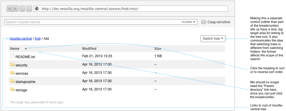
DXR's current front page goes away, replaced with a code-browsing view. If we'd like to add a tree description page, a la MXR, we could do it at the root of the browsing hierarchy. Breadcrumbs make clear where you are in the tree and are separated from the search panel to make clearer that browsing location has no effect on search scope.
Advanced Search
Currently, nobody understands when the advanced search panel shows up. It seems rather random. Now, it'll always be accessible via a disclosure control on the basic search panel.
Open Questions
- Should we add a textual signifier to the main search field when something other than text is chosen—
function:foorather thanfoo, for instance? There is little reason to support such syntax at all with the pop-up there, since you can select something from the pop-up at least as efficiently as typing out the signifier, assuming type-to-select in the user agent. If DXR grows to support arbitrary boolean expressions ((function:foo OR function:bar) regexp:sme+p), then syntax becomes more useful again. If we do decide to keep the syntax, we'll have to decide what to do with the menu if the user manually changes a signifier—change its selection, dim it, etc. - Can we detect when a qualified name is entered and do a fully-qualified search only then? What of global symbols?
- I'm not thrilled with that one, big field doubling as a place for fancy, multi-term queries and the simplest of terms. It makes for a lot of complicated edge cases when the user frobs either the field or the other controls that feed into it. Google takes the easy way out, moving its advanced-search fields to a separate page, which doesn't do find-as-you-type. Also, it has only words to deal with; our terms are more complex, having a variety of filter types.
Search Within
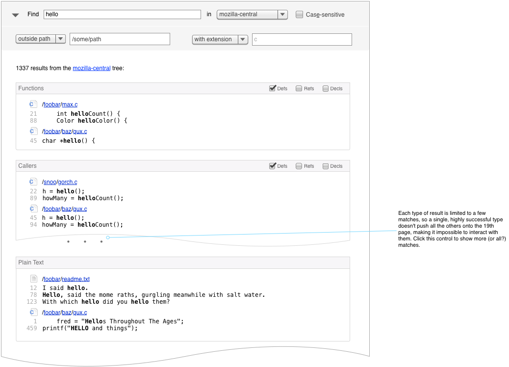
Search Results
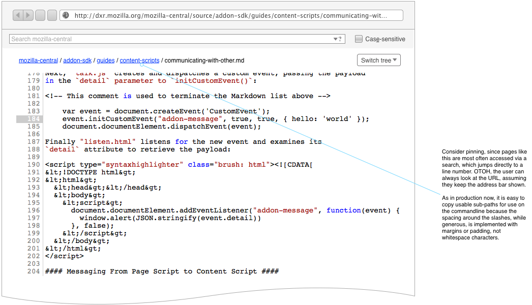
File View
Other Considerations & Use Cases
- The Navigation pane, also something which shows up apparently at random, should be more predictable and should have whatever kind of disclosure control we decide upon for the Advanced Search form.
- Mook switches trees a lot while looking at a single file in MXR. He's like to be able to do that without losing his scroll position, as it typically lands him at a similar-enough place in the code that he can reorient himself. We'll add a tree switcher to the navigation panel, which appears when a file is being viewed. The nav panel will be pinned.
Drill-Down Advanced Search: A Dead End?
This style lets you start a search quickly, without a lot of up-front thinking about constraints or DXR syntax. Like a web search engine, it returns a mixture of matches, across various filter types, and invites you to drill down further if you don't see what you want.
Problems:
- If we divide the results by filter type, we can't also divide them by extension or path, unless we hierarchalize, organizing extension subdivisions under filter-type ones. But what if we combine the interactive approach with an explicit couple of disclosable fields for truly extradimensional filters? If somebody loves that, I'll sketch it.
- Any symbolic-filter result is also going to show up in the plain-text result section. Should we de-dupe or something?
Notes:
- As now, Caller or Bases or Members results would show once the query matched a full function or class name.
In the end, this style has some nice things going for it, but I think it takes too much clicking around for the tastes of our audience. Plus, it would likely be lower-performance than the current system, at least without redesigning the data storage. Finally, we're not a web search engine: our users have a pretty good idea what kind of entity they're searching for up front, and making them sort through a bunch of noise to specify that constraint (along with tolerating the mental switching inherent in dialogue) strikes me as impolite.
Gallery of Unwanted Advanced-Search Widgets
Just for fun, here's a slagheap of discarded advanced-search disclosers. :-)


