Markc:Firefox Tab Mockups
There's challenge over at Humanized.com to produce ideas and mockups for a better way to handle large numbers of tabs in Firefox. This is my take on it:
The basic problem
I won't go into detail about what the problem is - go and look at the challenge page for that - but suffice to say that if you have a large number of tabs open, Firefox 1.5 squishes them all down to become unreadable, and Firefox 2.x leaves them at a larger size, but adds buttons with which you can scroll to the hidden ones. Both approaches have problems, outlined on the challenge page.
One of the biggest issues is how to quickly and easily get to a particular tab. With Fx 1.5 it requires a degree of guesswork (or memorising favicons); with Fx 2.x it requires scrolling and either reading the tab names, or recognising the favicons. Personally I remember some favicons (for sites I regularly use), but mostly I think that's a poor way to locate a particular tab if you're not particularly familiar with the site (or if it has no favicon). Reading the titles is potentially more accurate, but takes longer.
So I think that any viable solution has to show the favicon and the page title. Even then, I often find it quicker and easier to identify a page by its general design rather than by a small icon or a bit of text. So that brings us to one of the solutions that has been most widely suggested - "Exposé".
An Exposé-alike solution
I'll assume that everyone reading this is familiar with Exposé - but if not, have a look at Apple's page about it. My idea is to take the basic idea behind Exposé and expand it to provide more flexibility and features that are appropriate to browsing the web.
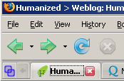
Activating the new Exposé-like mode would be done by a keyboard shortcut or a button on the tab bar. Apart from the new button, the tab bar functionality would be identical to Fx 2.x, so users who do not wish to use the new mode would still be able to use the tab bar as before. An about:config preference would allow for the button to be removed entirely. The button is shown here on the left of the tab bar:
Clicking on this button, or activating it via a keyboard shortcut or some other means, would cause the active area in the browser to display the main interface for the new mode. The switch to the new mode would not be animated in the same way as Exposé, but would rather be an immediate switch to the UI, or a fade-in over a short period of time (less than a second). Initially the UI simply displays the tabs as a table of thumbnail views of the web pages:
The content would be scaled to show as many thumbnails as possible - but only up to a point. Each thumbnail also has a copy of the site's favicon (scaled up and against a suitable background to make it stand out clearly), and a label with the page title (truncated as necessary). This makes it easy to identify each tab either by the favicon, the page name, or the general page layout. Hovering the mouse over an icon would show a tooltip with the full page name and possibly the URL or domain name.
Left-clicking on a thumbnail would switch to the relevant tab and deactivate the UI, as would selecting a tab on the tab bar. Right-clicking on a tab would activate the tab popup menu. Middle clicking would close the tab and remove the thumbnail from the view. Clicking the activation button a second time would dismiss the UI and return the user to the current web page - as would using the keyboard shortcut a second time, or interacting with other parts of the browser's chrome (e.g. the scroll bars, refresh button, etc.).
So far this is little more than a re-implementation of Exposé but with the addition of titles and favicons. Where it diverges from that idea, however, is in the possible interactions with the thumbnails and background.
Vector Graphics
First of all it is anticipated that the UI should be rendered as vector graphics - perhaps using Firefox's SVG capabilities, or perhaps calling directly to a lower level than that. By using vector graphics the user would be able to zoom in and out of the view with the scroll wheel, +/- buttons, or some other UI or shortcut option.
When zooming in the thumbnail would increase in size, but the favicon would not. The label background would increase in size, but the font size would remain the same - simply using the extra space to show more details (full page name, URL, etc.). The centre of the zoom would be based on the current mouse cursor position - so obtaining more details about a thumbnail could be acheived by moving the mouse over it, rolling the scroll wheel, then rolling it back out to return to the previous zoom level.
The whole UI can be panned by click-dragging the background, so the user can still move around the zoomed-in view without having to repeatedly zoom out then back in again.
Arranging and Grouping
Click-dragging on a thumbnail would allow it to be freely moved around the UI - much like moving an icon on a computer desktop. This allows the users to readily group pages together without affecting the position of their tabs. For example the image below shows the same tabs from the image above, rearranged into arbitrary areas of the UI:
Combined with zooming in and out this allows a very large number of tabs to be readily managed.
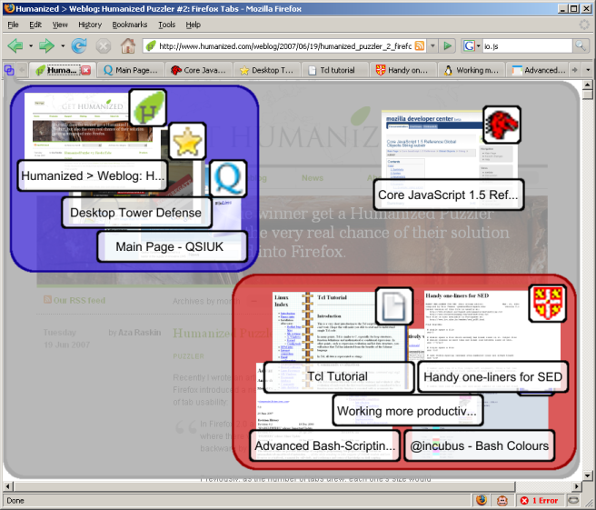
An extension to this idea is to allow for the creation of "groups". This would be triggered by a keyboard shortcut or by right-clicking on the background and selecting "Create a new group" from the context menu. The user would then click and drag a rectangle which covers one or more thumbnails. During this operation the rectangle is drawn translucently in front of the thumbnails; when the user releases the mouse button the rectangle moves backwards, behind the thumbnails so as to provide a visual indication of the group, but not to interfere with the normal operation of clicking on a thumbnail. The result of creating two groups is shown below:
It should be noted that groups are primarily a visual means of organising tabs, however they would also provide some additional functionality. Right-clicking on the group background (i.e within a group but not on a thumbnail) would bring up a context menu with group-related options such as these:
- Show these tabs
- Remove the group box
- Redraw the group box
- Close the tabs in this group
- Bookmark the tabs in this group
- Zoom in to this group box
Left-clicking in the group, or selecting the first item on the context menu, would rearrange the tabs on the tab bar so that the tabs encompassed in the group occupy the first tab slots (and would switch to the first tab). If the tab bar is large enough, this would result in all of the tabs in the group being available from the tab bar at once. This makes it easy to switch between different tasks that may require different sets of tabs. For example by grouping work-related tabs and leisure-related tabs it becomes easy to switch from "work mode" to "fun mode" without having tabs from each group intermixed on the tab bar.
A tab can be removed from a group simply by dragging it out of the group. Similarly a tab can be added to a group by dragging it in. If the group is tight for space, then dragging the thumbnail near to the group and selecting "Redraw the group box" from the context menu would remove the existing group box but activate the group box drawing mode immediately, allowing the user to re-draw the group including the new thumbnail.
Bear in mind, also, that the vector nature of the UI would mean that the user could zoom into a particular group (via the last item on the context menu) in order to get a more detailed look at the thumbnails - or just to rearrange them to make room for another.
Finally, because groups are just arbitrary areas on the screen, there is no reason why they shouldn't be able to overlap:
In this case the "Tcl Tutorial" is in both the red and the green groups. Having thumbnails in more than one group is not likely to be a common use-case, but combined with the ability to move the grouped tabs to the first slots on the tab bar would allow for very flexible arrangements of tabs that could be reorganised in seconds.
Tab Context Menu
It is envisioned that the context menu for tabs would function largely as it does now. However one possibility would be that triggering the context menu would also trigger the Exposé-like mode, automatically centred around the thumbnail for the tab that was clicked on, and at a default zoom level. For example, in the mockup below the "Tcl Tutorial" tab has been right-clicked:
If the user has arranged the thumbnails - even if they haven't bothered with full-scale grouping - this would mean that switching to a related tab becomes very easy. The user just has to right-click on a tab that they can already see, then click on the thumbnail of the related tab. This makes it simple to switch between related tabs, even if they are mixed with others on the tab bar.
Accessibility
For users with limited motor skills, being able to click on a thumbnail image would be easier than clicking on a small tab. There is the issue of triggering the new mode in the first place, but there are a number of possible solutions to that - including the possibility of an extension to add a much larger button to the browser's chrome.
Within the new UI it should be possible to navigate between the thumbnails. The TAB key would move sequentially between them, and the cursor keys could be used to move non-sequentially. Especially with the default layout of a simple grid, this would make it quick to move to a particular thumbnail. Advanced features such as arranging and grouping are largely mouse-dependent, though they could also be enabled via the keyboard (e.g. use the cursor keys to select a thumbnail, then use the SHIFT+cursor keys to move it around in the UI).
From Beginners to Advanced Users
This method of managing tabs is appropriate to users of all levels:
- For users who do not wish to use the new functionality the tab bar operates largely as it used to
- Users who only want a simple Exposé-like system can use it like that without needing to know about the more advanced features
- Users who want to organise the representation of their tabs to keep similar items together can do so by just dragging the thumbnails to arrange them
- Users who want to manage large numbers of tabs, complete with a means to group them into multiple, overlapping categories can use the full power of this approach.


