Website/Mozilla.org/Archive/HomepageRedesign/Brief
Mozilla.org Homepage Redesign: Creative Brief
Project Goal
Refine and redesign the mozilla.org homepage to more effectively tell the story of mozilla and serve as the central hub/entry point to all other mozilla sites in our web universe.
Project Background
Mozilla has one of the most highly-trafficked web presences in the world, with a number of websites that, when viewed as a whole, receive roughly 700+ million page views per month. However, entering and navigating our web universe can be very confusing, which causes a few problems: 1. difficulty for our users to learn about Mozilla, get involved or otherwise use the sites in the way they’re intended and 2. difficulty for us to communicate the full breadth of activities going on at any given time.
The solution can be framed as having four basic steps:
1. think about our sites as components of a larger network rather than individual pieces.
2. tell our story effectively by making sure each site has a clear role and distinct focus.
3. group related content together so it’ll be where users can find it.
4. connect sites more effectively through cross-linking, UI elements, visual palette, etc.
More specifically, the central proposal is that we should have a single Mozilla site (mozilla.org) that would focus on sharing the big picture of who we are and what we do, and would be a central hub for a bunch of product- and audience- specific sites to orbit around.
This project is the first step towards achieving that goal... by refining and optimizing the mozilla.org homepage. Blog post with more background information can be found, here.
Project Scope
This redesign is limited to the mozilla.org homepage, with a focus on improving the overall layout structure and presentation of information. This is not a full redesign (therefore we're not starting from scratch) but an effort to build on and refine the existing framework. With that in mind, below is a breakdown of the key content and areas for improvement:
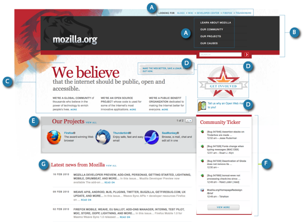
- A) Navigation Menus: While our efforts are focused on the homepage, it's important to note that there are 3 navigation menus across the site. Two site-wide menus, and other sub-menus placed on the left side of individual pages. Finding a better way of organizing and presenting the information through these navigation menus is important in helping to guide our viewers through the site's content.
One suggestion / option is to consolidate the two site-wide navigation menus, and have a single main nav across the top with a drop-down on roll-over exposing additional content under each category - this would be similar to how information is currently structured on mozilla.com. Additionally, we may want to expand the current list to include more categories (such as "Get Involved"). The information currently on the top nav ("Looking for: Blog, Wiki, Developer Center, Firefox, Thunderbird") can then be incorporated elsewhere into the body of the page.
- B) Masthead: We'd like to optimize the page by reducing the amount of vertical space dedicated to the masthead, and pulling the main content higher up. With the main side navigation menu moved to the top (as suggested above) we can explore ways of using this space more effectively and bringing more important content above the fold.
- C) Header and Primary Message: This is where we introduce what mozilla is, who we are, and what we stand for as an organization. The challenge is to summarize this information, package and present it in such a way that makes it more easily digestible. This requires some copy editing on our part, and help from you in finding a better presentation style.
- D) Calls to Action (CTAs): Making sure that the CTAs are clear, with better placement and presentation.
- Clarity: Identifying the main content we want our audience to see first, and highlighting what we want them to do more clearly.
- Placement: Structuring the information better so that the level of importance and hierarchy is more clearly distinguished.
- Presentation: Making sure that the graphics used for each CTA are not only visually consistent with the rest of the site, but also "actionable".. so that the viewer knows that they can click on a piece of content for more information. For example, a standard button with a CTA is easily recognized as a clickable object and would therefore help to improve click-thru rates.
- D) Dynamic content block: Related to the above... we'll need a dedicated space, a dynamic content block where we can highlight specific campaigns, calls to action, or rotate-in other relevant updates. This can be in the form of a block that transitions through different content automatically, on refresh, and/or with an "arrow" for users to navigate through.
- E) Projects: Mozilla is comprised of a number of community-based projects, the full list of which can be seen here: http://www.mozilla.org/projects/. While Firefox and Thunderbird are the two most widely recognized projects (and ones that we'll lead with and highlight on the homepage) it's also important to communicate that there are "more" projects under the umbrella of mozilla. Currently, the featured projects section on the homepage consumes a lot of space... displaying 6 projects (with pagination) and a link to view all. We'd like to explore other ways of presenting this information.
- F) Community Ticker: The community ticker uses the Lizard Feeder to surface various types of community contributions and activity. However, the content it currently displays is not only a bit dry (consisting primarily of bugs, code, and wikis) but it also feels rather static (not updating frequently enough). Here are some suggestions on how we can improve this section:
- Expanding the content to include bits of activity relevant to a wider audience (not just developers or the technically inclined). This may include:
- Social media activity like tweets from our official @Firefox account (which covers updates beyond just Firefox), as well as other relevant tweets from the community. Pulling relevant updates from identi.ca, and Mozillaca. Relevant posts on Digg. Etc...
- Organizing the information (perhaps through tabs) so that the viewer can select/filter different streams of activity.
- Exploring creative ways of distinguishing between different types of content. Perhaps by using different colors for each type of content or alternating shades for every other line of content on the ticker.
- Increasing the pace at which the ticker is updated, but doing so tastefully to avoid distracting the viewer from other content, or annoying them.
- G) News: The news section is currently a syndication of the about:mozilla newsletter - which captures the highlights of each week within the Mozilla world. We'd like to improve the formatting and overall presentation of this section to make the content more digestible. Furthermore, in addition to the about:mozilla newsletter, two other great sources of news are: the official Mozilla Blog, and Planet Mozilla (which aggregates blog posts from all over the community). Planet Mozilla is actually the most comprehensive of them all, as it includes the content from the Mozilla Blog, as well as the about:mozilla newsletter. It's worth considering these additional sources of information and possibly incorporating them into a broader "news and updates" type section on the homepage.
- Other Content: Other content that is, or may be, incorporated into the homepage in some way include:
- Link to the Mozilla Store (currently as it's own promo)
- Link to Wiki.mozilla.org (currently in the top nav)
- Link to Mozilla/Firefox Developer Center (https://developer.mozilla.org/En)
- Link to Support (http://www.mozilla.org/support/)
- Link to Mozilla Labs (https://mozillalabs.com/)
- other?
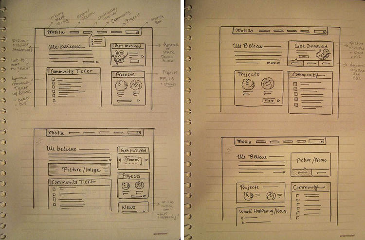
Suggestive Layout Sketches
Target Audience
Our two main audiences are people who are interested in learning more about Mozilla and also experienced community members who are looking for specific information. Although we aren't specifically including end-users in this group, we still want people to easily navigate through the site, even if they are first time visitors and new to Mozilla. They should also be able to easily find/download Firefox and Thunderbird.
Design Direction
As mentioned before, this is not a full redesign. Mozilla.org recently underwent a major redesign effort... therefore we're not starting from scratch, nor looking to completely change the look and feel of the site. However, as we're refining the content layout of the homepage, there is also room for refining certain graphic elements and enhancing the overall presentation style of the site in the process. Here are some things to keep in mind:
- Visual consistency and unity across the pages on mozilla.org is very important. As we refine the homepage, changes that are made to key elements will need to be applied across the site. Starting with the homepage, we need to establish a style guide for basic elements (like buttons) and a system for presenting different types of content.
- Related to above, there are currently several different button styles across mozilla.org. So, lets create a standard button style to be used on all promos. (see picture below for reference).
- Similar to above, we currently have several ways of displaying widgets or blocks of content throughout the site. Some have a solid background, others are painted brush strokes, and others are styled with sharp edged brackets (see picture below for reference).
- We'd like to use this re-fresh as an opportunity to explore other fonts, and showcase open font formats.
- Lets take inspiration from the existing graphic in the top left (Dino head with brush marks), and incorporate more of those colors (deep reds, dirty orange hues, blues) and texture into the body of the page -- this will help add more warmth and personality to the rest of the page.
- While there's a variety of information we're trying to present on the homepage, a clean/simple design solution is key.
- Related to above, it's important to make sure that there's sufficient padding around and between blocks of information - as opposed to overlapping/layering elements on top of each other, or forcing them into relatively small spaces.
Sampling of inconsistent widget and button styles currently on the site: 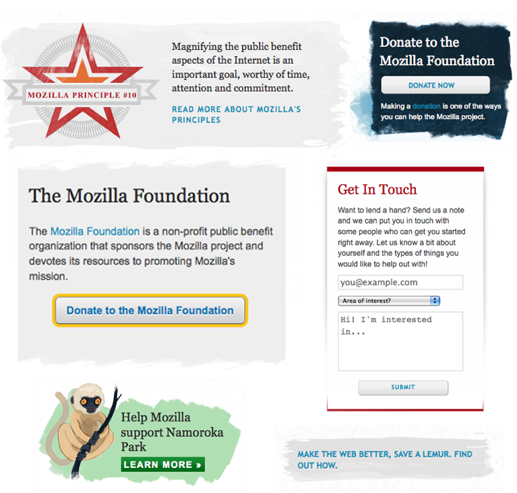
Localization
Although localization is not a current effort, it is part of the longer roadmap for mozilla.org... therefore we don't want to make design decisions that will limit our options for any future localization efforts.
Useful Links
Blog post discussing this project and soliciting community feedback: here
Blog post on discussing the reorganization of the mozilla web universe: here
Previous creative brief for the mozilla.org redesign: here
Contacts
Tara Shahian (tara @ mozilla dot com)
John Slater (jslater @ mozilla dot com)
David Boswell (david at mozillafoundation dot org)
Notes on revisions to brief
The original version of this brief was created in February 2010 and in the five months since then our thinking has changed a bit. Instead of editing the original brief, this section captures some of our more current thinking.
- The notion of arranging sites into hubs has evolved and is represented in the web universe map. We are considering adding this to the Our Community page which would mean the home page or header wouldn't need to include links to various sites (although the home page may promote that this map is there).
- The site's global nav has changed and the 'Our Causes' link has been replaced with 'Get Involved'. This means we no longer needed a permanent Get Involved promo on the home page as mentioned in section D and are now using that area as a rotating promo slot for other things.
- Having both a Community Ticker and News feed is seeming like too much. Combining these into one feed and adding a sign-up form for receiving future news seems worth exploring. (feed = LizardFeeder - bugs + microblogs with fligtar's ambient filter?)
- The current header has a bad overflow bug that is difficult to fix with the existing design. We should coordinate with the people who will code this page during the design to make sure this issue is addressed.
- Not mentioned in the brief is the need for a language picker so people can view localized versions of site pages. Community feedback on the current design was that people wanted something more prominent than a drop-down in the footer. An example of a more prominent language picker was in an early design for the last mozilla.org redesign.