Update:Remora UI Review/Mockups/Home Page/mockups 2007-06-18/
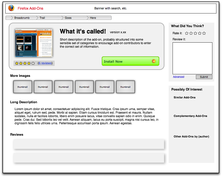
Putting aside, for the moment, the issues of search/navigation, new categorization, the sandbox/public divide, and the front page, I thought I'd start with the layout for the detail page for a individual add-on. This is of benefit even on its own given that many people, I expect, will be linking directly to one of these pages after learning about an add-on elsewhere.
Some issues worth addressing in the previous design are as follows: - losing the Install button off the bottom of the page / general prominence of the install button - low prominence of the reviews - low prominence of the ability to review or rate (esp. given that we want to push this) - low prominence of finding similar add-ons (and perhaps not enough breadth to what a user might be looking for (just similar or also complimentary?) - no at-a-glance overview of ratings, useful for quick assessment of quality - additional images available only after clicking through to a secondary page (which also means it's not quickly obvious that others even exist) - over-prominence of technical details perhaps not of use to typical end-user (version numbers, which versions of firefox it will work with (given that we can detect what the user is using) - [possibly] excessive banner space
those not in any particular order.
The following is an mockup of a early redesign:
