Enterprise Invitation Dialog UI Specification
| Specification Status
|
| Author |
Christian Jansen
|
| Last Change |
--Chris 05:17, 6 December 2006 (PST)
|
| Status |
Preliminary
|
Abstract
This specification covers the UI of the Enterprise Invitation dialog.
References
Detailed Specification
The Invite Attendee dialog consists of 3 areas.
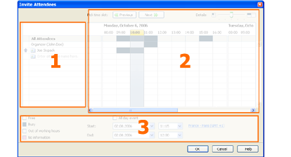
- Attendee List
- Free/Busy Grid
- Information and Date/Time Area
Attendee List
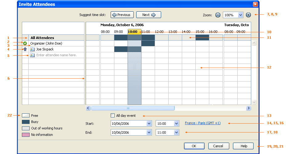
1. "Attendee List" Grid Heading
| Property |
State
|
| Label EN-US:
|
All Attendees
|
| Label Ger:
|
Alle Teilnehmer
|
2. "Include Organizer in Free/Busy" Drop Down
| Property |
State
|
| On Mouse Click:
|
Opens a list with two items:
(ICON) I will attend
(ICON) I will not attend
|
| Pre-Selected Item:
|
Attends event
|
| EN-US:
|
I will attend
I will not attend
|
| Ger:
|
- Ich nehme Teil
- Ich nehme nicht Teil
|
3. "Organizer" Field
| Property |
State
|
| Attribute:
|
- Has to be always visible.
- Has to display string and user name information
|
| Label EN-US:
|
Organizer ($USERNAME)
|
| Label Ger:
|
Organisator ($USERNAME)
|
4. "Type" Drop Down
| Property |
State
|
| Attribute:
|
Has to be displayed for each attendee
|
| On Mouse Click:
|
Opens a list with three items:
(ICON) Required Attendee
(ICON) Optional Attendee
(ICON) Resource (Room/Equipment)
|
| Pre-Selected Item:
|
Required Attendee
|
| EN-US:
|
Required Attendee
Optional Attendee
Resource (Room/Equipment)
|
| Ger:
|
Erforderlicher Teilnehemer
Optionaler Teilnehmer
Ressource (Raum/Arbeitsger?t)
|
5. "Attendee" Cell
| Property |
State
|
| Attributes:
|
The control has to behave exactly the same like the recipient list of Thunderbird's Mail Compose Window.
|
| Focus:
|
- After opening the dialog the 1st cell is focused.
|
| Keyboard Navigation:
|
- Return triggers free/busy data
- After recieving free/busy data the cursor is positioned in the next row below.
|
| User Feedback:
|
While recieving free/busy data a progress has to be indicated.
|
| String displayed initially:
|
Click here to add name
|
| Label EN-US:
|
Click here to add name
|
| Label Ger:
|
Hier klicken, um Namen hinzuzuf?gen
|
6. "Splitter"
| Property |
State
|
| Collapse:
|
None
|
| Resize before:
|
Grow
|
| Resize after:
|
Grow
|
Free/Busy Grid
7. "Previous" Button
| Property |
State
|
| Disabled:
|
By default
|
| Enabled:
|
If user selected a time slot taking place in the future
|
| On Click:
|
Picks a previous free time slot:
- within the working hours
- with the time slot specified in 15, 18
- applies to all attendees, including organizer
- skips weekends
|
| Label:
|
EN-US "Suggest time slot:", Ger "Termin vorschlagen:"
|
| Button Label EN-US:
|
(ICON) ~Previous
|
| Button Label Ger:
|
(ICON) ~Vorheriger
|
8. "Next" Button
| Property |
State
|
| Enabled:
|
By default
|
| On Click:
|
Picks an upcoming free time slot:
- within the working hours
- with the time slot specified in 15, 18
- applies to all attendees, including organizer
- ignores weekends
|
| Label:
|
EN-US "Suggest time:", Ger "Termin vorschlagen:"
|
| Button Label EN-US:
|
(ICON) ~Next
|
| Button Label Ger:
|
(ICON) ~Nächster
|
9. "Zoom" Dropdown & Buttons
| Property |
State
|
| Items:
|
25%
50%
100%  (Default)
200%
400%
|
| Item selected:
|
100%
|
| Zoom levels:
|
1 Cell = 25%  = 4h
1 Cell = 50%  = 2h
1 Cell = 100% = 1h   (Default)
1 Cell = 200% = 30 min
1 Cell = 400% = 60 min
|
| Label EN-US:
|
~Zoom:
|
| Label Ger:
|
~Zoom:
|
- Button
| Property |
State
|
| Enabled:
|
Yes
|
| Disabled:
|
@12,5%
|
| On click:
|
- One click zooms 1 level out.
- The Zoom drop down displays the according zoom level.
|
| Alt. Text EN-US:
|
Zoom out
|
| Alt. Text Ger:
|
Verkleinern
|
+ Button
| Property |
State
|
| Enabled:
|
Yes
|
| Disabled:
|
@400%
|
| On click:
|
- One click zooms 1 level in.
- The Zoom drop down displays the according zoom level.
|
| Alt. Text EN-US:
|
Zoom in
|
| Alt. Text Ger:
|
Vergrößern
|
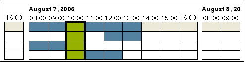
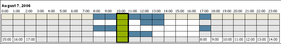
10. Time Slot Indicator
| Property |
State
|
| States:
|
- Green
- All attendees & resources are marked free.
- Yellow
- If the minority of the group is marked busy.
- If a resource is marked busy.
- Red
- If the majority of the group is marked busy.
- If at least one member marked as required is marked busy.
- No Information State
The no information state has no impact on the status display.
|
| Selection:
|
- Hours in range are marked bold.
|
| Selection:
|
Hours in range are marked bold.
|
| Position:
|
- Horizontally Centered (Default)
- Stays horizontally centered while navigating with Previous or Next button
|
| Snap to Grid:
|
- 2h min steps for move & resize @ zoom level 25 %
- 1h steps for move & resize @ zoom level 50 %
- 30 min steps for move & resize @ zoom level 100 %
- 15 min steps for move & resize @ zoom level 200 %
- 15 min steps for move & resize @ zoom level 400 %
|
11. "All Attendees" Row
| Property |
State
|
| States:
|
Displays free/busy information of all attendees
- Hex #35556B = busy
- Hex #EBEBE4 = free
- Hex #7F9DB9 = border
|
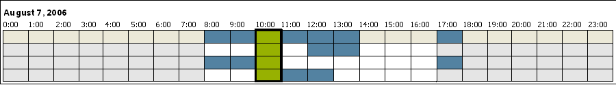
12. "Free/Busy" Grid
| Property |
State
|
| Standard View:
|
- One Day = the range of working hours set in Lightning configuration
|
| Extended View:
|
- In case an events is scheduled outside standard working hour range the grid extends to 24h for one day.
|
| Time Zones:
|
- The time offset of attendees located in different time zones is visualized by displaying the hours scale in the attendee's row.
- In case events are scheduled for over different timezones the grid extends to 24h.
|
| Colors:
|
- Hex #35556B = busy
- Hex #FFFFFF = free
- Hex #E6E6E6 = Out of Working hours
- Hex #E09EBD = No information
- Hex #BDBEC0 = border color
|
| Rows Visible:
|
12 (includes All Attendees & Organizer)
|
| Columns Visible:
|
12
|
| Dimension & Alignment:
|
- H = 18 px + border (1 px)
- W = 43 px + border (1 px)
- Space Day/Day = 3 px
- Grid headings are aligned left
|
| Scrolling:
|
- 1 Cell per click on left/right and up/down arrow
- All Attendees is always visible
|
| Tooltips:
|
On mouse over displays the tooltip of each event (same tooltip as used in the calendar views)
|
13. "All day event" Checkbox
| Property |
State
|
| Enabled:
|
Yes
|
| Attributes:
|
; If unchecked :
- Include Event in Busy calculation
- If checked
- Disable 15, 18
- Do not include Event in Busy calculation
- Expand range to one whole day
|
| EN-US:
|
~All day event
|
| Ger:
|
~Ganzt?giges Ereignis
|
14. "Start Date" Date Picker
| Property |
State
|
| Synchronization with Grid:
|
Changing the date has to update the grid. The grid has to display the date stated in the date picker.
|
| EN-US:
|
~Start:
|
| Ger:
|
~Beginnt am:
|
15. "Start Time" Drop Down List Box
| Property |
State
|
| Synchronization with Grid:
|
Changing the starting time changes the position of Time Slot Indicator. Both have be in sync.
|
| Disable:
|
If 13 is selected
|
16. "Timezone" Hyperlink
| Property |
State
|
| Show:
|
If time zones are enabled the dialog has to display a timezone link by default. The hyperlink has to display the timezone set in Lightning.
|
| On Click:
|
Opens the Timezone Dialog with the timezone selected, stated in the hyperlink.
|
17. "End Date" Date Picker
| Property |
State
|
| Synchronization with Grid:
|
Changing the end date expands the Time Slot Indicator. Both have be in sync.
|
| EN-US:
|
~End:
|
| Ger:
|
~Endet am:
|
18. "End Time" Drop Down List Box
| Property |
State
|
| Synchronization with Grid:
|
Changing the end time expands the Time Slot Indicator. Both have be in sync.
|
| Disable:
|
If 13 is selected
|
18. "OK" Button
| Property |
State
|
| Enabled:
|
Yes
|
| State:
|
Default
|
| EN-US:
|
OK
|
| Ger:
|
OK
|
19. "Cancel" Button
| Property |
State
|
| Enabled:
|
Yes
|
| State:
|
Normal
|
| EN-US:
|
Cancel
|
| Ger:
|
Abbrechen
|
20. "Help" Button
| Property |
State
|
| Enabled:
|
Yes
|
| State:
|
Normal
|
| On Click:
|
Opens the corresponding help page
|
| EN-US:
|
Help
|
| Ger:
|
Hilfe
|


