Markc:Firefox 3.0 UI Mockups
Inspired by Alex Faaborg's UI mockups for Firefox 3, I've spent a little while with The GIMP creating a couple of my own.
The basic idea
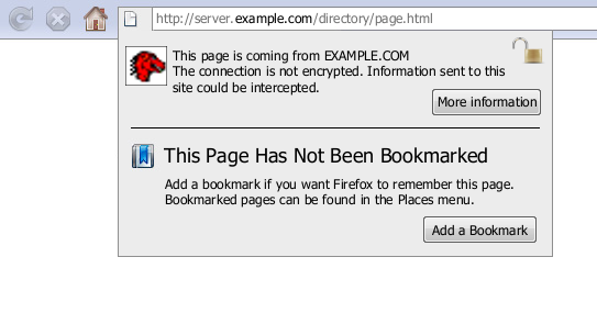
This shows two "sections" in the URL popup - a page section and a bookmarks section.
I agree with the idea of removing the favicon from the URL bar, but I do understand that people still want to see it (and not just on the tabs), so in this design the favicon is used as an icon at the left of the page section. The example shows a normal, non-secure site - with an icon to the right to indicate that it is non-secure. The padlock icon is kept to the right of the UI to reinforce its connection with the icon at the right of the URL bar.
Including the favicon in this popup does still offer the possibility of someone using a padlock image to try to fool the user into thinking it's a secure site. However the proximity to the open padlock on the right (which should probably be larger than the favicon) should make it more likely that such an image would cause the user to investigate more closely (because they now have both an open and a closed padlock image close together).
The text in the page section uses the "Public Suffix + 2 string to clarify where the page is actually coming from. In this mockup this string is shown as uppercase - a real implementation might instead use a larger font, a different colour, or some other means of making the important information stand out.
The last item in the page section is a button to find more information about the page and its security. This would open the "Page Info" dialogue with the security information shown by default.
The bookmark section shows the UI for a page that has not yet been added to the bookmarks. Principally there is a button to add a bookmark.
A secure page
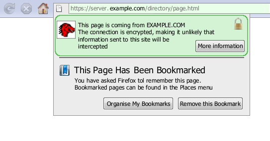
This version shows a secure site. The page section gains a coloured background and a locked version of the padlock image. Malware and Phishing sites would have coloured backgrounds which correspond to the colours used on the URL bar.
The bookmarks section shows the UI for a page that has already been bookmarked. In this case the user is offered the choice to remove that bookmark or to access the bookmark manager. If the page is bookmarked in more than one place then a dialogue or popup should appear when the user selects "Remove". This dialogue would show enough information about each bookmark for the user to decide which one(s) to remove. It should also allow multiple selection so that all of the bookmarks can be removed at once.
Other options
This mockup only shows two "sections". There might be some benefit to having more sections available - perhaps to handle tags or microformats. The addition of extra sections would have to be weighed against the possibility of the user being snowed under with too many options at once.
One approach to this would be to make most of the sections collapsible so that, by default, only a short summary line is shown (e.g. "This page contains microformats"). Clicking the summary would expand the section to show the appropriate UI elements. Expandable sections could become a useful UI for extension authors: for example an extension might add a "Blog this page" section, a "Mail this page to a friend" section, or simply a "Copy this URL to the clipboard" section.
If extension developers are allowed to add new sections to this UI it should be ensured that the Page Section is always at the top of the list.

