Mobile/Archive/SmartTabs
Summary
There is a more detailed documentation of the Project at the Bauhaus University's wiki.
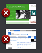
Visual representations of webpages are easier to recognize than text alone. Nevertheless there are some issues that could be solved.
Pages are hard to distinguish if...
- When having different Pages from the same domain
- Pages have a design which is just roughly similar (use white background in the main area is pretty common...)
Study
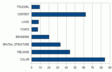
A study with some students was conducted. They used a set of webpages in random order and were afterwards asked what they remembered about the pages. Colors rank 1st, mentioned 84 times among 267.
The categories are not perfect: I'd like to mention that "branding" does typically include comparisons to other pages ("looks like wikipedia") and concrete comments about the design ("comic-style") while "feelings" include more general statements like "clean layout". These two categories were anyway those which are the hardest to incorporate in a thumbnail rendering!
The other categories are less problematic and have strict boundaries.
Ideas for Improvement
Make Closing Button Less Obtrusive
Make Button Smaller
- Pro: Less space is taken from the image. Button is close to screen edge
- Contra:
- Relevant part of the image not entirely free.
- The Button is harder to see.
Move the button down
- Pro: Frees the recognition-relevant upper-left part entirely.
- Contra:
- The target area has probably to move down a bit too; needs testing on a touchscreen-device.
- One Problem that could occur is that people will probably be more likely to tap below an item (they still see it) than to tap above it (it covers even more than usually). The available target area could become too small because of that.
Move button to the right edge
- Pro: The more relevant left edge is free.
- Contra:
- The left side is closer to the edge which means the area can be touched easier since one does not care about tapping a close object on the left side.
- When dragging the Bar in, one sees just the Buttons at first.
Smarter Page Crop
Concept: Choose a better crop of the page as thumbnail. Actually it already works pretty well, since mainly the upper left corner is present due to the small screen of the mobile devices. In my tests a 480px height crop seems to be decent (the height is more important, since distinctive visual features are often located on the left side)
- Pro: Choosing a more representative part of the page means better recognition and more differentiation between similar pages.
- Contra: ---
Adding Favicon
- Pro: Visual grouping of same Domain-Pages. Recognize logos of commonly used webpages.
- Contra: Could be mistaken for a button if not carefully integrated.
Note:It is likely that the favicon itself is hard to recall for non-frequently used pages. But it often gives color clues for the page. (Further research is needed)
Better rendering quality
- Pro: A better rendering of the tabs will improve the recognition.
- Contra: Performance issues. Could possibly be solved by rendering low-Fi first and when e.g. the user reads the page, the hi-fi Tabs are rendered.
Dismissed
- Tabs representing the area the user has scrolled to.
- Reason: Most pages provide almost no visual clues than. The most visual features of a page are concentrated in the header and partly at the upper-left edge.
A feature request suggesting the dismissed idea is bug 515667
Current Status
Design finished but not yet implemented
Relevant Scientific Works
- What Do people recall about their Documents?; Brude,Scapin; 2007
- A comparison of words and icons as external memory aids in an information retrieval task; Lansdale, Simpson, Stroud; 1990
- A comparison of words and icons as external memory aids in an information retrieval task; Lansdale; 1991
Related Bugs
- retrieve closed tabs: bug 548633
Team
Goals/Use Cases
- Make the visual tabs representing the pages better.
Non Goals
- Change the general model of interaction with tabs
- Use significant more screen real estate.

