Mobile/UI/Designs/TouchScreen/Proposal5
This is a compilation of various UI screen mockups. Some have been presented before but are reintroduced to allow quick comparisons.
Two screens are presented here - the Main Screen, and the Activated Screen:
- Main Screen: the screen after a page has completely loaded.
- Activated Screen - the Main screen with a menu activated that allows additional operations.
Main Screen
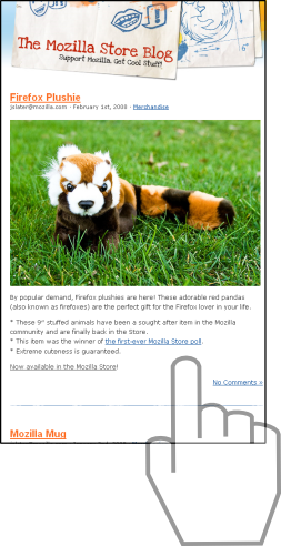
Clean
For those that prefer a clean interface, this is the ultimate in clean! There is not a single UI artifact that distracts the user from his/her browsing.
Touch operations:
- Drag to scroll
- Long tap to activate zoom
- Flick left to navigate back
- Tap any inactive area to activate the menu
The menu can be also activated by pressing any key; even touch screen phones have at least 1-2 keys!
This design is suitable for both square and rectangular screens.
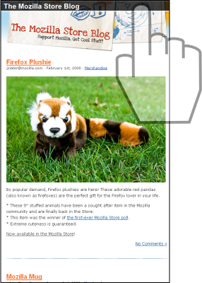
Minimal
Like the clean interface above, but want a title and security indicator? The Minimal interface offers just a title bar that displays the page title and security indicator.
Touch operations:
- Drag to scroll
- Long tap to activate zoom
- Flick left to navigate back
- Tap the title bar to activate the menu.
This design is suitable for both square and rectangular screens.
Logo
This full screen interface features a "floating" Firefox logo. The drop shadow should ensure that the logo is visible even on top of busy web pages.
Touch operations:
- Drag to scroll
- Long tap to activate zoom
- Flick left to navigate back
- Tap the logo to activate the menu
This design is suitable for both square and rectangular screens.
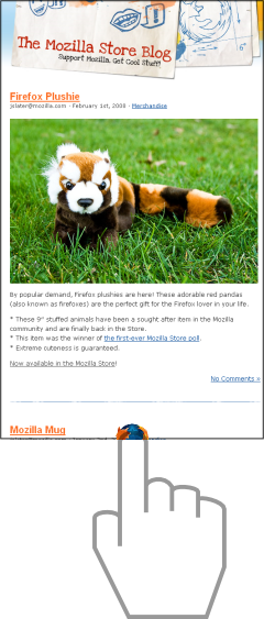
Half Logo
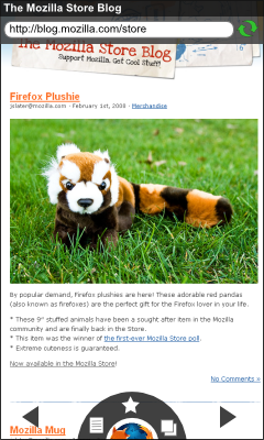
A clean screen with a half-visible firefox logo at the bottom of the screen.
Touch operations:
- Drag to scroll
- Long tap to activate zoom
- Flick left to navigate back
- Tap the logo to activate the menu
This design is suitable for both square and rectangular screens.
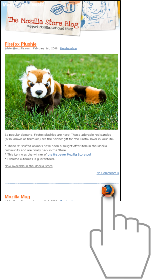
Quarter Logo
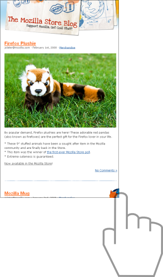
Similar to the previous idea with a quarter logo at the bottom right of the screen.
Touch operations:
- Drag to scroll
- Long tap to activate zoom
- Flick left to navigate back
- Tap the logo to activate the menu
This design is suitable for both square and rectangular screens.
Traditional
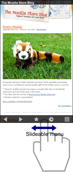
A traditional mobile browser UI with a twist; dragging the menu bar left or right slides it revealing other commands.
Touch operations:
- Drag to scroll
- Long tap to activate zoom
- Flick left to navigate back
- Tap any icon on the menu bar to invoke a command
- Drag the menu bar left/right for additional commands
- Tap the title bar to show/hide the URL bar
This design is best suited for rectangular screens. For square screens the always-on menu bar will reduce the screen estate for the web page.
Activated Screen
Slideable Menu
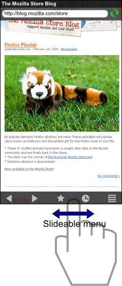
This design has the title bar and URL bar at the top, with a slideable menu bar at the bottom. For WQVGA (240x400) and WVGA (480x800) screens, the menu bar can display up to 5 icons in portrait mode, and 8 icons in landscape mode.
Dragging the menu bar left/right will slide the menu and display other icons.
This design is compatible with the following Main screens:
- Clean
- Minimal
- Traditional
- Half Logo
- Quarter Logo
Grid Menu
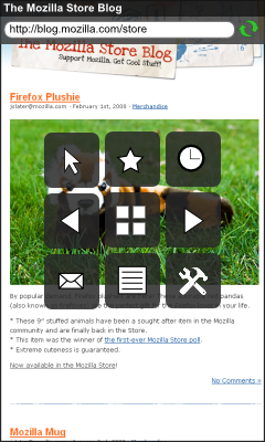
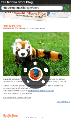
This design has the title bar and URL bar at the top, and menu icons arranged in a grid around the center of the screen.
This design is compatible with the following Main screens:
- Clean
- Minimal
- Logo
- Half Logo
- Quarter Logo
This design is suitable for both square and rectangular screens. Grid sizes can be 4x3 (landscape) or 3x4 (portrait) for rectangular screens, and 3x3 for square screens.
Circular Menu
This design has the title bar and URL bar at the top, and menu icons arranged in a circle around the center of the screen.
This design is compatible with the following Main screens:
- Clean
- Minimal
- Logo
- Half Logo
- Quarter Logo
This design is suitable for both square and rectangular screens.
Semi-Circular Menu
This design has the title bar and URL bar at the top, and menu icons arranged in a semi-circle at the bottom of the screen.
This design is best suited for the Half Logo Main screen and is suitable for both square and rectangular screens.
