Patterns Sandbox, Under Construction

Currently, this is just a replica of Gaia/Design/Patterns.
Designs here are not yet approved and will got through additional validation.
If you have doubts or questions on the validiy of these files, please send mail to Josh Carpenter or Carlo Bernoulli.
Happy Sandboxing!
Contents
Status & Team
BUILDING BLOCKS
Buttons
Characteristics:
- Have two components: visual target and hit target.
- Later is always larger. Has minimum sizes.
- Types:
- Icon + text
- Icon only
- Text only
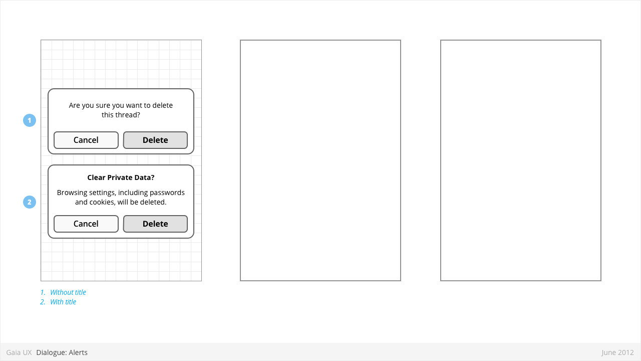
Dialogues: Alerts
Used for:
- Alerting users to important events, notifications, etc.
Characteristics:
- Modal: occupies the screen and requires user input to clear.
- Consist of
- Title
- Body (optional)
- Dismissal button (eg: “Cancel”)
- Confirmation button (eg: “Delete”)
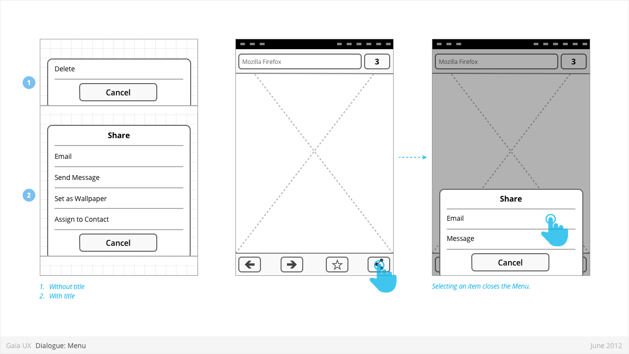
Dialogues: Menus
Used for:
- Presenting a list of items, usually actions or links (eg: Edit, Delete, etc).
Characteristics:
- Menus are spawned from buttons, often positioned within Toolbars.
- Present 1 or more items.
- Vary in height, to a maximum of Keyboard component height.
- Titles are optional.
- Are closed by:
- Selecting one of the items
- Pressing "Cancel" button (wording may be different)
- Pressing “OK” button, if available (label may be different)
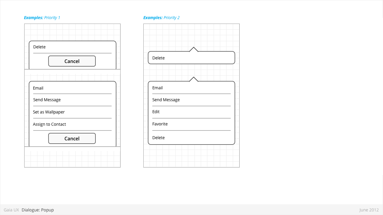
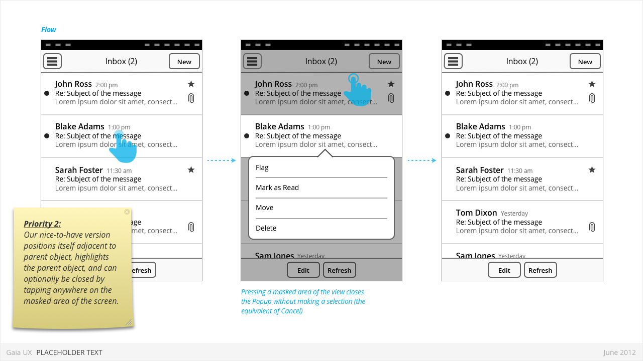
Dialogues: Popups
Used for:
- Enabling optional shortcuts to contextual actions that might otherwise require stepping one level deeper into the hierarchy. For example, deleting a photo via it's thumbnail, instead of having to open the full image.
Characteristics:
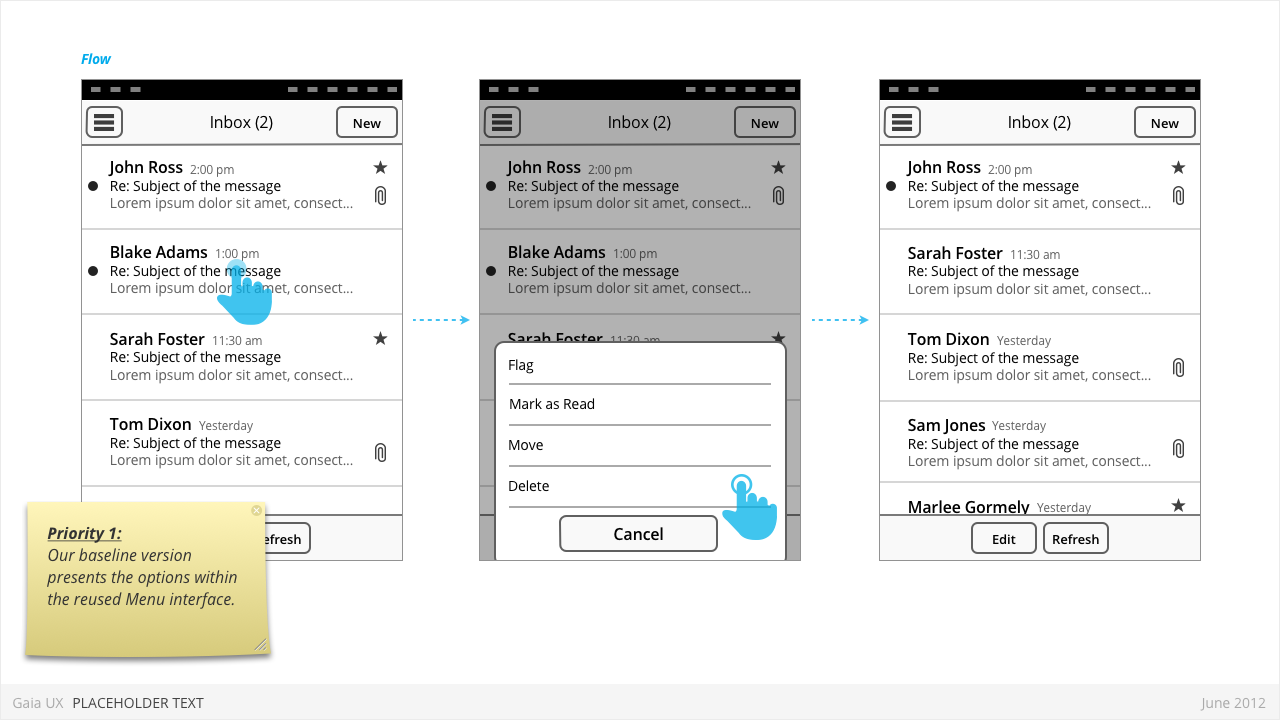
- User presses-and-holds a selectable item (can be a list row, a phone number, a browser link, etc)
- Menu displaying one of more options pops up after X seconds.
- Priority 1:
- Reused the Menu pattern interface to present the options.
- Priority 2:
- Menu positions itself immediately above or below the parent object (depending on the amount of available screen space)
- The parent object element is visually highlighted (e.g.: darken surrounding content, or draw border, etc)
- User can press anywhere else on screen to change the focus and close the popup.
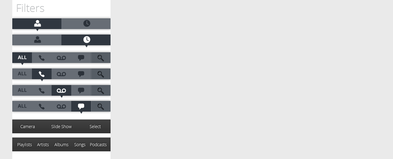
Filters
Used for:
- Secondary Navigation
- Filters can provide a second set of tabs, where tabs are already present.
- Data Filter
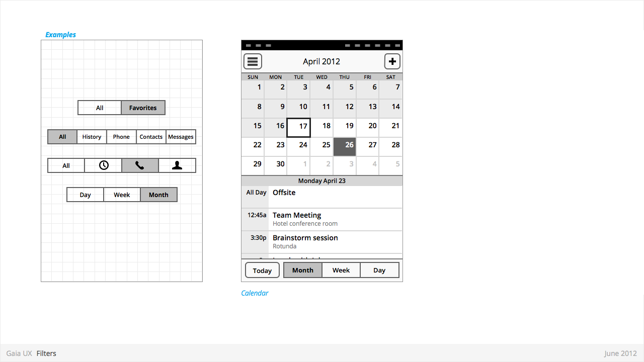
- Filters can be used to enable the user to view a single set of data in a different lens.
- eg: in Calendar, the filters they allow user to view time in different scales, from Day to Month).
Characteristics:
- Horizontal sequence of buttons.
- Only one button is Focused at a time.
- Best practice is to place filters within Toolbars, so they do not flow with the content.
- Left, Middle and Right buttons can be styled uniquely.
- Width: variable, depending on number of filters required within a single set (see Numbering). Should establish a maximum width, however.
- Numbering: minimum 2, maximum 5.
- Can be populated with icons or text, but not both. Because of the smaller height of a filter (versus a tab), text is the best practice.
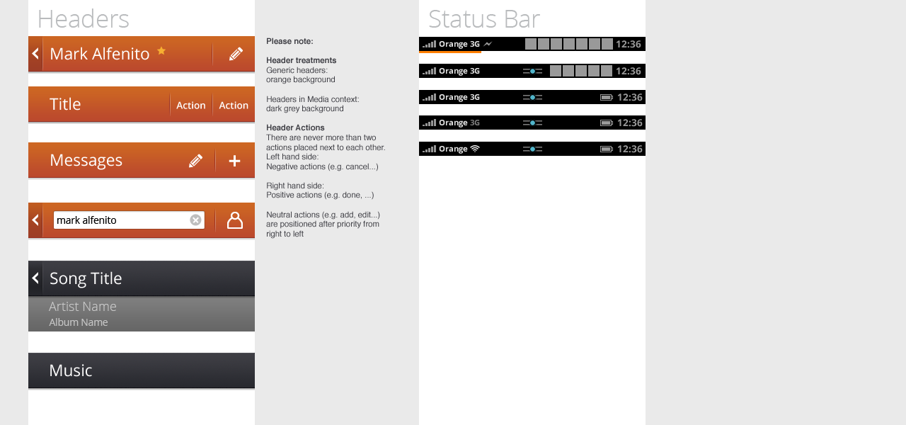
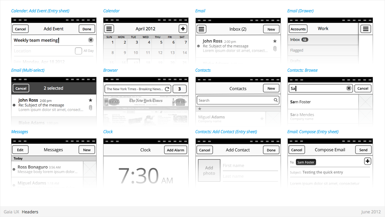
Headers
Used for:
- Labeling the active view.
- Providing top-level navigation and inputs for the active view.
Characteristics:
- Horizontal full width bar that appears at top of screen in most apps
- Floats above content, with option to flow with content in some rare cases (eg: Browser).
- Heading text provides name of current view.
- Optional: heading text string can include text (eg: current unread email count)
- Present in most applications
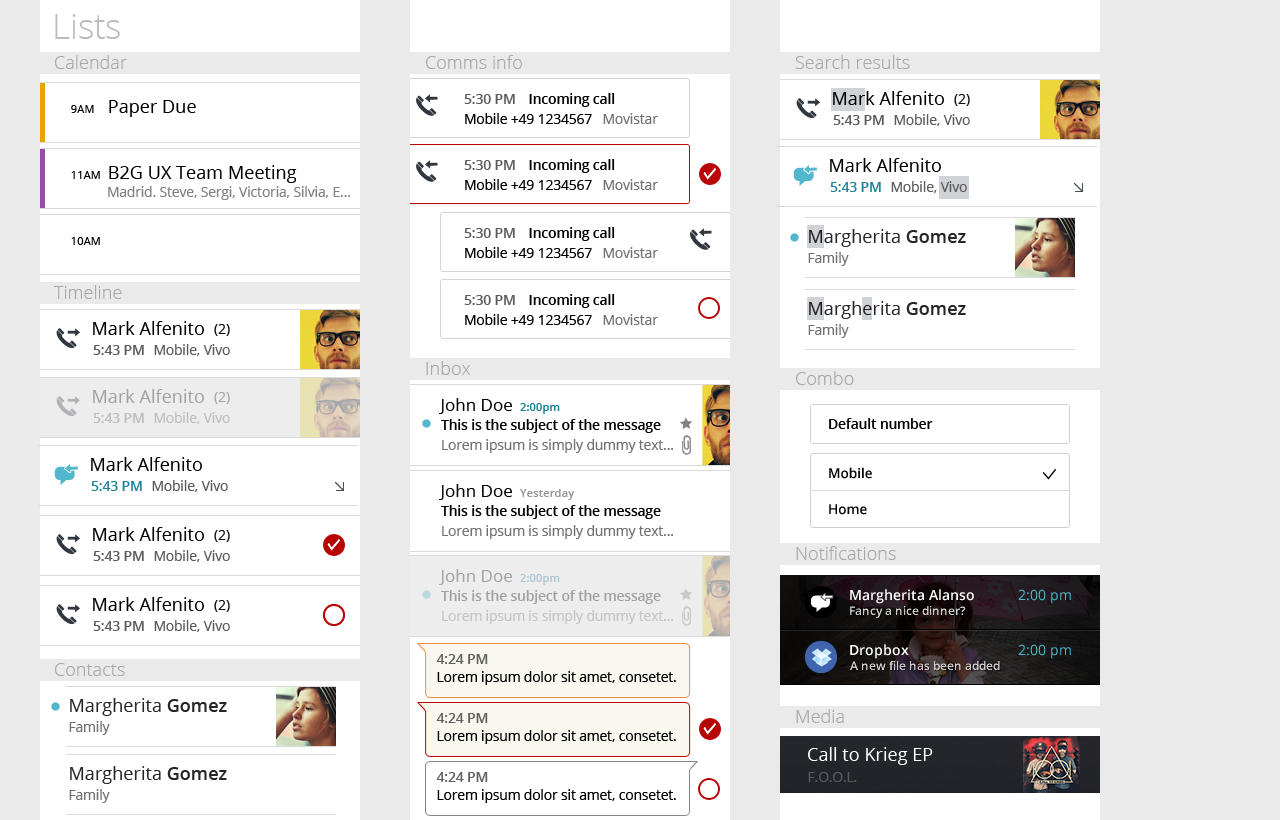
Lists
Used for:
- ...
Characteristics:
- Varying heights (1—3 rows)
- Varying contents (from text only to image + text + button)
- Are composed of rows, and section headers
- Types:
- Action row (click anywhere to trigger input)
- Status indicator row
- Button row
- Link row
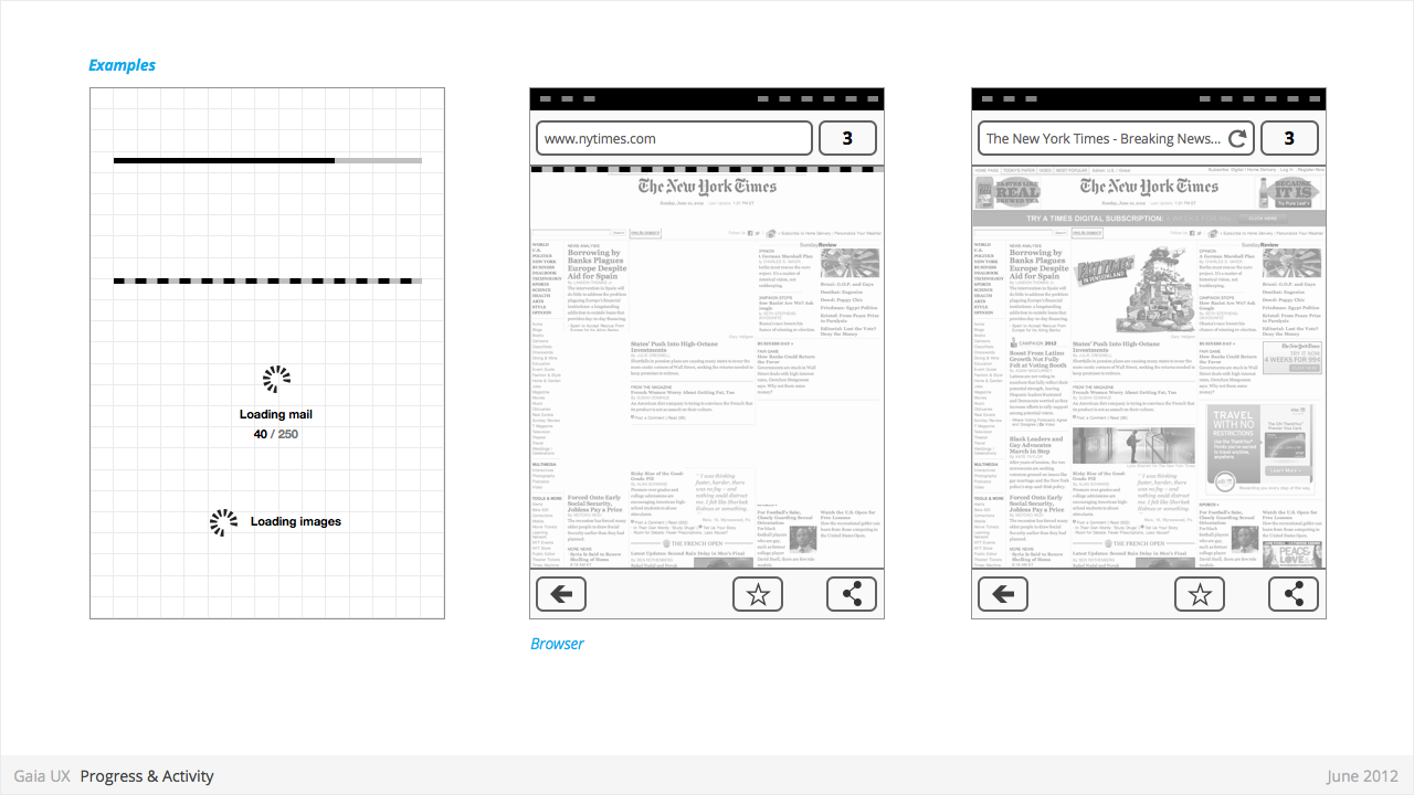
Progress & Activity Indicators
Used for:
- Providing user with visual feedback that a process is active.
Characteristics:
- May include an animated visual element, a text label, or some combination of the two.
- Types:
- Progress
- Displays a loading animation that goes from 0 to 100 percent, communicating the current process status.
- Activity
- Displays a looping animation, communicating to the user that the process is active.
- Progress
Scrolling
Used for:
- ...
Characteristics:
- Types:
- Scrollbar
- Index scrolling
Seek Bars
Used for:
- ...
Characteristics:
- Consists of track and knob (button w/ normal and pressed states)
- Optional images for left and right values
- Can be horizontal or vertical
Switches
Used for:
- ...
Characteristics:
- Presents two mutually exclusive choices or states (used in table views only).
- Types:
- On/Off toggle
- Radio
- Checkbox
Tabs
Used for:
- ...
Characteristics:
- Fill the full horizontal width.
- Number between 3—5.
- Positioned at bottom of screen.
- Can contain various elements (buttons, filters, indicators, etc).
- Versions:
- Text + icon
- Icon-only
States:
- Normal
- Focused
- Disabled
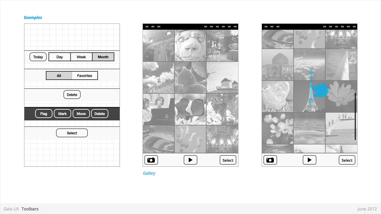
Tool Bars
Used for:
- Contains actions, indicators, and navigation associated with the current view. eg:
- Delete selected items (button)
- Refresh content (button)
- Enter “Edit” mode (filter)
- View “Favorite” contacts only (filter)
Characteristics:
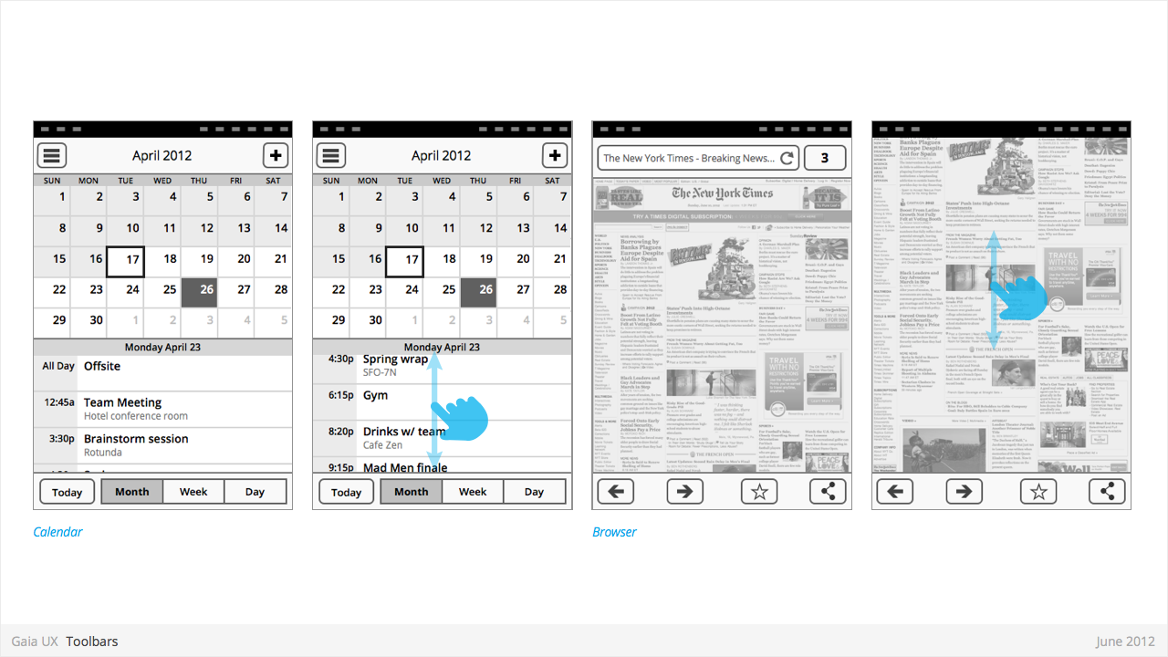
- 100% width. Fixed height.
- Does not scroll with content. Floats above.
- Should be positioned at the bottom of the screen unless Tabs are also present. In that case, should be positioned at the top.
- Can contain various elements (buttons, filters, progress/activity indicators, etc).
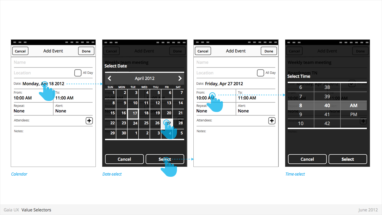
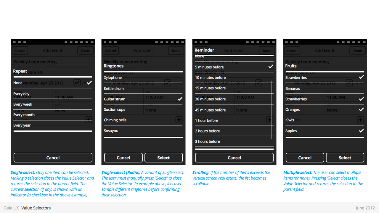
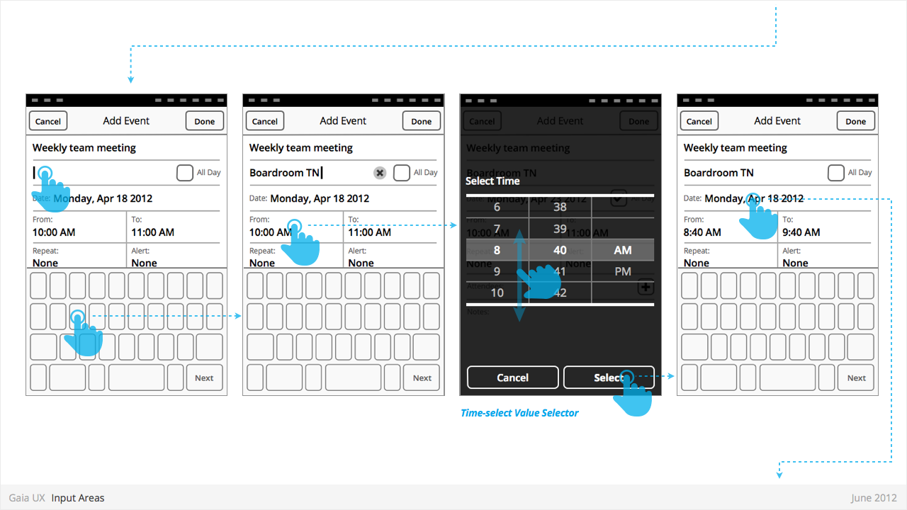
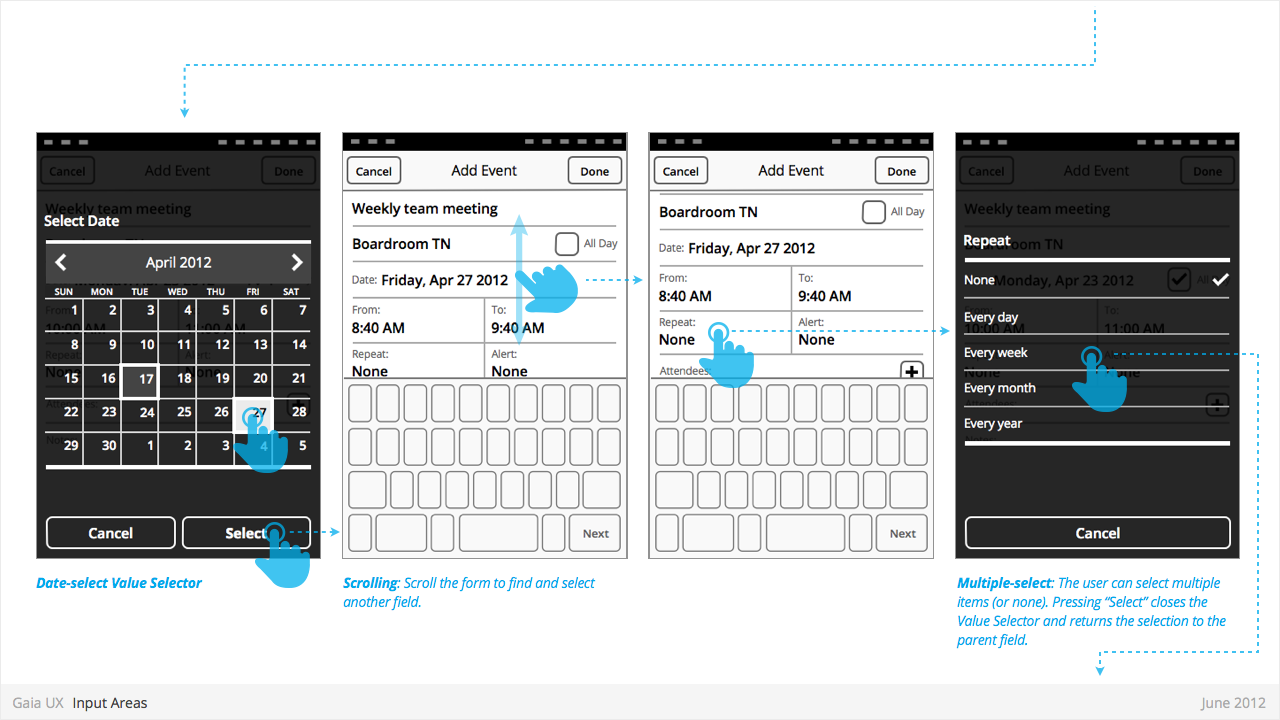
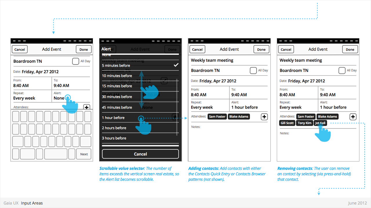
Value Selectors
Used for:
- Provides a way for the user to select one of more values.
- Most commonly associated with forms, but also used elsewhere.
- Interface conventions are flexible, and new Types can be added to the list below.
Characteristics:
- Types:
- Date
- Time
- Single-select list
- Multiple-select list
PATTERNS
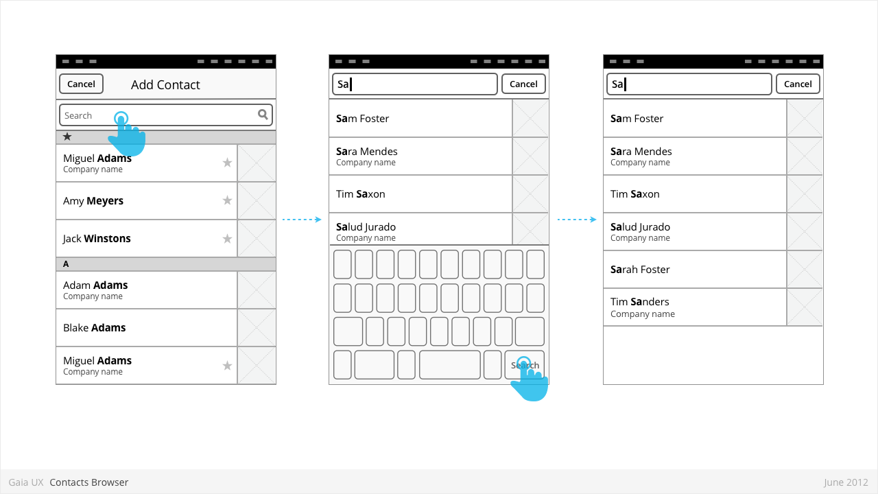
Contacts Browser
Used for:
- Adding a contact to a correspondence (eg: Email, SMS)
Characteristics:
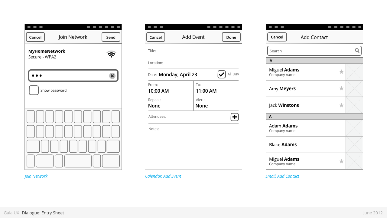
- Is an example of an Entry Sheet dialogue.
- Opens when user selects “Add” button.
- Presents complete list of contacts.
- “Cancel” closes the Browser without making a select.
- Tapping a contact closes the Browser and adds the selected contact to the selected field.
- Uses index scrolling [ADD LINK]
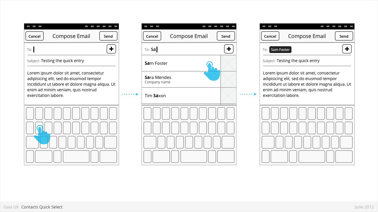
Contacts Quick Select
Used for:
- Selecting a known contact quickly, without leaving the current view.
Characteristics:
- The user highlights an entry field (eg: To), and the keyboard appears.
- As the user types, the system attempts to draw matches from the contacts.
- If one or matches are found, a small list appears, highlighting the matching contacts.
- To make a selection, the user can tap one of the rows, closing the list and adding that contact to the highlighted field.
- Alternatively, if the user wishes to clear the list, they can type Backspace until the field is clear, and there are therefore no more matches. The list then disappears.
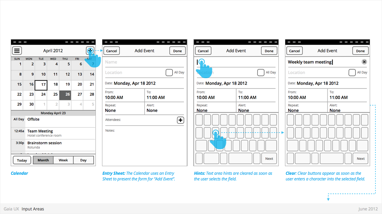
Dialogues: Entry Sheet
Used for:
- Editing a single setting that:
- Contains a large number of possible values. eg: Text entry forms, long lists,
- [or] Requires multipe inputs or selections eg: WiFi network connection process.
Characteristics:
- Occupies the full screen
- User should be given impression that they are on the same page, and that the Entry Sheet is merely a temporary modal overlay. They have not navigated one level deeper in the hierarchy.
- To reinforce this...
- Valid animations could include slide in from top, from bottom, cross fade, scale in, etc.
- “Cancel” buttons are used instead of “Back”.
- Every element within the Entry Sheet must be related to adjusting the single setting; Settings Panels should not contain links to other pages or lists.
- Closing:
- “Cancel”
- Varies: “Done”, “Join”, “Send”, etc.
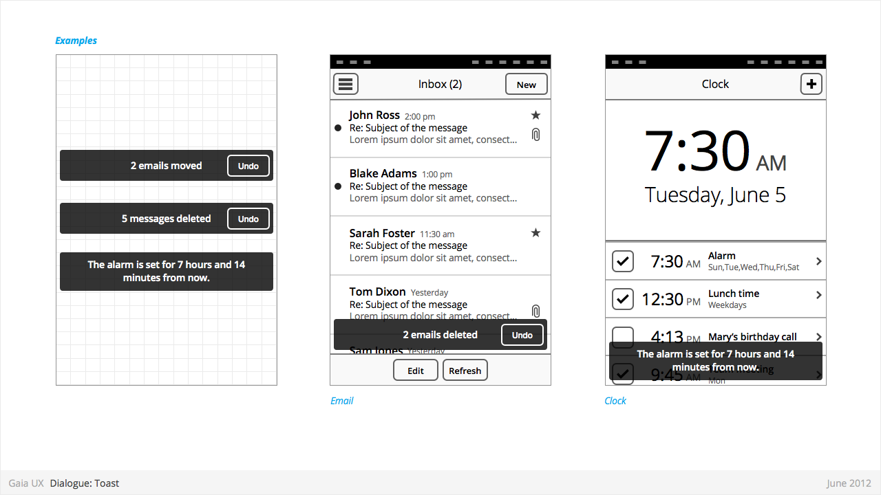
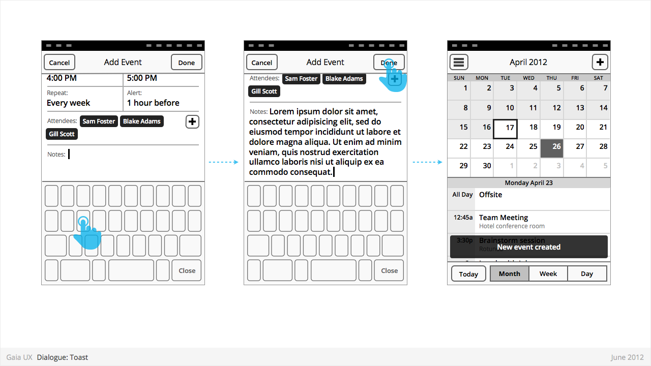
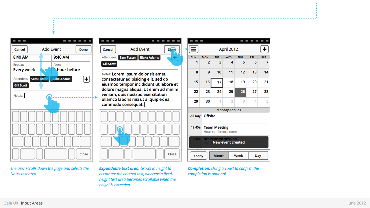
Dialogues: Toasts
Used for:
- Toasts confirm a user action, and optionally provide a follow up action (eg: Undo).
Characteristics:
- Typically appear after a multi-select edit. eg:
- Deleting multiple photos from (Gallery)
- Deleting multiple emails (Email)
- Moving multiple emails (Email)
- Toasts are positioned at the bottom of—and layered on top of—their associated content view.
- Toasts should be non-intrusive, and never cover up other UI elements (eg: toolbar, tabs, etc).
- Optionally provide opportunity to take related secondary action via button (eg: Undo).
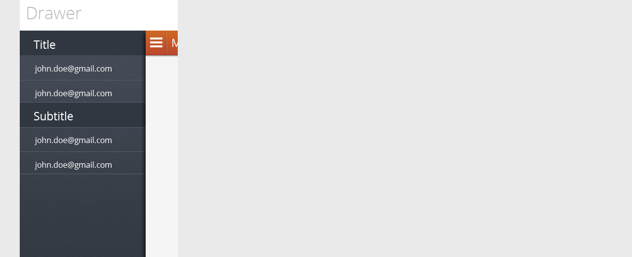
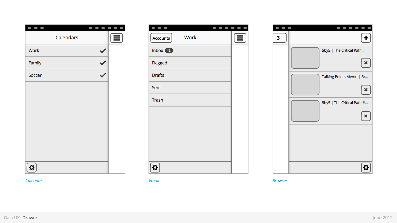
Drawer
Used for:
- Providing access to top level navigation links that may be too numerous for a Tabs pattern, or user-generated, (eg: Tabs, user accounts etc).
Characteristics:
- Provides access to top level navigation links that are usually user-configurable (eg: accounts in Email and Calendar, or tabs in Browser).
- Is also a great place to tuck secondary or power-user features, such as links to app Settings.
- Position: Should be positioned on left side of screen, but can be positioned on right in rare circumstances (eg: Browser).
- Open: should be opened via standard "Drawer" button, but other buttons can be used in rare circumstances (eg: numeric tabs button in Browser).
- Close: can be closed by tapping viewable area of the primary interface. And in future versions by swiping horizontally from bezel.
- Traditionally visually depicted as being one layer below the primary interface, and sliding in from the side via animation.
- Width: variable, but must always leave sufficient room for the "Drawer" button on the primary interface to remain fully visible.
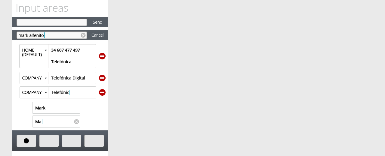
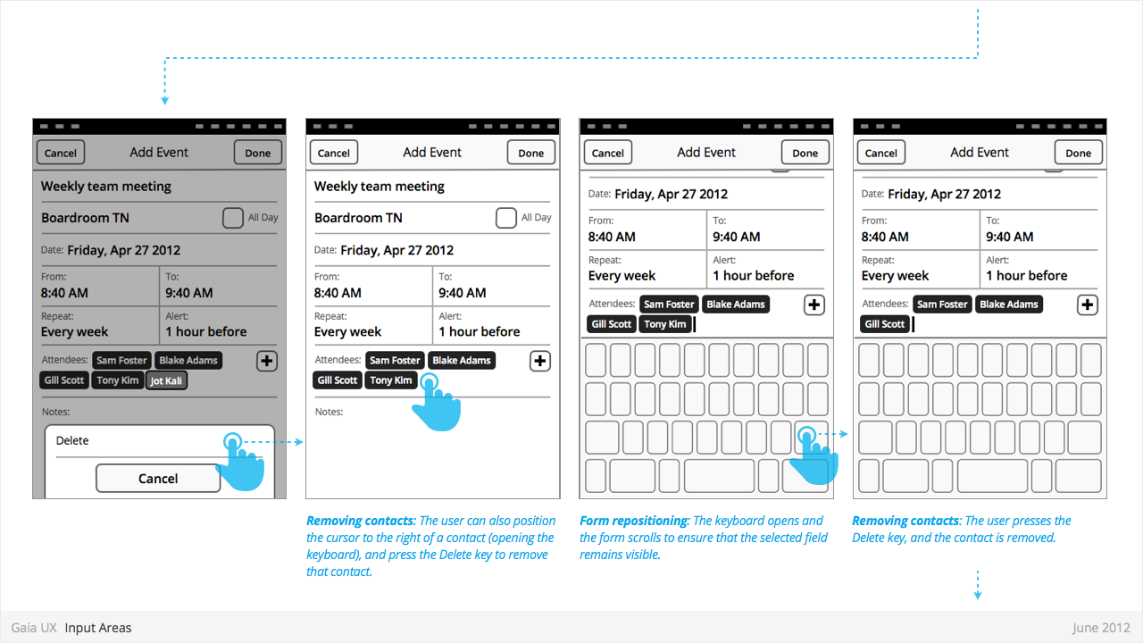
Input Areas
Used for:
- ...
Characteristics:
- ...
Multi-Select
Used for:
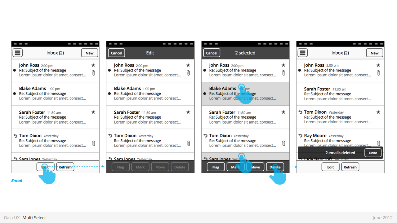
- Enables user to perform “bulk actions”, such as deleting 6 emails from a roll of 20, or selecting 3 photos to email to a friend.
- Is used on lists of items (eg: vertical list of emails in Inbox, or grid of photos in Gallery)
Characteristics:
- Is entered by...
- Is a “mode”, not a section. Animation and visual design should give user the impression that they are in a temporary mode within the original view, not that there are in a differerent view.
Can be called “Edit” or “Select” mode, depending on the use case. Header text should indicate action being taken (eg: “Select photos”). Once an item has been selected, text should update to “X selected”, where X = quantity of selected items.
- Closes once the user:
- ...completes one of the available actions (eg: “Delete”).
- ...or taps “Cancel” button.
- Closing resturns user to the previous view.
- If user has taken action (eg: delete 3 message threads), a Toast should appear, confirming the action.
States
- Normal
- Focused
- Disabled
Settings
Used for:
- ...
Characteristics:
- ...
