Support/StartPageOptimization
This project aims to optimize the experience for users of the Firefox Support start pages by making it clearer how the site is meant to be used. The goal is to reduce the bounce rate of the start pages.
See also Support/StartPageOptimization/FirstTest.
Overview
The Firefox Support (SUMO) start pages are critical pieces for user retention since they are the first pages users of Firefox see when looking for help on mozilla.com or from the Help menu of Firefox itself.
If we're not able to help the user, or if the start page isn't giving the user the impression that SUMO will contain the answer, the user might leave the site, and ultimately even stop using Firefox.
Today, the majority of the SUMO visitors leave the site immediately, suggesting that the start pages are not effectively serving their purpose. In order to retain our users, we need to optimize the content on these start pages to effectively communicate that SUMO contains the answer to their problem.
SUMO

At the heart of the SUMO website is the Knowledge Base (KB), which is a wiki-based repository of support articles (how-to:s, troubleshooting, references, tutorials) for Firefox. The idea is that the KB should provide the answer to the most common problems in Firefox and that our users should be self-served by searching the KB for the solution to their problem.
If the user can't find the answer in the KB, we have two main user-to-user support options: forum and Live Chat. Because of our massive user base, in order for the U2U support to be successful, most people must be able to solve their problems by themselves using the KB, making it by far the most important piece of the website.
The way users are meant to flow through the website can be described as the "support funnel."

- The Knowledge Base should contain the solutions to our most common problems. Users should start by searching for their problem here. Ideally the vast majority of our users find the solution to their problem here; it’s critical both for performance reasons and for quality of support. Using the funnel metaphor, the user would go straight through the funnel without hitting the sides.
- If they can’t find the solution to their problem in the Knowledge Base, the forum should show if others have already reported the problem. (We’re working on making this step simpler — more on that later in this series.)
- If neither the Knowledge Base nor the forum contains the answer, the forum or Live Chat should be available to the user. These two components should be viewed as fallbacks when the Knowledge Base fails to solve the user’s problem. Which of the two fallbacks is best for the user depends on the situation. The forum has the benefit that the posted question is public and can be read by many people, thus increasing the chance of getting answered, while Live Chat offers a direct communication with a Firefox expert, if the user is willing to wait for it.
- Frequent or serious issues solved in the forum or Live Chat should be documented in the Knowledge Base, to ensure that the support quality and performance remain consistently high, and to allow us to get better data on which issues are the most commonly reported.
Two Start Pages
To clarify, SUMO actually have two start pages:
Inproduct Start Page
First, there’s a support option within the Firefox browser itself (i.e., inproduct). Users clicking on "Help" from the Firefox menu are taken to the inproduct start page.

Below the search box, this start page lists references and tutorials that are originally coming from Firefox 2. This is based on the assumption that people using help from the product itself are more interested in learning about the program rather than solving a problem (note that this has not been verified with a test; for more info, read Support/StartPageOptimization/FirstTest).
Normal Start Page
The other way for users to enter SUMO is through the main navigation bar at www.mozilla.com. Users clicking on “Support” (depending on the localized version) go directly to the normal start page.

Below the search box, this start page lists the most popular support articles, and a blurb for new users, listing articles useful for new users.
Today's Problems
Metrics
- The start pages have a bounce rate of 85% for the inproduct start page, and 53% for the normal start page.
- Among the people that stay on the site, 71% utilize the search box on the inproduct start page, and about 50% utilize it on the normal start page. The higher search rate on the inproduct start page (among the few who actually stay on the site) could be an indication that the listed tutorials and references under the search box aren't useful to people.
Design & Content
There are three main problems that we've identified with the current SUMO start page design/content:
- The Knowledge Base (KB) is really just the first step in trying to find a solution to the problem. We also offer ways to ask direct questions.
- Problem 1: This is not obvious today; we don't say "the KB is just step 1," so people may leave the site thinking they won't find the solution to their problem.
- There is a lot of content on SUMO and the KB contains over 250 solutions to common problems.
- Problem 2: The current design doesn't effectively communicate the fact that there's a lot of content on the site, and many people leave our site without finding help. The referenced site design research (see below) seems to suggest that the current design isn't optimized for its purpose.
- The current start page puts a lot of emphasis on the search box.
- Problem 3: Not everyone is comfortable searching for or even describing their problem. We need a useful way of browsing the KB, and ensuring that people know they have that alternative of using the KB.
Proposed Solutions
Problem 1: The KB is just step one
We should make it obvious to visitors of the SUMO start page that we will walk them through the process of solving their problem. People should understand that the best approach is to search or browse the KB first, but that the KB isn't the only way of getting help. Ideally, we'd use a 1-2-3 approach and messaging on the front page, where the KB is step 1, making it obvious that we won't give up until the problem is solved:
- Try to find the info in the KB (search/browse)
- Extend the search to the forum (search existing forum threads; the new search engine which will be rolled out shortly, automatically lists forum results too, so this step happens automatically if the user searched in step 1)
- Post a new support question (forum or live chat)
The key here is to make people understand this from the very beginning, so they don't give up just because they couldn't see their problem listed on the front page.
In order to explain all this on the front page, we probably need a paragraph prominently explaining how to use our site. See also Problem 2 below, since this is related to making the design more compact. We might also want to explore the idea of actually using visual numbers 1, 2, and 3 for the individual steps, making the search box a clear "Step 1" -- sending the message that there's more to come.
Problem 2: The KB is vast
As explained above, there are many things we want the start page to communicate. We want to ensure that people always use the KB first, either by searching, browsing the most popular articles, or by browsing the full KB. At the same time we want people to understand how to use the site -- KB is just the first step. This is a lot to accomplish on one page, and the research chofmann has been digging up suggests that we can do some optimizations to improve the situation.
- Make the design a little bit more compact, to allow for more text without pushing e.g. the top support articles list below the fold.
- Add a more descriptive paragraph under the heading, describing in an effective way how to use the site. Something like:
- "Have a problem with Firefox? You've come to the right place. The first step to solve your problem is to search for it in our Knowledge Base. If you can't find the answer there, we will guide you to other ways of solving your problem."
- Make it obvious that there is more content than what is listed on the start page. Ensure that everyone that visits the site digs in -- reduce the bounce rate.
- E.g. add a prominent link below the search box saying "Or you can <browse the full Knowledge Base> if you don't want to search."
Problem 3: Not everyone wants to search
For the people who aren't comfortable searching for their problem, we need a solid way of browsing the KB. One proposed idea is to present some sort of tag cloud, allowing people to click on a tag to filter the list of articles to only show articles about that specific tag, e.g. "bookmarks", "location bar", "download", "print" or whatever. We already have the back-end support for tag clouds, and the KB is loosely categorized around these tags.
Previous Research
Many of the proposed changes in the mockup of the new start page are based on the Eyetrack III research, which analyzed how people use web sites and where they generally focus on. The specific findings we're making use of in the mockup are:
- Smaller font size results in a little more careful viewing of the page [1]. "Want people to read, not scan? Consider small type"
- Disparity in font size seems to make a difference between scanning and reading behavior [2]. Big headings make people less likely to read the content.
- Story text in a one-column format gets read more extensively than story text presented in a "newspaper-like" multiple-column format [3]. Although this particular study was made with story text (not lists), this might suggest that our use of two columns for the article lists below the search box makes it harder for people to scan the article titles.
- The top-left corner, and generally the left side of the page is viewed most extensively [4]
Some other interesting recommendations from the text Fancy Formatting, Fancy Words = Looks Like a Promotion = Ignored:
- Emphasize the highest priority tasks so that users have a clear starting point.
- Use examples to reveal the site's content. Rather than just describing what the site offers, the Census homepage states the actual population number. Juicy content for this type of site.
- Offer tools for high-priority tasks directly on the homepage. Our search box seems like a good example of that.
- Don't use clever phrases and marketing lingo.
- Limit font styles and other text formatting.
- Don't look like an ad.
Proposed Mockup
This mockup is tries to solve the problems detailed above, using solutions suggested in the research:
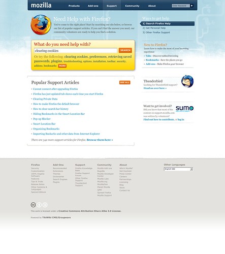
Click image above for description of changes
- Changed the heading to something more actionable to draw the user's attention
- Changed the first paragraph to explain that we offer personal help, that the user has come to the right place, and that you can both search and browse for solutions, while still making a point that we're volunteer-driven
- Explained the different ways to get help from the very outset, so people don't give up assuming we don't offer more than what is shown on the start page. See the sidebar box replacing the main menu.
- Renamed "Ask a question" link to "Get Personal Help" to make the value of our support offerings more obvious
- Removed the technical terms "Knowledge Base" and "Support Forum" to focus more on the task the user is trying to achieve (solving a problem) rather than how and where that would happen
- Added example search terms to encourage people to use the search box
- Changed to a single-column layout for the most popular support articles, to improve readability
- Made it a point that we have a lot more articles on the site than what is shown on the start page by adding the text at the bottom saying "There are xx more support articles..."
- Added a generic box in the sidebar that in the mockup is being used for the New to Firefox content. This could also be used for other purposes -- e.g. from the whatsnew.html page on mozilla.com, we could link to a different start page that listed articles related to troubleshooting Firefox after an upgrade, and/or listed what was new in the current version of Firefox.
Old mockup (kept for reference)

The changes:
- More descriptive text at the beginning, ensuring the user that he/she has come to the right place and how the site should be used.
- Smaller heading, making the difference between the heading and the text under it smaller, and saving vertical screen space
- Text in search bar changed to make it more obvious that searching is just step 1 in the process of solving the problem.
- More popular support articles fit above the fold because of the tighter layout (note that this benefit might disappear depending on how and where we include a tag cloud).
- Examples of popular searches are presented and clickable below the text field, serving as a way to educate the user how to best use the search box. Clicking on an example search fills the text box with the searched text.
- Link below the search box to browse the KB manually, making it more obvious that the kb is larger than what you see on the front page (depending on how the tag cloud KB navigation is integrated, this might be superfluous)
- Single column under the search box, showing just the most popular articles, making it easier to read article titles because they don't span over two rows
- less air between the article titles to show even more articles above the fold
- Tag cloud thrown in on the right side
Problems
The placement of the tag cloud doesn't make the connection between it and the search box obvious. Really, there are three ways of finding the solution in the KB:
- Searching -- we make that option very prominent because, for those who are comfortable with searching, it results in the quickest and most accurate path to the solution
- Browsing via categories/tags -- this is where this new tag cloud idea comes in
- Browsing the most popular support articles -- the list of articles below the search box
In the current mockup, it's not really obvious how the tag cloud relates to the KB. It's also completely lacking style and headings, making it unintuitive and hard to use.
The example search terms are in a way very closely related to tags -- maybe there's a way to combine them?