User:Tro/Firefox Theme and UI Revamp/Direction and Feedback
Firefox 3.7 Theme/UI Proposed Direction
The original goals of the Windows Theme Revamp Sprint/Project were to identify problems with the current Firefox UI and propose solutions to those problems. Initially emphasis has been placed on Firefox's visual appearance on Windows. Particularly Windows 7 and Vista (i.e. the future). Going forward we are going to look into the best ways to carry these ideas over to Mac and Linux as well.
Since restructuring the theme touches and depends on so many other elements the project has expanded slightly in scope. It now encompasses not just the current visual style, but also how best to handle UI placement, arrangement and also the evolution of some new features.
After a few iterations, and a lot of discussion, the UX team has settled on a firm initial direction to be implemented in Firefox 3.7. This direction is at the UX team proposal stage, to be approve by drivers and subject for constructive community feedback.
Update to Visual Styling
As noted on the 3.0 Windows Default Theme Issues Wikipage, Firefox feels dated and behind on Windows. Especially Vista and Windows 7. These issues include absence of Glass, anemic purple toolbar color on Vista, tall and bulky UI footprint, element overload, inconsistent toolbar icon usage/style, lack of a tactile look & feel and perhaps too great of a divergence between the look on XP and Vista/7.
The proposed direction to correct these shortcomings includes:
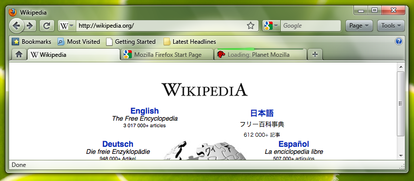
- Embracing Glass: Toolbar and Tabs using Glass. Raised translucent buttons that are slightly glossy to meld with the toolbar. Raised 3D look to achieve tactile "feel".
- Neutral Tones: Overall neutral color scheme that can transition among platforms. Can remain attractive and slick without fighting for focus from web content.
- Hiding the Menu Bar: Hiding the menubar by default(on Vista/7) allows us to use Glass, free up vertical space and retain platform consistency.
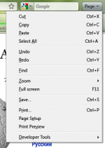
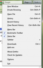
- Page and Tools Buttons: Condense and trim existing menu structure into two buttons "Page" and "Tools". Similar to Safari and Chrome.
- Combine Stop/Reload: Combine Stop and Reload into one button. Reduces visual "clutter" and combines two buttons that have mutually exclusive functionality.
- Home Button/Tab: Remove "Home" Button from default toolbar. Move functionality to a "Home Tab" containing your homepage.
Hiding of the Menubar
Starting with Vista, and continuing with Windows 7, the menubar has been systematically removed from Windows applications built by Microsoft and other vendors. It has been replaced with alternatives like the Windows Explorer contextual strip or the Ribbon found in Office 2007. The Ribbon UI is now also used in Paint and Wordpad for Windows 7. Many apps still retain the menubar as an option to be pinned or to be shown briefly by holding the Alt key.
Firefox isn't the type of application that necessarily has contextual actions in the same way Windows Explorer does. So how to handle the functionality of the menubar if it is hidden? Chrome and Safari (and to a lesser extent IE7 & 8) have solved this by sorting, trimming and collecting the menubar functionality into two separate buttons. One of these buttons has items that apply to the webpage and another to the application itself. Now they don't always agree on which item should go in which menu, but the general principal is sound. This is a good solution.
The menubar as a UI is pretty good at one thing: hiding complexity. The general purpose of the menubar is to contain all of the things that you want your program to do but you can't(or shouldn't) cram into the main UI. So the menubar generally ends up with a lot of stuff that isn't used very often, if at all, and yet is reproduced on every window and takes up a significant amount of real estate. It also has the tendency to become a dumping ground for new or hardly used features. This experience can be made worse with sub-menus, or even sub-sub-menus, which are hard to find and hard to target.
The approach applied to this problem has been to:
- Dissect the menubar and menu bar items.
- Categorize items based on function/theme.
- Categorize items based on whether they should be expected to affect the Page or the Application.
- Trim items that duplicate functionality in the default UI.
- Remove some items that don't make sense.
- Expose some items in the UI that weren't previously.
This is being documented on the Menu Cleanup wikipage.
The main goal here was to achieve parity with Vista and Windows 7. Secondary goals were to cleanup the menu, reduce space taken by the menubar and make way for future UI options like tab-on-top. Less UI space = more content space.
A goal going forward is a smarter placement/discoverability of features so that they don't have to be hidden away in a menu. Population of the Page and Tools buttons should be considered carefully.
Hiding of the menubar by default would only occur on Vista and Windows 7. Windows XP would retain the menubar by default as would Linux and of course Mac. Holding Alt on Vista/7 would show the menu (which can also be toggled on).
Bookmarks Changes
By default there are four separate ways to access bookmarks in the main Firefox window:
- Bookmarks Menu
- Bookmarks Toolbar
- Bookmarks Sidebar
- AwesomeBar
So there are at least four different ways people are using bookmarks. Some users may be using just the menu, some people may just be using the toolbar, some people may be using the sidebar for a tree view of all bookmarks or some people may just be starring things and using the awesomebar.
This creates a few problems:
- If the menubar is off how do people access their bookmarks menu? What if the bookmarks menu has never been used?
- Many people never alter, nor use, the bookmarks toolbar. Yet it is enabled by default taking space away from content.
Basically, how to combine bookmarks and plan for different use cases.
The proposed solution for this is to make the bookmarks toolbar the place for bookmarks. Create a bookmarks "widget" that replicates the bookmark menu functionality and place that on the bookmarks toolbar. This could be moved to the main navigation toolbar as well.
There are additional suggestions for this in 4.0.
Combine/Stop and Reload
The Stop and Reload buttons have mutually exclusive functionality. Yet we have a separate button for each.
Merging stop and reload would free up more toolbar space and reduce the amount of buttons on by default. This is particularly important because of shifting functionality caused by the hiding of the menubar.
A common complaint about this is the use case where someone might go to hit the stop button on a seemingly hung page as it just finishes loading only to hit refresh again instead. To solve this there would be a slight delay between when a page is finished loading and available for refresh again. Accompanied by a crossfade between the Stop and Refresh icons.
In the Customize page there would be an option to add a separate Stop and Reload buttons.
Create Simple Home Tab
The home button at present functions pretty much exactly like a bookmark. Yet it has its own dedicated place in the default set of toolbar buttons. It's not entirely useful and takes up prime real estate.
For 3.7 we would like to create a "Home Tab". Moving the functionality of the home button to a persistent "mini-tab". This tab, for 3.7, would just take you to your homepage. Any links clicked on this page would spawn a new tab. This would serve as a good introduction to tabs for users not accustomed to them.
There are further plans for this as well as "App Tabs" which will be discussed for 4.0.
Progress "Line"
A progress bar can make waiting seem slightly less painful and let you know if something might be hung-up or not. It won't actually make things faster, but it might make them feel faster.
Instead of the indeterminate progress indicator in use now, we would like add a progress "line" under the location bar on the active tab and at the top of each background tab. This will let people know about how much longer their background tabs have until they load and it also looks cool.
New Notification UI
An intermediary step in the redesign of the notification system is also planned for 3.7.
This intermediary design will leave all browser level notifications as Notification Bars. This includes:
- Rights Notification
- Disabled third party plugin
- Locked Profile
Page level notifications will be integrated into the Site Button (currently home to Larry). As well as floating "panel" notifications.
A more full implementation planned for 4.0.
Feedback/Concerns/Questions
You are trying to make Firefox look like Chrome/Safari/IE/Opera:
We are not trying to make Firefox look like any other browser. Firefox is Firefox. Similarities between browsers are unavoidable. They all have shared lineage and are based off of their predecessors. The basics of what a browser does and how it does it is already established. Browsers are all trying to solve the same problems so evolutionary ideas that are similar are inevitable.
With that said, just because an idea didn't originate here doesn't mean it isn't a good idea. Platform trends and conventions are sometimes good to follow. There are plenty of ideas being worked on for Firefox that are innovative and novel.
Other applications don't hide the menu bar so how is this maintaining external consistency?
Maybe it would be better phrased as "emerging external consistency". As of Windows 7 the most popular user facing prepackaged applications (and Office) ship with the menubar off by default. If it has one at all. Whether Photoshop or AutoCAD ship with menubars isn't necessarily relevant. For one they are different types of applications and for another they don't have a ubiquitous competitor ship with the OS (IE).
Firefox 4.0 Theme/UI Direction
While thinking about UI changes for Firefox 3.7 we simultaneously thought about where we wanted to take 4.0. These designs are envisioned as evolutionary steps. This serves two purposes: easing the transition and allowing adequate development time for platform capabilities.
This is a tentative direction of things we would like to see happen in 4.0. These directions are still in early brainstorming and proposal phase, and broader suggestions and ideation is welcome.
Visual Styling
A primary goal of the 3.7 update is to improve how Firefox looks on Windows. This will be carried forward to 4.0 with refinements but no major changes.
Major UI Change in 4.0
Several major additions and changes are being discussed to the UI for 4.0. Keep in mind these changes are farther out and therefore more in flux than ideas for 3.7.
- Merging the LocationBar and SearchBar
- Merging Stop/Refresh/Go Into One Button
- Adding a Tab-on-Top Option
- Introduction of App Tabs
- Expanded Home Tab Functionality
- Hiding Bookmarks Bar
- Profile Stuff
- Removal of Status Bar
Merging the LocationBar and SearchBar
The AwesomeBar already has a lot of search functionality, even though it is currently only local. These fields have a convergent function: finding things. Merging these and including something like Taskfox will put search in a unified location with added utility. It will also reduce toolbar complexity/clutter by merging functionality.
Merging Stop/Refresh/Go Into One Button
Merging these into one button and attaching them to the location bar gives them context. A secondary benefit is that it combines like functionality and removes another toolbar button.
A common concern about this is that it would increase targeting time by moving the refresh/stop buttons so far away from the back/forward buttons. That really depends on where you are moving your mouse from however. If you are typing in the URL bar and moving to hit the go button then you are already in the right spot to hit stop if you change your mind. However if you are hitting back or forward and then want to hit stop/refresh it is far away.
This is a legitimate concern but it's hard to say how it will work out without observing it.
In the Customize page there would be an option to add a separate Stop, Reload and Go buttons.
Adding a Tab-on-Top Option
The tabs-on-top option would allow:
- Firefox to have a correct UI hierarchy where the controls are tab specific.
- Fix a redundancy in having both a titlebar with page title as well as a tab with the page title. Still titlebars can have the whole title instead of a truncated one.
- A Fitt's Law win if the window is maximized.
- A small vertical space saving allowing more room for content.
retain the option to have have tabs-on-bottom. Also potentially tabs on the left or right side in a thumbnail or list style view.
Introduction of App Tabs
The idea behind "App Tabs" is that some web apps are more like applications than web pages. For example, Google Docs, Gmail, Acrobat.com, MobileMe, 280 Slides, etc. Things you would want to have open all the time and they could potentially be chromeless since you don't navigate through them with back/forward. Sort of like built in Prism. If, say, you wanted Gmail open all the time without chrome you could drag it to the left and pin it thus making it an App Tab.
There would also be some other way to make an app tab besides drag/pinning it to the left. For instance a contextual menu item.
Expanded Home Tab Functionality
The Home Tab introduced in 3.7 will start to be slightly more than just a link to your home page. It turns into a dashboard like page. It could potentially have your top bookmarks, about:me stats, history timeline, recently closed tabs, change styling on major local holidays, or more.
Hiding Bookmarks Bar
If a user hasn't altered the bookmarks bar past the default, it will be hidden and the bookmarks widget moved to the navigation bar. If they have it will remain the same.
This will free up some more vertical space for content and remove visual clutter of an element that isn't being used.
The bookmarks bar could of course be turned back on.
New Notification UI
A redesign of the notification system is planned for 4.0.
This design will remove notifications bars. Integrating persistent notifications into the Page and Tools buttons. As well as notification panels and activity indicator panels.
Profile Stuff
Introduction of User Profiles. Uses could include different sets of bookmarks, individual histories, different settings, password/login manager, bookmark syncing(similar to Weave).
Removal of Status Bar
The status bar currently takes up a lot of space on every window. The full link description is used by some but not all. The progress bar can be duplicated elsewhere. It is also currently a catch-all for a great many extensions. As well as being at the bottom of the window away from the rest of the UI.
If the status bar was removed the functionality could be relocated and streamlined to other parts of the UI:
- Extensions Point: Create a place in the navigation bar for extensions. They could then make use of new UI structures like panels developed for notifications. They would also be collected in a centralized and visible location.
- Problems:
- Not a lot of room: Installing a lot of extensions will quickly fill the space. How to handle overflow?
- How to handle extensions that aren't just an icon: Some status bar extensions have text or horizontal widgets.
- Full Link Text: A proposed way to handle this would be to put it in the location bar. It would have unique styling to indicate "This is where you will go". It would have the perceived performance effect of making navigation feel faster. It would also continue to keep UI in the same location at the top of the window.
- Problems:
- Progress Bar: Will be added to background tabs and under the location bar of the active tab.
An alternative proposal would be to turn the status bar off by default. Move the existing functionality away and only turn it back on if an extension that uses it is installed.


