Firefox3/Theme/MacOSX: Difference between revisions
(Added link to the ticket.) |
No edit summary |
||
| Line 19: | Line 19: | ||
[[Image:Jurmous-firefoxcombined2.jpg]] | [[Image:Jurmous-firefoxcombined2.jpg]] | ||
== Evolution of previous proposal == | |||
It seems that white is preferred for default skin on which I will continue. Black will be a separate download then. | |||
* Less rounded borders on location: more efficient on space | |||
* draggable thumb to control width of location/search | |||
* separated lock and feed icons. '''They should animate in when needed for attention (grow pop style)''' | |||
* the stop button is back (although I prefer stop and reload in one) | |||
* the add bookmark button is placed on bookmark bar as +. More logical. | |||
* Although there is a second option of the invisible glowing star on the location bar. What is better location or sometimes hidden bookmarkbar. And what if you use delicious as I do? | |||
* Pill super minimised mode design for presenters with preopened tabs. | |||
[[User:JurMous|JurMous]] 14:44, 29 September 2007 (PDT) | |||
[[Image:Jurmous-firefox3-proposal5.jpg]] | |||
Revision as of 21:44, 29 September 2007
This wiki page is for posting and discussing mockups of Firefox themes for Mac OS X, enjoy :)
The related Bugzilla ticket is Bug 397723.
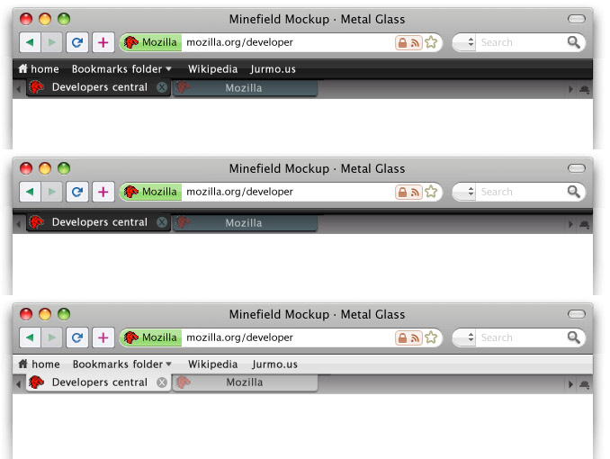
Glass + Metal, 3 proposals (2007 09 29)
Just a rapid mockup, to support visually some discussion on the Bug 397723 topic. I've tried to add some colors to the icons, but I scrapped them since I couldn't find any interesting solution. :P --Folletto Malefico 22:18, 28 September 2007 (PDT)

New buttons on previous proposal (2007 09 29)
Using previous proposal but with tighter spacing, different buttons inspired by new/macbook apple keyboard, color on buttons for better intuitive browsing and a bookmark bar collapsed mode. Also using leopards new trafficlights. JurMous 03:17, 29 September 2007 (PDT)
Also tried out the more sparse buttons. (combining stop/reload, home to bookmarks and + for bookmarking like safari) Black and white options Black is inspired by the new iMac and iPhone Glass/metal combo. JurMous 05:41, 29 September 2007 (PDT)
Edit: Uploaded new version with correct nav and a black with bookmarks collapsed. JurMous 07:39, 29 September 2007 (PDT)
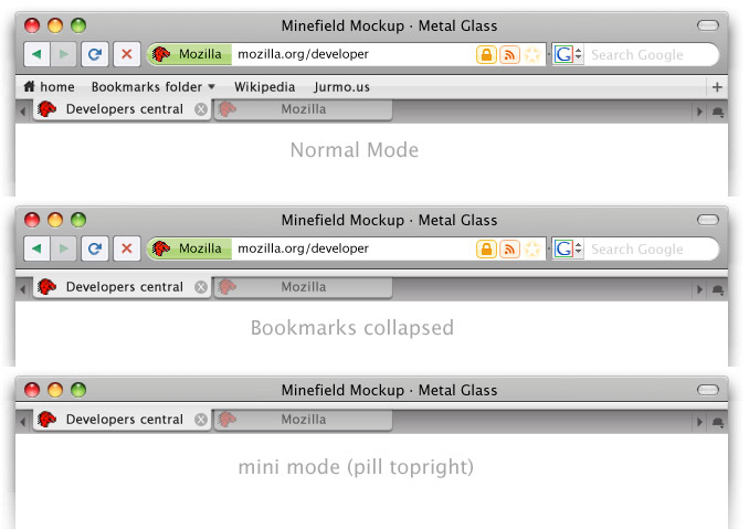
Evolution of previous proposal
It seems that white is preferred for default skin on which I will continue. Black will be a separate download then.
- Less rounded borders on location: more efficient on space
- draggable thumb to control width of location/search
- separated lock and feed icons. They should animate in when needed for attention (grow pop style)
- the stop button is back (although I prefer stop and reload in one)
- the add bookmark button is placed on bookmark bar as +. More logical.
- Although there is a second option of the invisible glowing star on the location bar. What is better location or sometimes hidden bookmarkbar. And what if you use delicious as I do?
- Pill super minimised mode design for presenters with preopened tabs.
JurMous 14:44, 29 September 2007 (PDT)

