Firefox:Add-ons Manager UI
Jump to navigation
Jump to search
Previous Designs
Ideas from Feb-May 2006: Firefox:Extension_Manager_UI
Task Flow Overview
Install from AMO (and whitelist)
- User clicks on an AMO "Install Now" button
- The modal confirmation dialog appears
- Issues: The dialog is (a) too intimidating, (b) verbose, (c) confusing
- Add-ons Manager is launched in the temporary "Installation" view
- Progress indication goes by (usually too fast to see)
- On completion, the text changes to "Restart to complete the installation"
- User clicks the "Restart Firefox" button or goes on with his/her life
- eventually, the user restarts
- Issues: the position of the permanent "Restart Firefox" button makes it seem like it must be pressed to close the dialog (as with an OK or Cancel button)
- Firefox comes back up.
- Issues: If the installed add-ons pop up prefs panes, they are there; if not, there's no indication that anything has happened, successfully or otherwise
Install from Elsewhere
0. User clicks on something to start an install or the page just pushes it
- Notification bar appears to let the user know that Firefox has stopped the page from installing something. The users can click the button ("Edit Options") or dismiss the notification bar
- If the user clicks the button (END otherwise), a dialog appears that lets the user add the current site to the whitelist of sites that can install software (this whitelist is going away); user does so and closes the dialog
- Issues: overly complex UI (many extra concepts introduced); the user may not want (in fact, likely doesn't) to whitelist the site for eternity
- User is dropped back on the original page and must figure out how to restart the install (click button or reload page, depending on the situation)
- Issues: no sign of what to do next -- we've abandoned the user
- The modal confirmation dialog appears
- Issues: The dialog is (a) not intimidating enough (differs from the last case), (b) verbose, (c) confusing
- from this point on, the process (and corresponding issues) is the same as in the previous case
Plugin Install
Suggested Designs
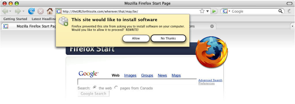
Friendly Confirmation
Drive-by Blocker
Revised - option 1 (no whitelist):

Revised - option 2 (whitelist):

New favicon-based notification concept (more about this here: mockups)
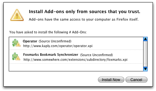
Scary Confirmation
The rationale behind this redesign is to elevate the warning, rather than the list or reiteration of the identity of the add-on, to primacy in the dialog. The user (should) already know what he/she is installing, so its presence is just as context for the new information (the warning) above.
Notes:
- (Source Unconfirmed)- this takes the place of "Unsigned" in the implementation. If it were signed, the name of the source would be in parentheses.
- the URL should be selectable
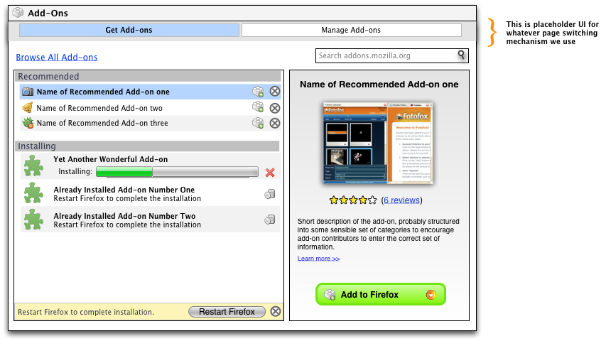
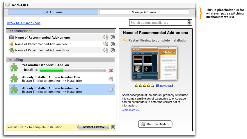
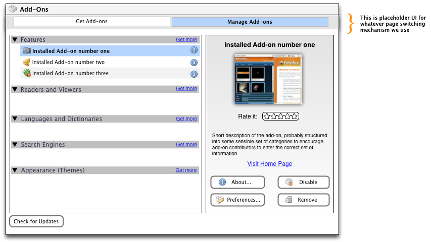
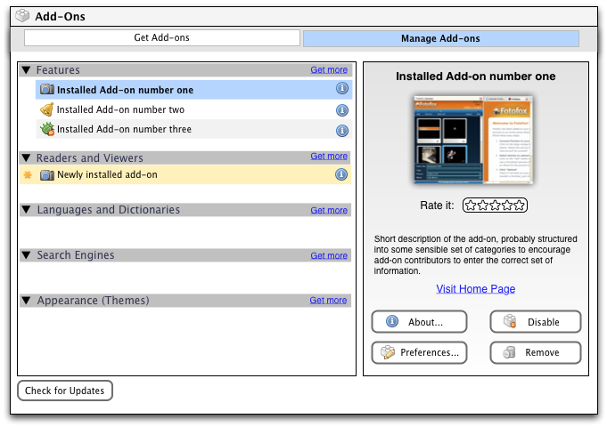
Add-ons Manager
Goals of the redesign:
- Major
- Greater task orientation
- Greater ability to start the process of finding and getting add-ons from within the browser proper
- more integration and/or sharing of features with AMO (ie. ratings, descriptions, etc.)
- decrease (or eliminate) tabs that are sometimes there and sometimes not; a corollary - decrease the number of times the same add-on shows up in more than one tab/space (ie - a near-complete install in one place and a not-quite-yet selectable add-on in another)
- Minor
- ability to see more add-ons at a glance
- increase prominence of the user-actions available for each add-on
- more prominence to details about addons without digging into prefs
- Moving permanent restart button out of the lower-right-hand-corner (where it looks like an "OK/Cancel" button) and to a place where it's clearly the next step after installing an add-on


