User:Jorge.villalobos/EditorToolsRedesign: Difference between revisions
Jump to navigation
Jump to search
| (One intermediate revision by one other user not shown) | |||
| Line 7: | Line 7: | ||
* What matters here is the data and links to main sections of the Editor Tools. I know the design is too boxy. | * What matters here is the data and links to main sections of the Editor Tools. I know the design is too boxy. | ||
== Queue Page == | == Queue Page == | ||
| Line 18: | Line 14: | ||
[[File:Review_Page_Mockup.png|500px|thumb|center]] | [[File:Review_Page_Mockup.png|500px|thumb|center]] | ||
* This is the page I changed most, not only graphically, but also some of the loading logic and the possible actions that can be performed on it. | * This is the page I changed most, not only graphically, but also some of the loading logic and the possible actions that can be performed on it. | ||
* | * The Editor Actions box at the bottom should behave just like it currently does, with the addition of the Comment action, which would allow editors to add arbitrary comments to a version. The comments would not be sent to the author. | ||
* Also, below the "Notify me the next time this add-on is updated" checkbox, there should be an additional checkbox for Admins, only when the add-on has been admin-flagged. It should be unchecked by default and say "Remove admin flag". | |||
== View Source Page == | == View Source Page == | ||
Latest revision as of 20:47, 4 May 2011
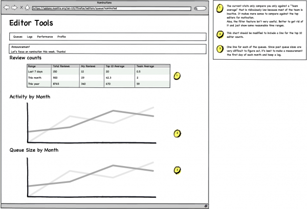
These are some mockups that illustrate what I (and many other editors) think the editor tools should look like and behave. Some are aesthetic changes, some are just including more data and organizing it differently, and a few are changes that require some larger work. It shouldn't be taken as an all-or-nothing, whatever can be done to bring the Editor Tools closer to this will be greatly appreciated.
Click on the images for larger views.
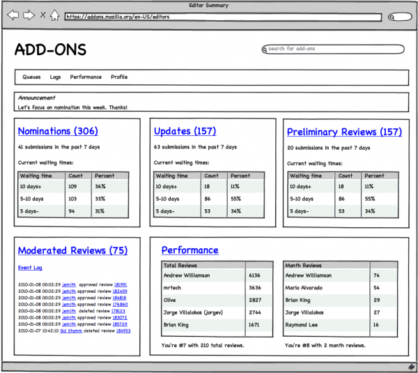
Editor Summary Page
- What matters here is the data and links to main sections of the Editor Tools. I know the design is too boxy.
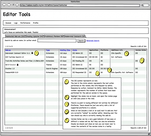
Queue Page
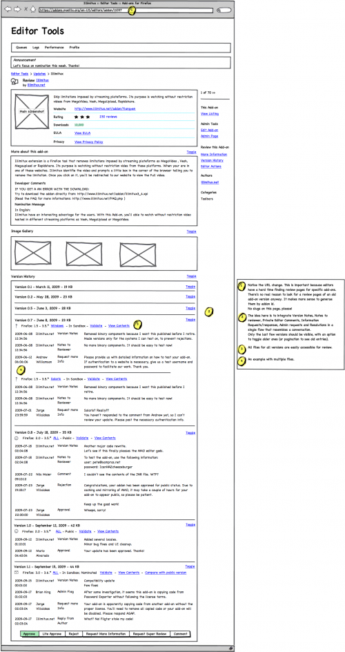
Review Page
- This is the page I changed most, not only graphically, but also some of the loading logic and the possible actions that can be performed on it.
- The Editor Actions box at the bottom should behave just like it currently does, with the addition of the Comment action, which would allow editors to add arbitrary comments to a version. The comments would not be sent to the author.
- Also, below the "Notify me the next time this add-on is updated" checkbox, there should be an additional checkbox for Admins, only when the add-on has been admin-flagged. It should be unchecked by default and say "Remove admin flag".
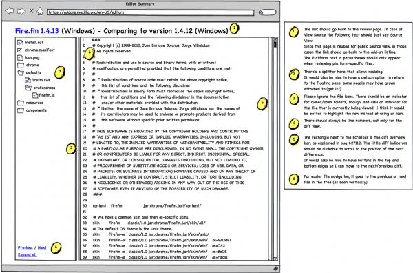
View Source Page
Some additional / alternative suggestions by Axel View_Source_Alternative
Performance Page
- The personal performance log is now in the Profile page.
Review Log Page
- Same as the current Review Log page, but with filtering options for Add-on Name, Editor Name, and Comments (search through all editor comments).
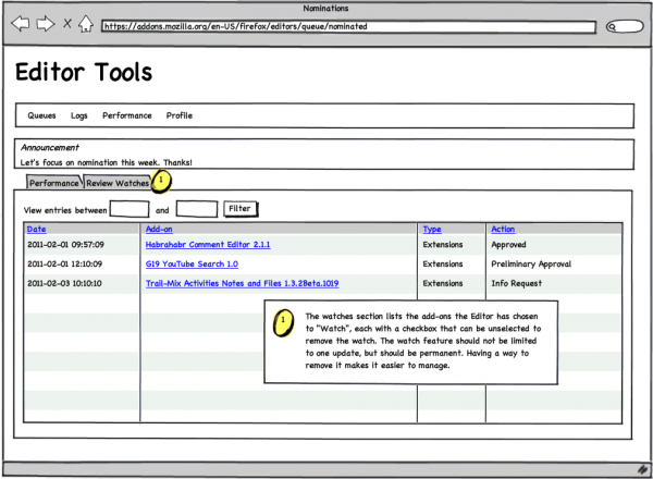
Profile Page
- The idea of this new page is to have a place for per-editor settings. The first tab just shows the personal review log. The second tab would have a list of the add-ons the editor has chosen to "watch" (get reminders of new verisons via email) with the option to "unwatch" them.
