Labs/Ubiquity/Documentation/Documentation Style Guidelines: Difference between revisions
Indolering (talk | contribs) m (Created page with '= Minimalist Documentation = Minimalist documentation is a modality of documentation emphasizes three principals: == Procedural Instruction == Trade conceptual overviews with ex...') |
Indolering (talk | contribs) |
||
| (28 intermediate revisions by 2 users not shown) | |||
| Line 1: | Line 1: | ||
= | = Universal Guidelines = | ||
Minimalist documentation is a modality of documentation emphasizes three principals<br> | |||
#Procedural Instruction | |||
#Minimal Wording | |||
#Error Recovery | |||
#Guided Discovery<br> | |||
== | The Minimalist Documentation has been supported [http://www.google.com/search?q=The+Minimal+Manual.pdf&ie=utf-8&oe=utf-8&aq=t&rls=org.mozilla:en-US:official&client=firefox-a empirically], even by researchers seemingly [http://scholar.google.com/scholar?q=A+Critical+Assessment+of+the+Minimalist+Approach+to+Documentation&hl=en&as_sdt=0&as_vis=1&oi=scholart critical] of the style.<br> | ||
== | == Procedural Instruction == | ||
Focus on examples of real tasks and activities not conceptual overviews. | |||
Make each example a self contained unit independent of any other example. Examples should be broken down to the command level with stand-alone examples of each command. | |||
#Tap option + space bar | |||
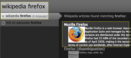
#Type: wikipedia firefox | |||
#You should see this exact screen: | |||
#*[[Image:Ubiquity Documentation-Wikipedia Screenshot Example.png]] | |||
#Tap the Enter key to open the Wikipedia article in a new tab | |||
=== Rational === | |||
Thus minimalist documentation is focused on examples of tasks, there is no attempt to teach the underlying models of operation. '''Real users are trying to do something''', not understand the grand scheme of things. | |||
By focusing on procedural, task based instruction, minimalist documentation caters to how users naturally browse documentation and think about their problems. | |||
Users interaction with documentation occurs when they are inhibited in performing a task. When users want to kill the paper clip, they do not take a tutorial on how to use word or read from the beginning of the manual- they skip to the “paper clip” chapter hoping to find something about turning it off. | |||
Tutorials and other traditional documentation which strive to give conceptual overviews are the best way to learn. Volumes of psychological research prove that the thorough processing prompted by a conceptual overview improves retention and performance. | |||
However, the typical setting for traditional psychological tests of learning guarantee both motivation and attention -such as work training. Web browsers are a glass pane- their purpose is to deliver content, their utility invisible, their new features just smudges on the glass, obscuring the view of their content. | |||
Thus, the Minimalist method of procedural instruction gets a user on-board and gets to the broad conceptual understanding later. There is plenty of empirical evidence to support this, but I will list them later. | |||
== Minimal Wording == | |||
Facilitate a users search for information by removing obstacles blocking their path- excess verbiage. '''Be ruthless'''. | |||
In the larger perspective, simplify all help UI's (users were confused by the Wiki additions) and dump users directly to help oriented Q/A systems such as Get Satisfaction or chat rooms at the end of wiki posts. | |||
=== Reasoning === | |||
Minimal wording extends beyond short sentences, intros, exits, and philosophical reasoning's are for blog-posts, not for intros. Users just do not read them, | |||
== Guided | "<nowiki>[Users]</nowiki> encounter a usability problem on average about '''once every 75 minutes''' and typically spend about '''a minute''' looking for a solution" Be ''ruthless''. [http://www.google.com/search?hl=en&client=firefox-a&rls=org.mozilla%3Aen-US%3Aofficial&hs=gb7&q=Toward+a+More+Accurate+View+of+When+and+How.+People+Seek+Help+with+Computer+Applications+filetype%3Apdf&aq=f&oq=&aqi=] | ||
Ubiquity | |||
Furthermore, "Users will search once, maybe twice."[http://www.uie.com/articles/users_search_once/] If their first attempt isn't successful it's best to dump them to a moderated assistance queue than let the problem fester. | |||
== Tone == | |||
Use a conversational tone: "your email account" vs "an email account" etc. | |||
=== Rational === | |||
Known as the personalization principal, conversational tone has been proven to improve learning. [http://www.worldcat.org/oclc/228676642] | |||
= Written Text = | |||
== Error Recovery == | |||
If there is a common error or bug in a particular release, make sure to include examples and remedies of that error. | |||
One option is to include screen shots, tightly focused on only relevant information or using a spotlight, with prompts such as, "Can you find this on your screen?" | |||
== Guided Discovery == | |||
Try to start with the simple first, and avoid more complex commands. Ubiquity's interaction is pretty simple, so this one is easy. | |||
= Screenshots = | |||
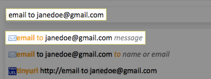
Use a layer of black at a 50% opacity to reduce visual clutter around the area of interest. | |||
[[Image:Ubiquity-reference-screenshot.png|center]] | |||
The human eye is lazy, it will float to the lighter areas of color due to the increased effort required to perceive color. The translucent black pushes the point of interest to the foreground while allowing the viewer to orient the item of interest in relation to other UI elements. | |||
= Video = | |||
Video is particularly tricky and is most successful when it follows the same minimalistic guidelines as outlined above.<br> | |||
Mayer's comprehensive [http://www.worldcat.org/title/multimedia-learning/oclc/228676642 Multimedia Learning] constructs a framework for multimedia learning based on decades of research. His specific recommendations include,<br> | |||
*Remove unnecessary pictures, music, words, jargon, and symbols (Coherence Principal)<br> | |||
*Provide strong visual cues to focus attention, [http://www.omnigroup.com/products/omnidazzle/ OmniDazzle], for example. (Signaling Principal)<br> | |||
*Do not overlap spoken narration with on-screen text (Redundancy Principal)<br> | |||
*Tightly group conceptual elements together (Spatial Contiguity Principal)<br> | |||
*Present words and pictures together instead of sequentially (Temporal Contiguity Principal)<br> | |||
*Allow user control of video, i.e. chapters (Segmentation Principal)<br> | |||
*Explain any new concepts or vocabulary (Pre-Training Principal)<br> | |||
*Use '''spoken''' word and visuals (Modality Principal)<br> | |||
<br> | |||
Latest revision as of 22:06, 13 June 2010
Universal Guidelines
Minimalist documentation is a modality of documentation emphasizes three principals
- Procedural Instruction
- Minimal Wording
- Error Recovery
- Guided Discovery
The Minimalist Documentation has been supported empirically, even by researchers seemingly critical of the style.
Procedural Instruction
Focus on examples of real tasks and activities not conceptual overviews.
Make each example a self contained unit independent of any other example. Examples should be broken down to the command level with stand-alone examples of each command.
- Tap option + space bar
- Type: wikipedia firefox
- You should see this exact screen:
- Tap the Enter key to open the Wikipedia article in a new tab
Rational
Thus minimalist documentation is focused on examples of tasks, there is no attempt to teach the underlying models of operation. Real users are trying to do something, not understand the grand scheme of things.
By focusing on procedural, task based instruction, minimalist documentation caters to how users naturally browse documentation and think about their problems.
Users interaction with documentation occurs when they are inhibited in performing a task. When users want to kill the paper clip, they do not take a tutorial on how to use word or read from the beginning of the manual- they skip to the “paper clip” chapter hoping to find something about turning it off.
Tutorials and other traditional documentation which strive to give conceptual overviews are the best way to learn. Volumes of psychological research prove that the thorough processing prompted by a conceptual overview improves retention and performance.
However, the typical setting for traditional psychological tests of learning guarantee both motivation and attention -such as work training. Web browsers are a glass pane- their purpose is to deliver content, their utility invisible, their new features just smudges on the glass, obscuring the view of their content.
Thus, the Minimalist method of procedural instruction gets a user on-board and gets to the broad conceptual understanding later. There is plenty of empirical evidence to support this, but I will list them later.
Minimal Wording
Facilitate a users search for information by removing obstacles blocking their path- excess verbiage. Be ruthless.
In the larger perspective, simplify all help UI's (users were confused by the Wiki additions) and dump users directly to help oriented Q/A systems such as Get Satisfaction or chat rooms at the end of wiki posts.
Reasoning
Minimal wording extends beyond short sentences, intros, exits, and philosophical reasoning's are for blog-posts, not for intros. Users just do not read them,
"[Users] encounter a usability problem on average about once every 75 minutes and typically spend about a minute looking for a solution" Be ruthless. [1]
Furthermore, "Users will search once, maybe twice."[2] If their first attempt isn't successful it's best to dump them to a moderated assistance queue than let the problem fester.
Tone
Use a conversational tone: "your email account" vs "an email account" etc.
Rational
Known as the personalization principal, conversational tone has been proven to improve learning. [3]
Written Text
Error Recovery
If there is a common error or bug in a particular release, make sure to include examples and remedies of that error.
One option is to include screen shots, tightly focused on only relevant information or using a spotlight, with prompts such as, "Can you find this on your screen?"
Guided Discovery
Try to start with the simple first, and avoid more complex commands. Ubiquity's interaction is pretty simple, so this one is easy.
Screenshots
Use a layer of black at a 50% opacity to reduce visual clutter around the area of interest.
The human eye is lazy, it will float to the lighter areas of color due to the increased effort required to perceive color. The translucent black pushes the point of interest to the foreground while allowing the viewer to orient the item of interest in relation to other UI elements.
Video
Video is particularly tricky and is most successful when it follows the same minimalistic guidelines as outlined above.
Mayer's comprehensive Multimedia Learning constructs a framework for multimedia learning based on decades of research. His specific recommendations include,
- Remove unnecessary pictures, music, words, jargon, and symbols (Coherence Principal)
- Provide strong visual cues to focus attention, OmniDazzle, for example. (Signaling Principal)
- Do not overlap spoken narration with on-screen text (Redundancy Principal)
- Tightly group conceptual elements together (Spatial Contiguity Principal)
- Present words and pictures together instead of sequentially (Temporal Contiguity Principal)
- Allow user control of video, i.e. chapters (Segmentation Principal)
- Explain any new concepts or vocabulary (Pre-Training Principal)
- Use spoken word and visuals (Modality Principal)

