Gaia/Design/Patterns: Difference between revisions
Jump to navigation
Jump to search
No edit summary |
No edit summary |
||
| Line 1: | Line 1: | ||
Design Patterns are core sets of interactions that are used repeatedly throughout the UX. | Design Patterns are core sets of interactions that are used repeatedly throughout the UX. | ||
==Contacts Browser== | ==Contacts Browser== | ||
Revision as of 07:25, 19 June 2012
Design Patterns are core sets of interactions that are used repeatedly throughout the UX.
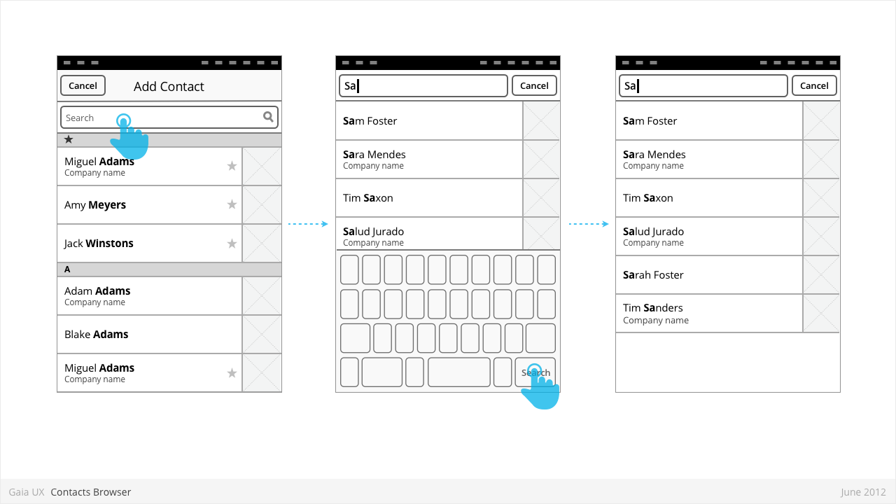
Contacts Browser
Used for:
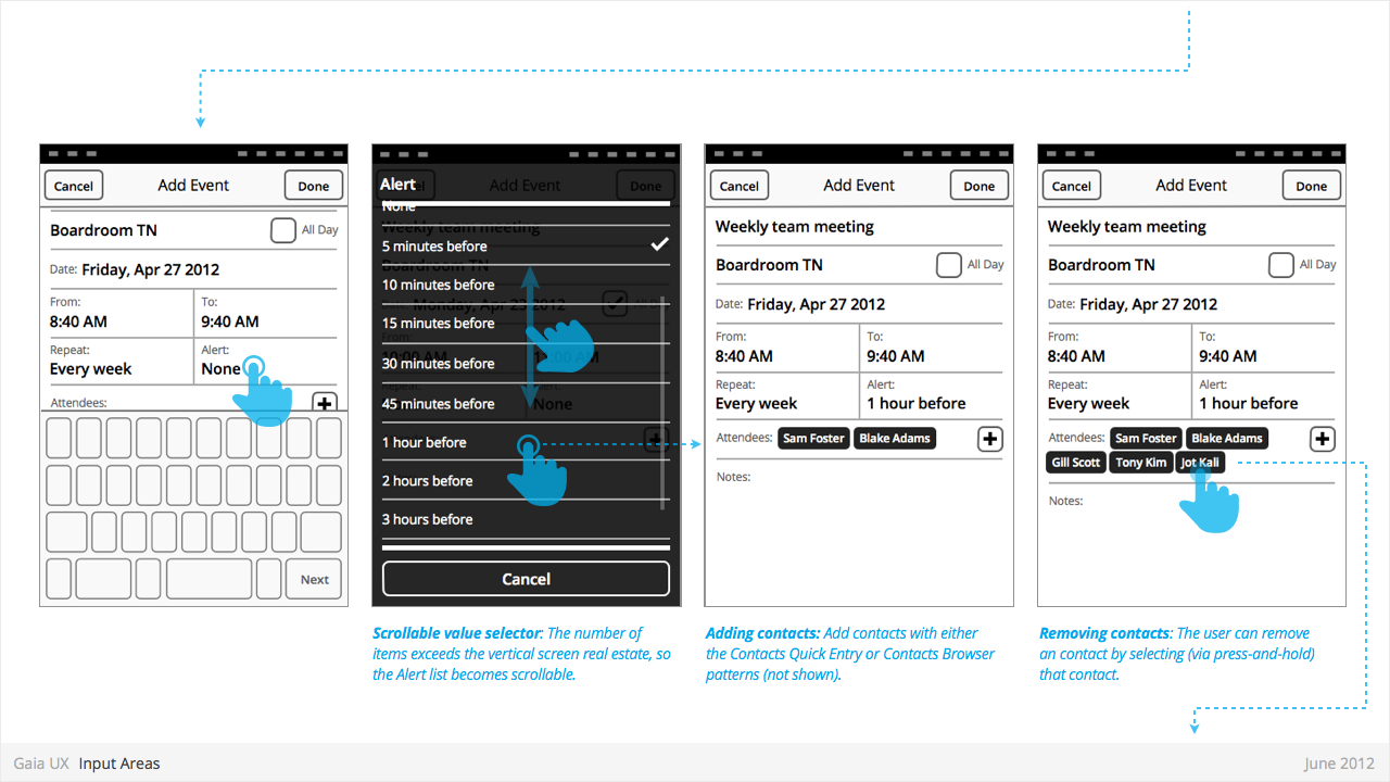
- Adding a contact to a correspondence (eg: Email, SMS)
Characteristics:
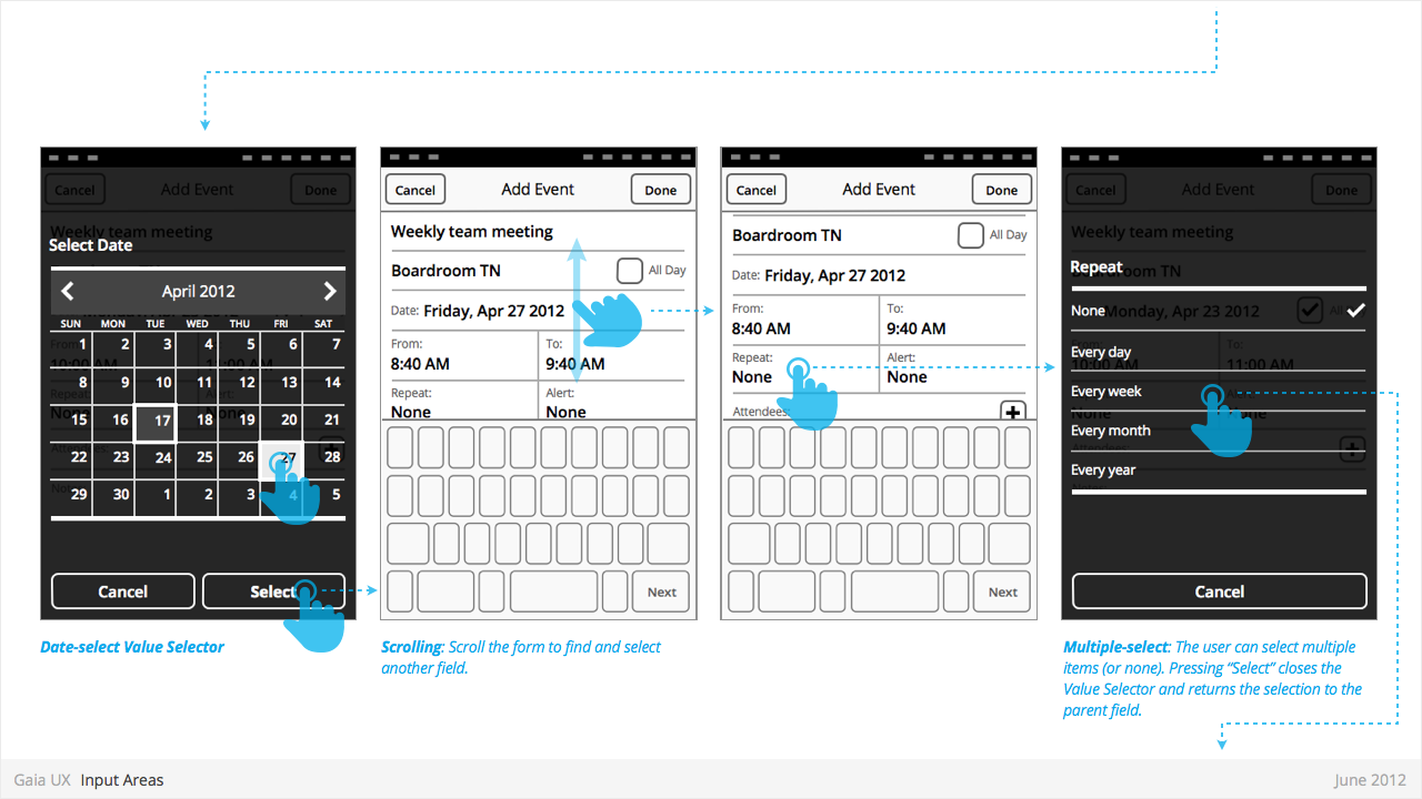
- Is an example of an Entry Sheet dialogue.
- Opens when user selects “Add” button.
- Presents complete list of contacts.
- “Cancel” closes the Browser without making a select.
- Tapping a contact closes the Browser and adds the selected contact to the selected field.
- Uses index scrolling [ADD LINK]
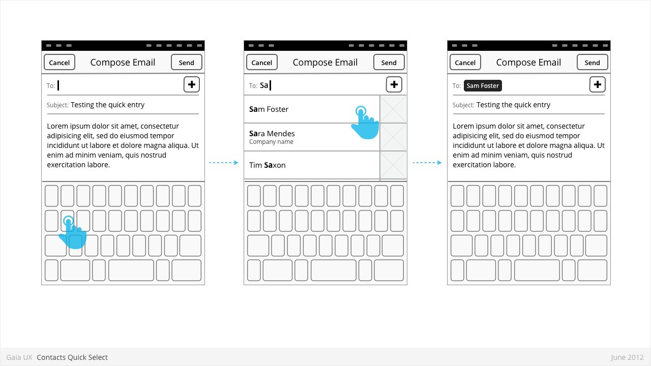
Contacts Quick Select
Used for:
- Selecting a known contact quickly, without leaving the current view.
Characteristics:
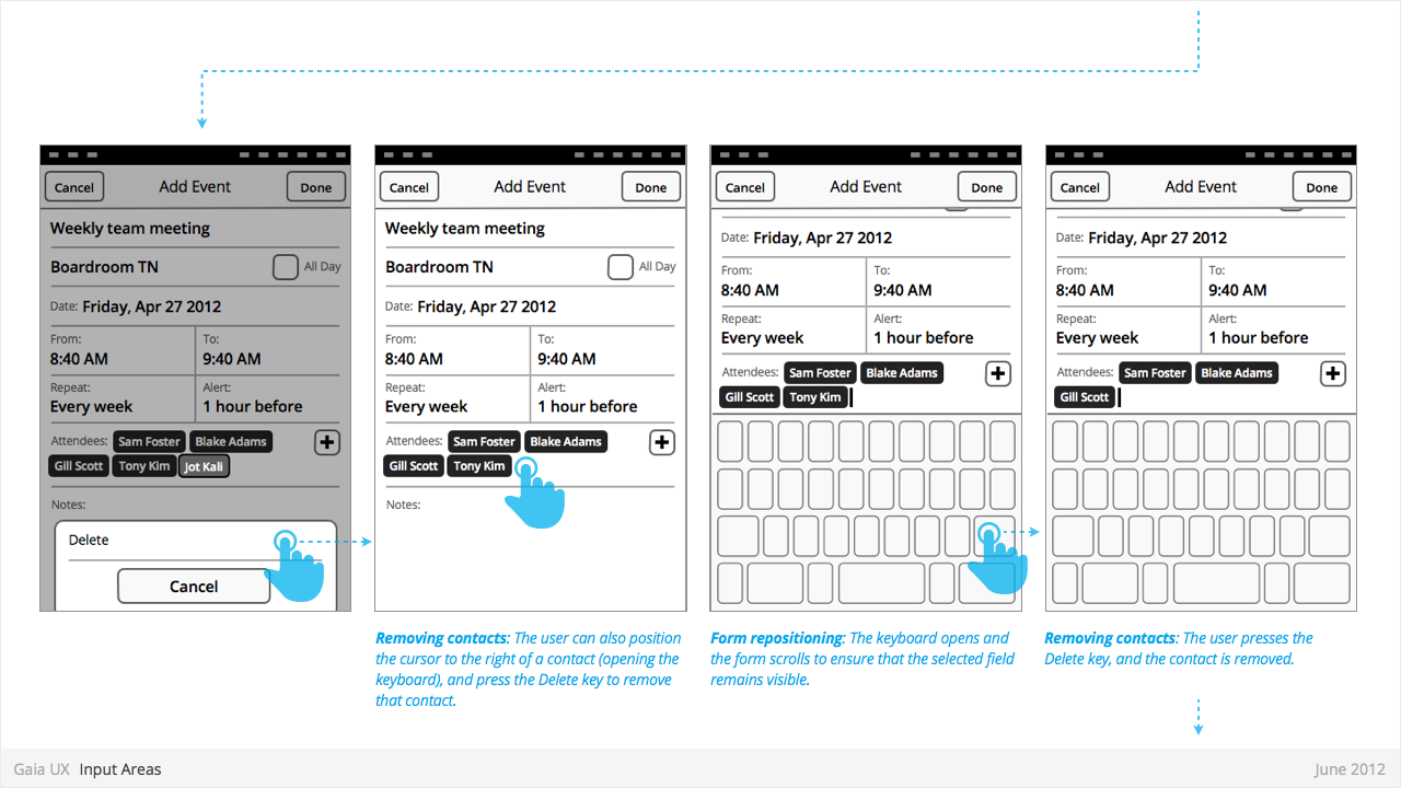
- The user highlights an entry field (eg: To), and the keyboard appears.
- As the user types, the system attempts to draw matches from the contacts.
- If one or matches are found, a small list appears, highlighting the matching contacts.
- To make a selection, the user can tap one of the rows, closing the list and adding that contact to the highlighted field.
- Alternatively, if the user wishes to clear the list, they can type Backspace until the field is clear, and there are therefore no more matches. The list then disappears.
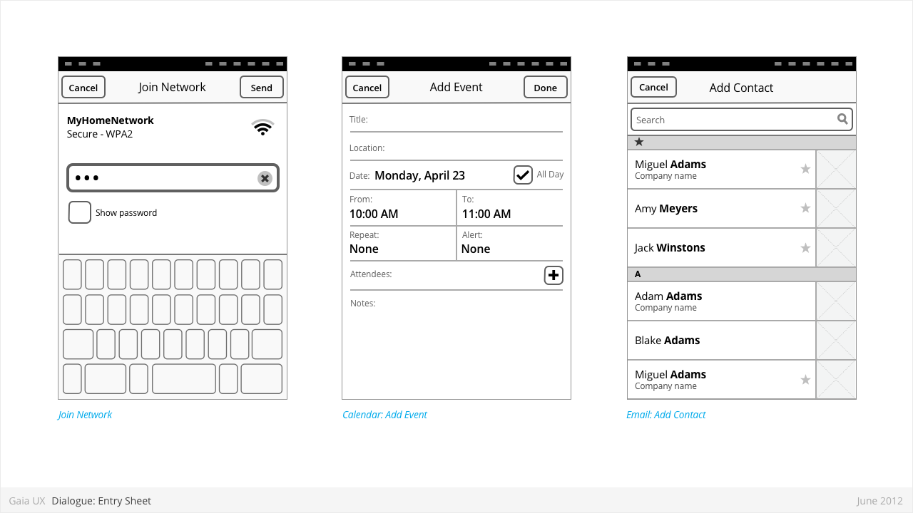
Dialogues: Entry Sheet
Used for:
- Editing a single setting that:
- Contains a large number of possible values. eg: Text entry forms, long lists,
- [or] Requires multipe inputs or selections eg: WiFi network connection process.
Characteristics:
- Occupies the full screen
- User should be given impression that they are on the same page, and that the Entry Sheet is merely a temporary modal overlay. They have not navigated one level deeper in the hierarchy.
- To reinforce this...
- Valid animations could include slide in from top, from bottom, cross fade, scale in, etc.
- “Cancel” buttons are used instead of “Back”.
- Every element within the Entry Sheet must be related to adjusting the single setting; Settings Panels should not contain links to other pages or lists.
- Closing:
- “Cancel”
- Varies: “Done”, “Join”, “Send”, etc.
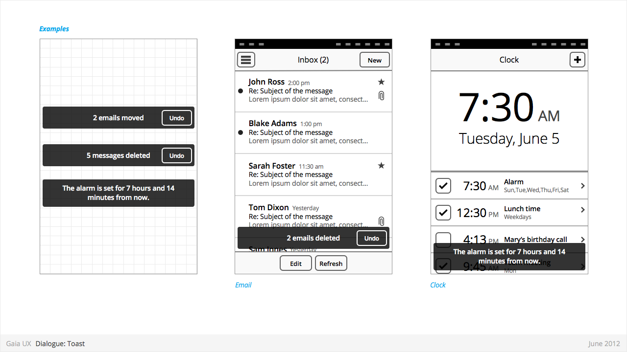
Dialogues: Toasts
Used for:
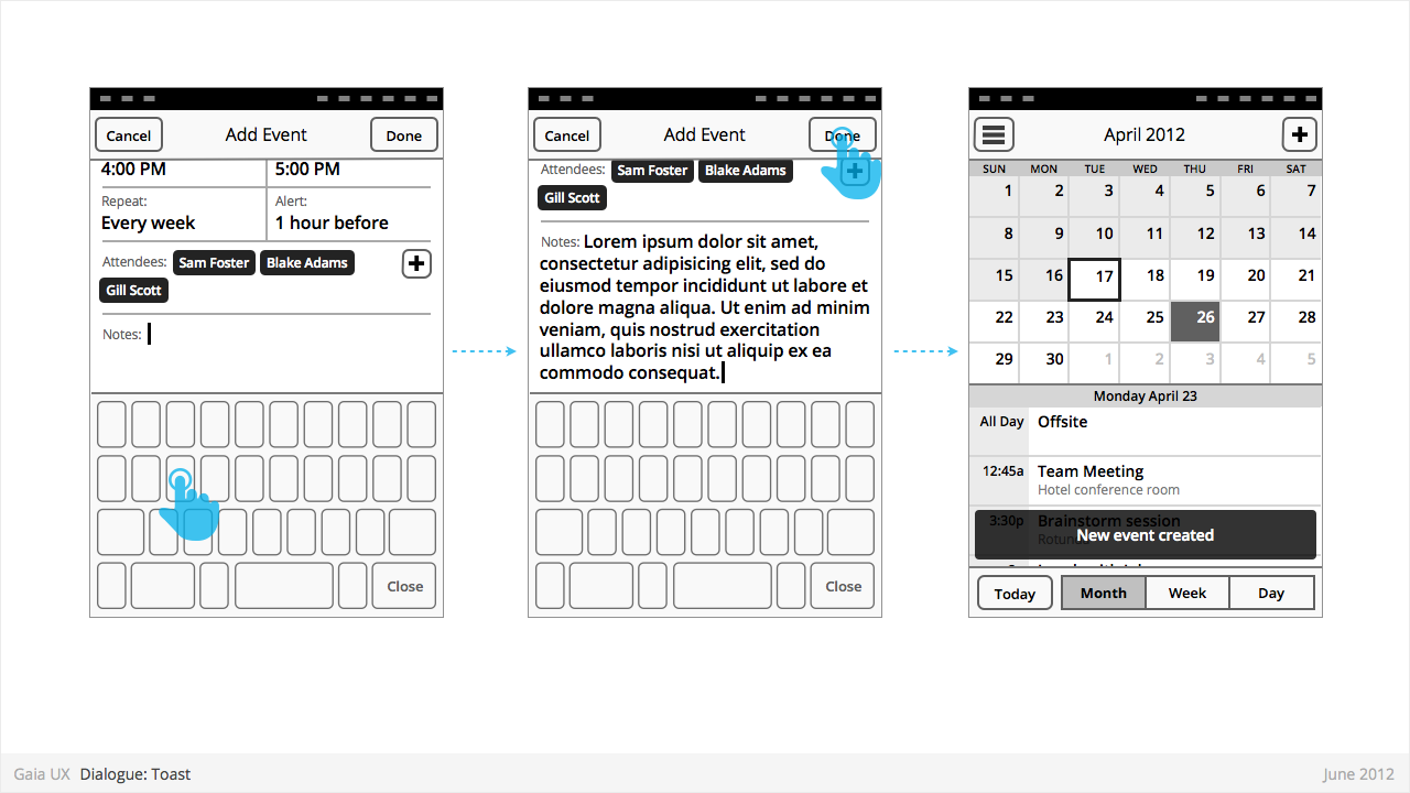
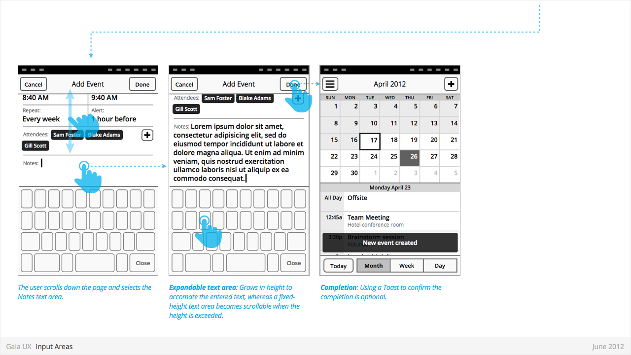
- Toasts confirm a user action, and optionally provide a follow up action (eg: Undo).
Characteristics:
- Typically appear after a multi-select edit. eg:
- Deleting multiple photos from (Gallery)
- Deleting multiple emails (Email)
- Moving multiple emails (Email)
- Toasts are positioned at the bottom of—and layered on top of—their associated content view.
- Toasts should be non-intrusive, and never cover up other UI elements (eg: toolbar, tabs, etc).
- Optionally provide opportunity to take related secondary action via button (eg: Undo).
Drawer
Used for:
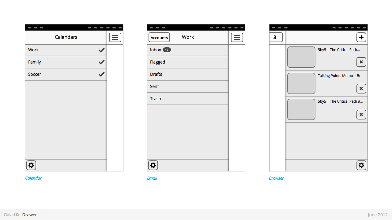
- Providing access to top level navigation links that may be too numerous for a Tabs pattern, or user-generated, (eg: Tabs, user accounts etc).
Characteristics:
- Provides access to top level navigation links that are usually user-configurable (eg: accounts in Email and Calendar, or tabs in Browser).
- Is also a great place to tuck secondary or power-user features, such as links to app Settings.
- Position: Should be positioned on left side of screen, but can be positioned on right in rare circumstances (eg: Browser).
- Open: should be opened via standard "Drawer" button, but other buttons can be used in rare circumstances (eg: numeric tabs button in Browser).
- Close: can be closed by tapping viewable area of the primary interface. And in future versions by swiping horizontally from bezel.
- Traditionally visually depicted as being one layer below the primary interface, and sliding in from the side via animation.
- Width: variable, but must always leave sufficient room for the "Drawer" button on the primary interface to remain fully visible.
Input Areas
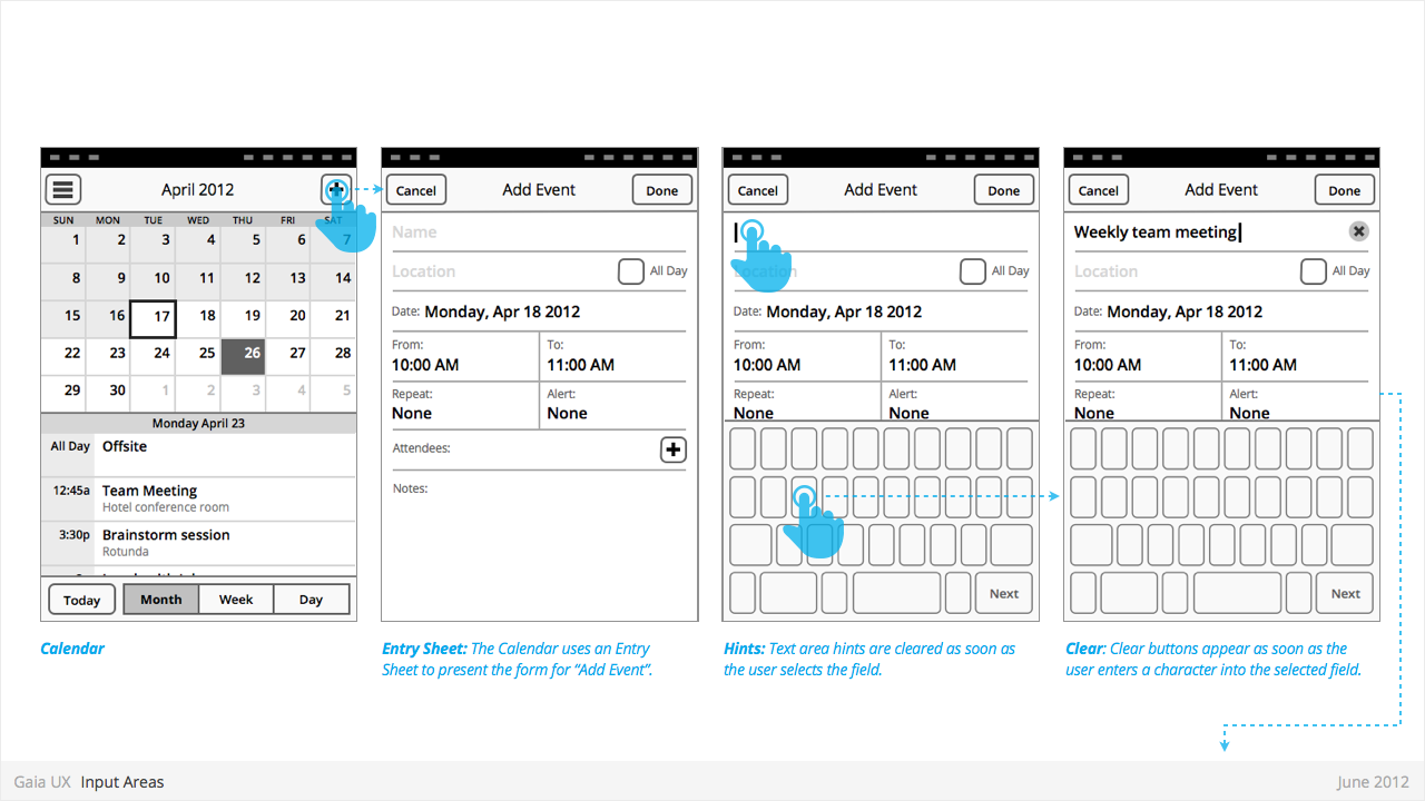
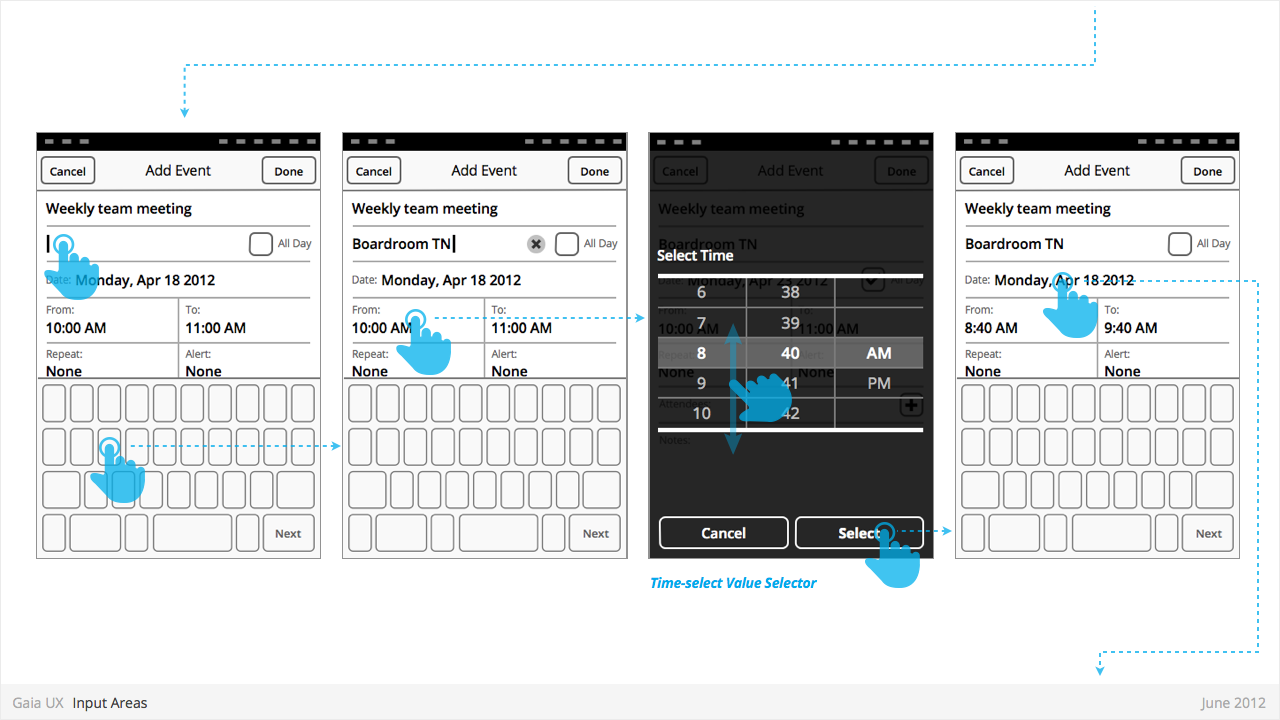
Used for:
- ...
Characteristics:
- ...
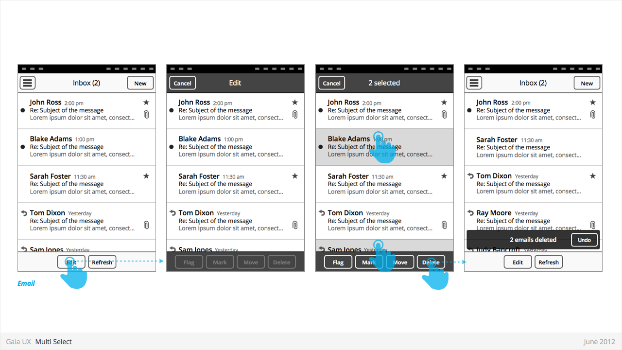
Multi-Select
Used for:
- Enables user to perform “bulk actions”, such as deleting 6 emails from a roll of 20, or selecting 3 photos to email to a friend.
- Is used on lists of items (eg: vertical list of emails in Inbox, or grid of photos in Gallery)
Characteristics:
- Is entered by...
- Is a “mode”, not a section. Animation and visual design should give user the impression that they are in a temporary mode within the original view, not that there are in a differerent view.
Can be called “Edit” or “Select” mode, depending on the use case. Header text should indicate action being taken (eg: “Select photos”). Once an item has been selected, text should update to “X selected”, where X = quantity of selected items.
- Closes once the user:
- ...completes one of the available actions (eg: “Delete”).
- ...or taps “Cancel” button.
- Closing resturns user to the previous view.
- If user has taken action (eg: delete 3 message threads), a Toast should appear, confirming the action.
States
- Normal
- Focused
- Disabled
Settings
Used for:
- ...
Characteristics:
- ...
