Mobile/UI/Designs/TouchScreen/Fennec 1.1+/Revised Functionality and Layout of Form assistant
NOTE: This work is in progress
Problem description
<TBD>
Basic components
In this proposal, Form assistant uses basically the same components as the current version (1.1) of Fennec. However, there are some changes.

Basic layout
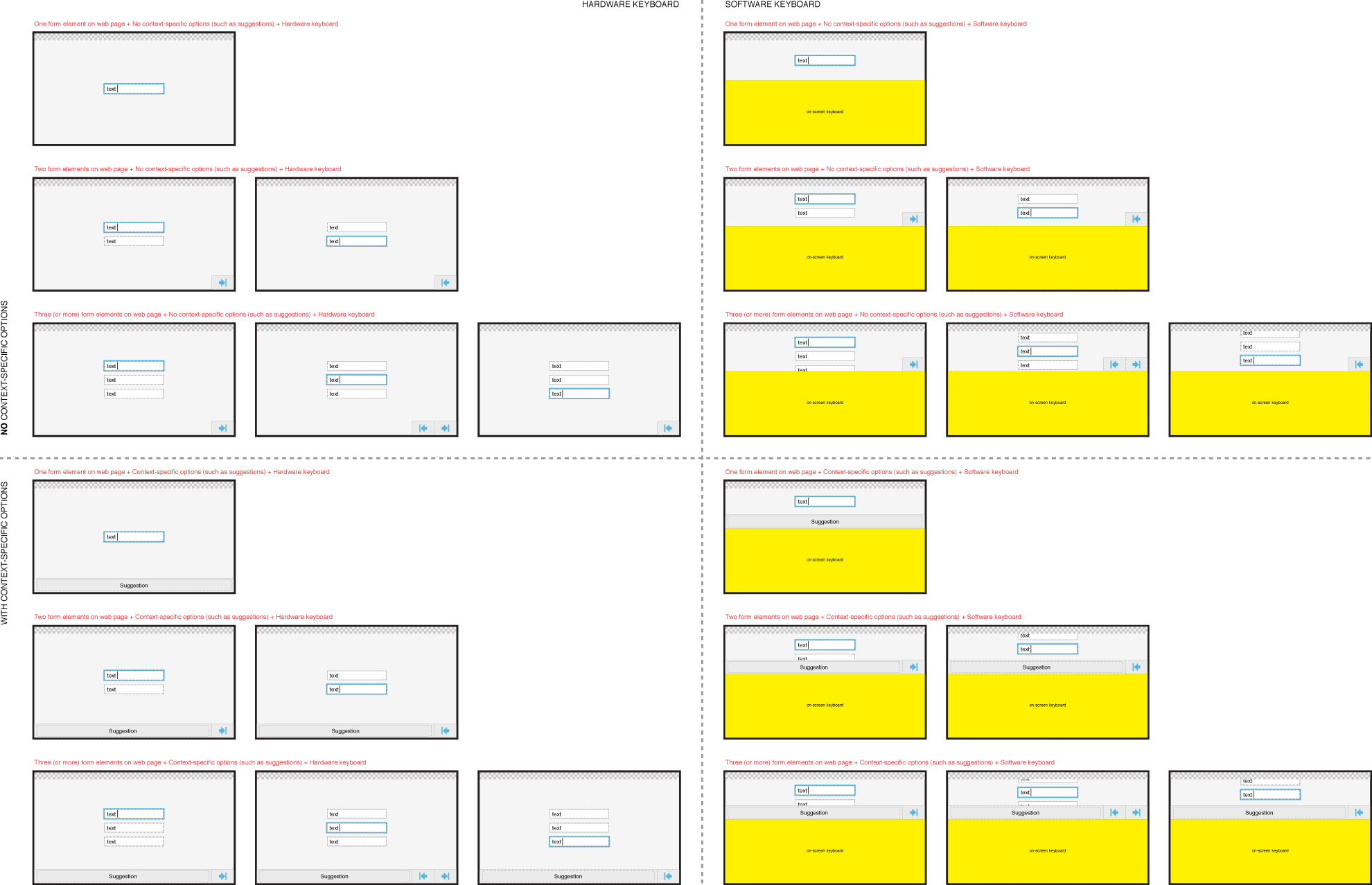
Similarly to current version (1.1) of Fennec, the Form assistant should locate in the bottom of the view, however always above the Virtual text input methods (i.e. never be covered by a Software keyboard).

Form assistant should be useful with both Hardware and Software keyboards. Because Software keyboards generally take half of the screen (typically a bit more in Landscape and a bit less in Portrait orientation), the Form assistant should take as less screen estate as possible to leave room also for the actual form element and/or web content in the view. For this reason the Form assistant should take one row at maxmum and it should not take full width of the screen unless it is really needed for e.g. showing context-specific option such as suggestions for text input fields or search for (single and multi-selection) Choice lists. Of course, finger-usable choice lists will take more space in opened state.
Anyway, the controls of the Form assistant must be big enough for using with fingers (or even with thumb). This is contradicting the aim to maximize the space for the Web content even when a Software keyboard is involded but could stil be doable. It most likely would not spoil use experience, if the Form assistant was displayed only when it is reasonable and really needed, and it displayed only relevant options (which can be used for something real – i.e. did not waste space for dimmed options). For example, if a web page contained only one form element (e.g. text input field), there is no mean to provide dimmed Previous and Next options, because they just take space from content. Form assistant could waste space for something useful.

See the figures below for more detailed view on the case above.
Landscape orientation (see full size image)

Portrait orientation (see full size image)

Text input elements
The aim of redesign is to
- link existence of Form assistant to Focus state of text input element. The Form assistant is displayed when a text input element is in focus and hidden when focus is dismissed. Because page is zoomed in as the result of activating a form element, it should be easy to reset focus back to the form element (or to another element) just by tapping it directly.
- minimize the size of Form assistant and make it more applicable for using with Virtual text input methods (both in Landscape and Portrait orientation).
- avoid horizontal scrolling of suggestions in a small row potentially in the middle of content sensitive to drag/flick interaction.
Layout
Layout of Form assistant for editing Single line Text input element.

Layout of Form assistant for editing Multi-line Text area element.

This might relate more to functionality of text input elements and probably it is obvious, but Fennec should (auto-scroll the web document to) keep the caret always in the view when the user is editing content in a large text input element.
Functionality
With the implementation detailed below, the Text input elements would work consistently with desktop Firefox.
Inserting focus to a Text input element on a web page
- Single tap on it
- Tap Next/Previous button of Form assistant (if they are available)
Removing focus from a Text input element on a web page
- Single tap outside of it
- Close Software keyboard (with the function/button/etc provided by keyboard)
- Tap Next/Previous button of Form assistant (if they are available)
Form assistant should be
- opened or stay open, if the user inserts focus to a text input element.
- closed, if the user removes focus from a text input element and it does not result inserting focus to another form element you could use with Form assistant.
See the image below for basic focus behaviour:

See the image below for focus behavior if there was several text input element on a web page. NOTE: Tapping a text input element while editing another field should of course move the focus the the tapped field (the image would have become just too busy if I had added the arrows for them).

Potentially, there is no space for displaying the suggestion in another bar above the Form assistant in the view when entering text into a single line text input element with Virtual keyboard in Landscape orientation. The suggestions should be displayed in the same row/bar as the Previous and Next buttons (if they were available).
The solution to provide suggestions as a horizontally scrollable list can be troublesome because it can be in the middle of content/controls that can be moved or trigger other functions with the drag/flick interactions.
The design below requires further iteration but couldn´t the Form assistant expand to take full width of the screen, if Fennec is able to suggest content for the text input field, and display suggestions as buttons. If there was not enough space for showing all suggestions available in one row, the Form assistant still could display the most relevant candidates as buttons for instant use and an additional button (with indication how many more suggestions there are available) for invoking a menu listing all suggestions. If you selected an item from the menu, the string would be inserted to the text input field, and if you tapped outside of the menu, the list would be closed but the focus would still remain in the text input field.
The suggestions row could have either free width or it could be stretched to fit to width of the screen. I am not sure which one would be better. Free width would follow the overall logic to cover as less content as possible but it might look a bit busy in some case.
Free width:

Streched width:

Figure illustrating the suggestions list is to come later on...
With the implementation detailed below, the Pop-up menu would work consistently with the Fennec´s context-sensitive menu and desktop Firefox.
Layout
<TBD>
Functionality
Inserting focus to a Pop-up menu on a web page
- - Single tap on it
- - Tap Next/Previous button of Form assistant (if they are available)
Removing focus from a Pop-up menu on a web page
- - Single tap outside of it when in closed state
- - Tap Next/Previous button of Form assistant (if they are available)
Opening a pop-up menu/list
- - Insert focus to it (see above)
- - Tap pop-up menu when it is in closed state
Closing a pop-up menu/list
- - Tap list item: selects the ietm
- - Tap outside of list or Form assistant (cf. Context-sensitive menu)
- - Start panning outside of list or Form assistant (cf. Context-sensitive menu)
- - Tap Next/Previous button of Form assistant (if they are available)
Form assistant should be
- opened or stay open, if the user inserts focus to a pop-up menu.
- closed, if the user removes focus from a pop-up menu and it does not result inserting focus to another form element you could use with Form assistant.
<figure to come>
Multi-selection Choice list
Multi-selection Choice list should work similarly to Pop-up menu except that selecting a list item would not close the menu. To exit the menu (with the currently selected items), the user could tap outside of the menu (or start panning outside of it) or tap the Previous or Next button if they were available.
<figure to come>