Fennec/NativeUI/UserExperience/ReaderMode
Below is the proposed first version of a reader mode for mobile Firefox.
- All the mockups (some old) can found in this Flickr folder.
- Bug #750678 is related to reading list navigation (and may end up implementing some of the mockups below).
- Other reader mode bugs are tracked by #696921 and this blog post shows screenshots of an early UI implementation from June 2012.
User Interaction
1. How to Access Reader Mode from the Browser?
Problem: The new browser design is heading towards a chromeless / buttonless aesthetic, how do we introduce the reader mode?
Solution: The reader mode can hidden the the menu invoked by pressing the hardware/software menu button or with an icon which appears in the URL bar. In tablets there is another possible interaction: it would be interesting to have a feature (perhaps ON by default) where when you rotate the device from landscape to portrait the page would automatically enter reader mode.
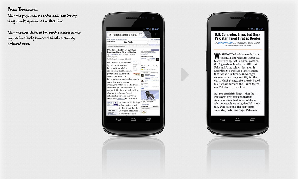
Proposed Visual Design Mock Up
2. Proposed Interactions
Problem: Add functionality to the reader mode while still maintaining a chromeless, reading focused layout.
Solution: Introduce off screen menus rendered visible with swiping gestures.
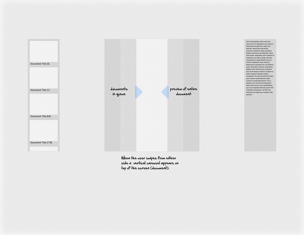
Sample Interaction Flow
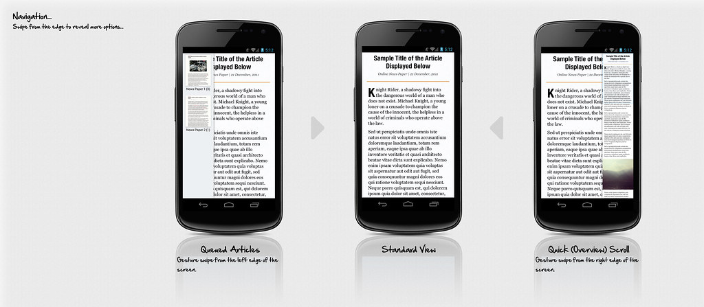
Proposed Visual Design Mock Up
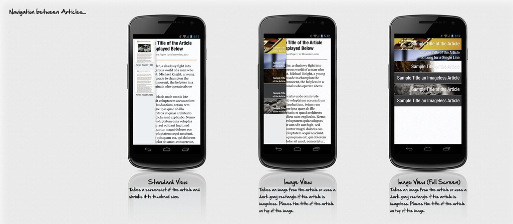
Examples of Article Navigation (Potentially for a future release)
3. The Toolbar
Problem: How do we access / display the various options without intruding on the reading experience
Solution: On tapping of the screen a translucent tool bar appears, further options can be invoked by pressing the menu icon in the bar, or the hardware menu key.
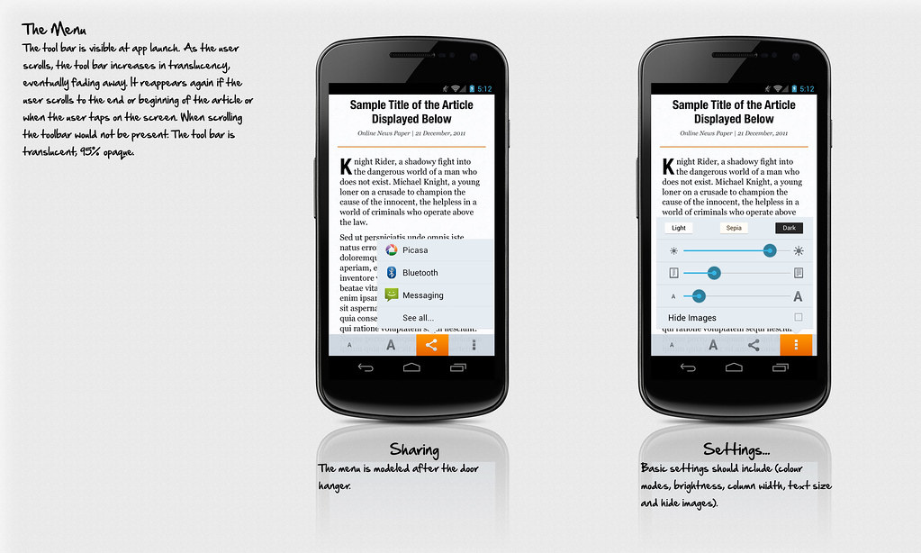
Proposed Visual Design Mock Up
4. Visual Variations
Various Examples:
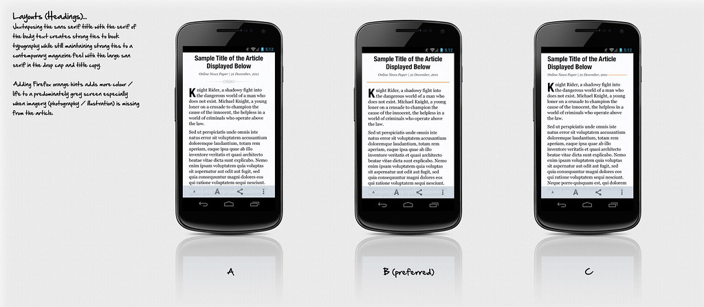
Overall Layout & Typography, Sans Serifs will likely be Open Sans as seen in the later mock ups
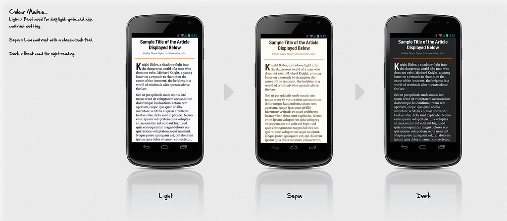
Colour Themes
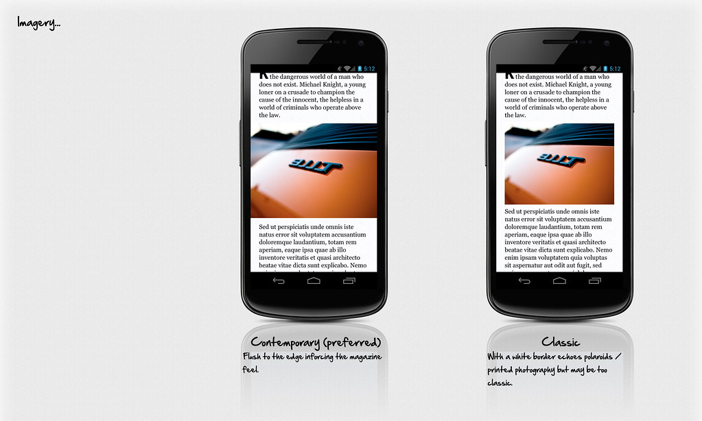
Image Treatement, ideally if we could aim for the left example, flush layout.
5. Scalability
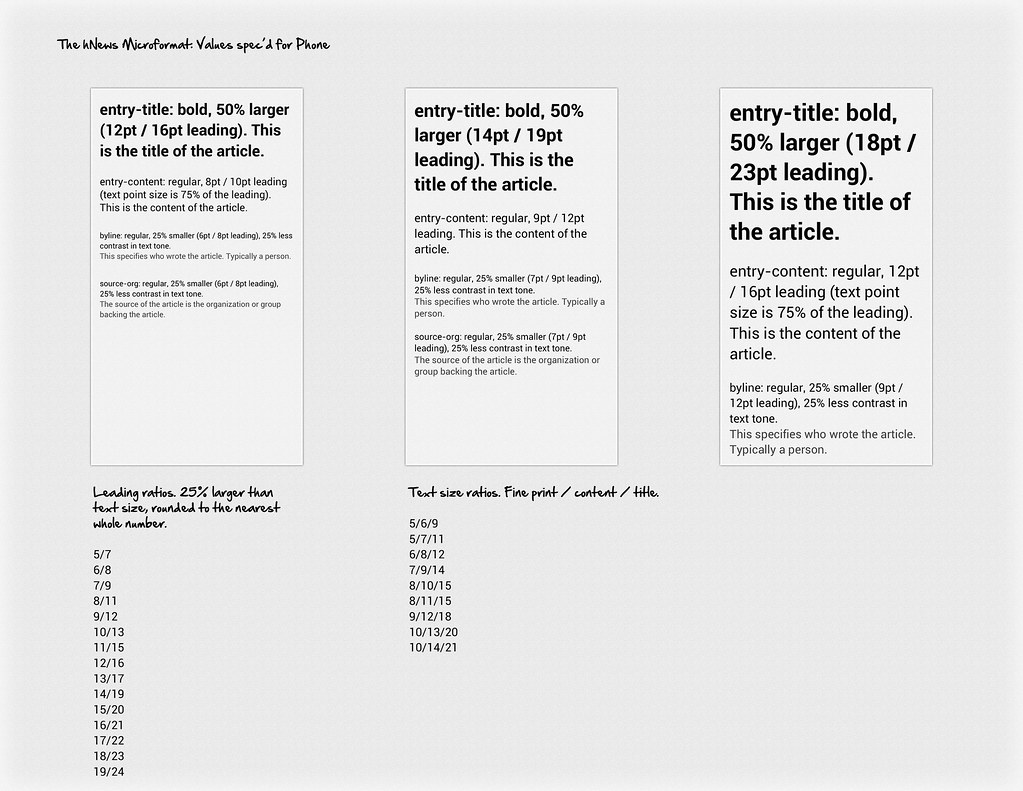
Typography size scaling ratio pairs, we will need to create different ones for 7" and 10" tablets
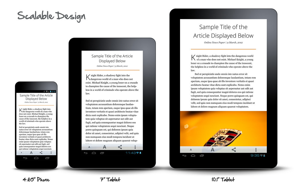
Phone to Tablet scaling, notice titles and picture location is different, we will need custom settings for various form factors
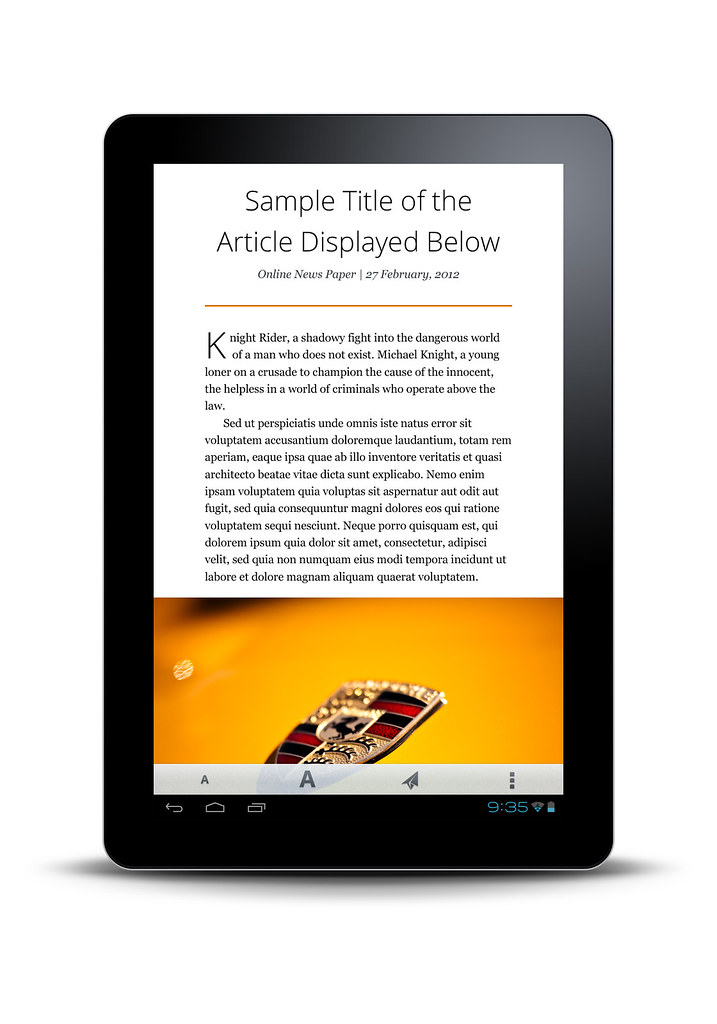
10.1" Tablet, looks great in portrait
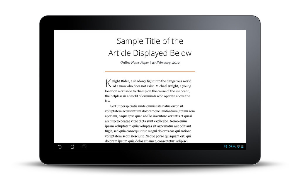
A bit awkward in landscape, but ok for v.1
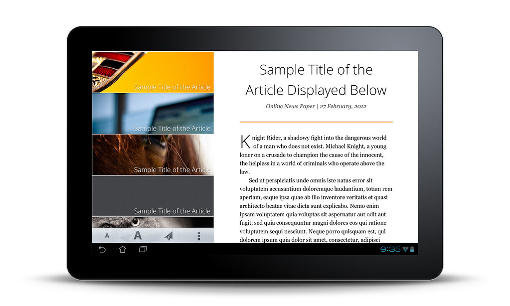
Perhaps we can add images or article scroll menu in landscape to maximize the space? v.1 would be nice, but if not v.2?
Discoverability
Early user feedback in bug 696921 suggests that discoverability may be an issue. One way to alleviate this might be to create a "first-launch" help screen for Fennec. Attached are some examples of prior art (mostly iOS apps, with links to source) for such help screens. Some first-use help is implemented as a "walkthrough" with several steps, or even a "play-through" animation. Others have shaded overlays with callouts describing the various UI elements, or make use of the blank area within the app's "home" screen to highlight elements of the UI.
First-Launch Help Screens: Prior Art
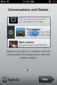
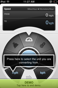
The Tapbots iOS apps
These apps have very intuitive first-launch help screens which introduce new users to UI controls and gestures. The Convertbot app even has a "play-through" animated demonstration of the app's features.
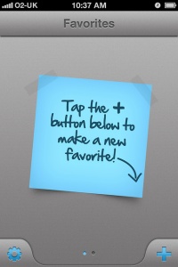
Favorites 2 by Matt Gemmell
When the app is first launched, the empty speed dial screen shows this help:
Articles by Sophia Teutschler
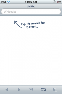
This is another app with a very minimalist UI, like Fennec. When no articles are open within the app, a callout directs the user to the search bar at the top of the screen.
