Firefox/3.0 Windows Default Theme Issues
Dated Look & Feel
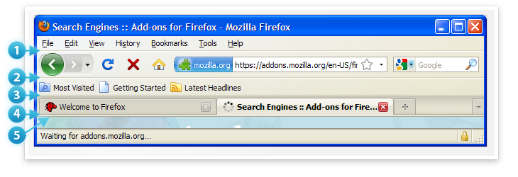
Windows Vista was released in November 2006 bringing with it Aero Glass, a move towards eliminating the Menu Bar and a smoother, slicker look and feel. Mostly gone are the clownish and garish colors of XP Luna. This was over two years ago. 
Vista Introduced:
- Slightly rounded corners on etched location bar.
- Removal of Menu Bar.
- Aero Glass creates a smooth frosted look for potential use in toolbars. In the absence of Aero the toolbar has a smooth blue gradient.
- Move towards contextual action driven toolbar.
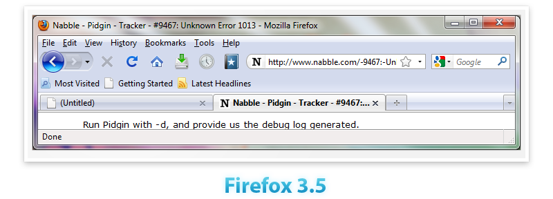
Firefox currently does not observe any of these conventions. Even though Vista uptake has not been substantial Windows 7 proves that the platform is staying the course with these visual changes. Other browsers like Chrome and Safari have already headed this direction with resulting slicker looks and a streamlined UI.
Inconsistent Icon Usage on the Main Toolbar
The icon set used on the main toolbar is inconsistent. Some of the icons are glyphs in the spirit of Media Player while others are more representational traditional icons. Icons also have a variable size with some being larger/smaller than others creating visual alignment issues.
Bumpy Toolbar Texture
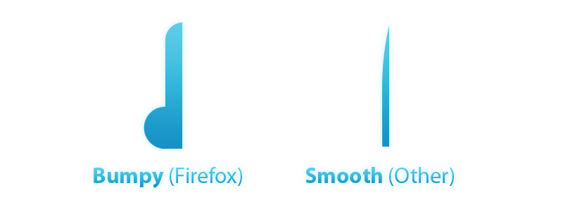
Vista also brought along a push towards smooth gradients for toolbars and interfaces (much like OS X). This can be seen natively when Aero is not enabled and also in other applications such as Office, Paint(Windows 7), WordPad(Windows 7), Safari, Chrome and Postbox. Firefox, in part because of the menu bar, takes on the default anemic purplish hue for toolbars but it also goes from Gloss to Flat to Gloss creating a bump effect. This is not a sleek profile:
UI Height/Footprint and Horizontal Line Problem(they aren't slimming)
Firefox on Windows has a very tall UI compared to other browsers and even Firefox on OS X.
Firefox on XP has another problem with a multitude of stacked horizontal lines(at least 5). This actually serves to exacerbate the large footprint problem by drawing attention to it. 
Element Overload
Firefox currently has a lot going on visually that can potentially be combined, hidden, removed or relocated.
- Home Button - Isn't very useful and yet gets prime toolbar positioning
- Stop/Reload - Can be combined with each other and the "go" arrow and inserted into the status bar. (or appear in place of the favicon in each tab after mouse-over... - just a thought - ... because users are used to find these buttons on top and not at the bottom of the window)
- Back/Forward Grouping Element - Of questionable value vs. its ability to add visual complexity (can possibly remove the dropdown arrow outright)
- Awesome Bar and Search Bar - Have convergent purposes and yet are still two elements.
- Menu Bar - Can be hidden and key functionality moved to Page & Tools buttons.
Lacks Tactile Look & Feel
The current use of buttonless glyphs and traditional icons leaves Firefox feeling a little flat. Glyphs combined with buttons that have depth are inviting. Throw in a nice pressed state and they are buttons that want to be pressed. (see OS X, Chrome, Safari)
Cross Platform Divergence is too Great
In an effort to push for platform integration it is possible that Firefox's visual look and feel has diverged too much. Even within Windows versions there can be fairly drastic differences. It is possible to achieve platform integration while maintaining the "Spirit" of the platform but also experimenting and "bending the rules".
Insufficient when Handling Multiple Pages
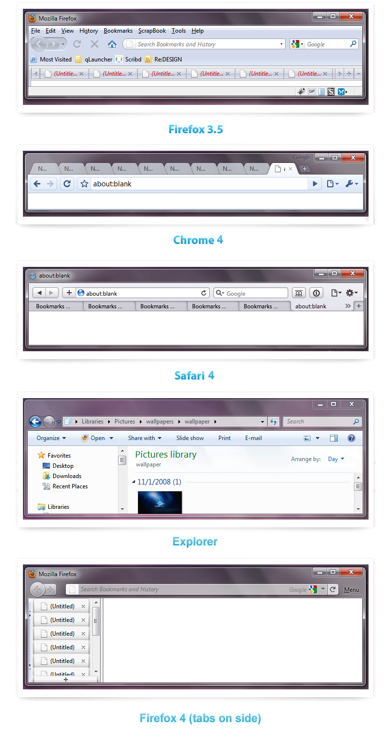
Current browsers make it difficult for a user to manage more than eight pages, yet it's not uncommon to see people with 15+ tabs. The Vista user experience guidelines state if there are eight or more tabs they should be vertical.
Information shouldn't be sorted in a heterogeneous way, that's why tabs are movable. Although they are movable they are not automatically sortable, by default a user has to manually sort tabs. Sorting tabs becomes difficult when all tabs aren't visible, you can't group or even go between similar pages when researching if you forgot that you have that page open unless you see it.
How would one go about solving this problem? Ask which interface native to Windows would serve a tab's function better. A couple possible solutions:
- Manage pages with images the way Windows 7/Mac OS manage windows
- Manage pages like an ordered list, instead of the unordered format it has now, like file browsers do in Windows 7/Mac OS.
- Allow pages to have tags (or better yet create a service that does this for you by domain).
- Allow pages to be categorized like they are in Windows/Mac OS with their tree style sidebar.
- Let the bookmarks be their own page instead of another window or bar


