Mobile/Archive/AwesomeScreen2.0
Contents
Summary
Create an integrated view of
- pre-typing awesomeresults (quick dial/your top 10/etc.)
- access to
- bookmarks
- history
- remote tabs/pages
- snippets
- notification of what's new
Similar in function to desktop Firefox plans for a home tab.
Current Status
Next Steps
Related Bugs
Team
- Designer: Madhava
- Developer: Vivien
Designs
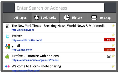
With existing address-bar designs
Default View
In Fennec 1.0-1.1, the awesomescreen provides a list of frecency-based suggestions (base set before typing, and improved suggestions during typing). It also provides an always-on-screen set of search buttons.
In this design for a revamped awesomescreen, several new items are integrated into the view, while one (search buttons) are moved so as to not always be present (see work going on in Virtual Keyboard
This annotated mockup summarizes the changes to the structure and components of the screen:
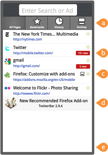
- (a) - sub-categories
- By default, the awesomelist will show an annoted (there are indicators of which ones are bookmarks or tagged, etc.) history set, ordered by frecency and, once typing has started, by closeness of match to the search terms
- there are times, though, when a user wants to use a browse strategy rather than a search strategy to find a particular item
- at these times, it may be faster to look through a set of just bookmarks in their natural order (and hierarchy), or just history, ordered chronologically
- tapping on one of these category "tabs" will show a subview of just that subset of awesomelist items, ordered and grouped in a way that makes sense (see mockups, further down the page)
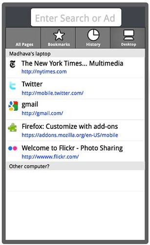
- while providing these more traditional views, it also makes sense to locate the set of "remote pages" -- synced tabs -- here (these should be incorporated into the full superset awesomelist when looking at "all pages"
- (b) - badges
- These are provided, where possible, to give a user a sense of whether there is anything new waiting for him/her at the listed site.
- Two examples: unread email on gmail; messages on Facebook
- the intention is that users can know, before having to load a site, whether there is any reason to actually go there
- (c) - more type indicators
- We already indicate which of the listed pages are bookmarked, as well as listing tags
- On desktop, we're starting to indicate which items are already open in tabs; we should do this here, too
- We can also show which ones are open remotely (as shown in the mockup)
- We could also show which ones were shared
- (d) - snippets/banners
- these are a method (to be used sparingly, and only when there is high user-value) to display messages to the user
- examples: an important new add-on; a security or major version update
- these should only be on-screen before a user has started to type; once typing has started, only actual awseomeresults that match should be shown
- (e) - relocated search bar
- the search bar is no longer permanently along the bottom of the screen; see Virtual Keyboard for details
And here, in landscape:
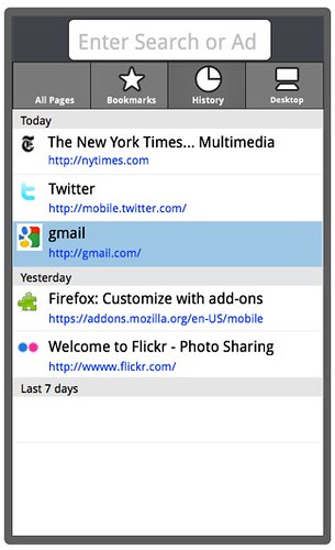
History View
Remote Pages View
In-place Editing
- a long tap on a row should allow whatever editing is possible for that item type (i.e. "managing" the row for a bookmark)
- users should be able to share any type of row (history, bookmark, etc.)
Other proposals
- Related thinking from [Pflippp] https://wiki.mozilla.org/Mobile/UI/Designs/TouchScreen/Fennec_1.1%2B/Awesomescreen_content_structure_revision
Addressbar-less designs
The same concept -- an integrated view of your part of the internet -- but in a browser without a full-time address bar. The advantage to this design is that it's easier to have this content be a _page_ rather than an overlay/popup in that it's not the result, from the user's perspective, of tapping on a text-entry field.
- View of of a loaded page; "home" button, to go to the awesomepage, and site button are visible
- Awesomepage loaded; top indicator of where you are (not a tappable button) - visual treatment to change
- Site info/actions popup