Mobile/Fennec/Extensions/UserInterface
Introduction
When thinking about how to design the user-interface of your mobile Add-on, there are a couple of constraints that are different from fitting into Firefox on the desktop. Here are two:
- How should the add-on's design be different just because it's for mobile
- How can the design fit within the design of Fennec, specifically
These two overlap, given that the design of Fennec was itself heavily influenced by point number 1, above. This guide will address both points, in sections 2 and 3, below.
General UI design for mobile
There's a mid-sized and furiously-growing body of knowledge about designing UIs for mobile. I've included some links to further resources and some recommended books for more in-depth coverage (see section 2.3), but what follows should get you started thinking about the main issues.
There are two major categories of considerations in mobile. Simply, you have to take how both parties in the interaction, the device and the person, are different in a mobile context. The first -- that the constraints imposed by and the functionality available on a mobile device differ from their desktop counterparts -- is probably the more obvious and well-thought-through. The other, that the way that people behave and use technology while mobile is different than while they're at desks, is equally if not more important. A good design for mobile takes both into account.
Device Characteristics
The following is a list of the most relevant characteristics of the current generation of mobile devices.
Small screens
- They're getting bigger and higher resolution, but they're still small
- Pare down what you put on the screen to the minimum - you have limited space to work with; if something isn't directly relevant to the task at hand, consider moving it away or getting rid of it
- You are further limited in that finger-size is fixed, even as resolution gets higher -- you can fit only so many points of interaction (like buttons) even as you can display more
Difficult to type
- Even with good predictive suggestions on soft keyboards or physical keyboards, typing is almost always more difficult and time-consuming than on a full-sized keyboard
- Try to minimize the amount of typing a user has to do
- let them pick from lists or make suggestions as to what they might want (which you can improve based on input like the awesomebar) that they can tap on
- remember previous input so users don't have to keep re-entering it
Direct manipulation - touchscreens
- It's not all just limitations! Touchscreens allow for very rich physical interactions
- look into to gestures, and follow the emerging design patterns
- remember that you're designing for finger size, not just fitting on the screen. Higher resolution will mean you can fit more on the screen, but fingers will still be as big as ever. There's a reference for finger size here
- certain principles from the desktop don't apply in the same way; as an example, Fitts' Law's implications are different:
- consistency of placement is more important than having controls be close together
- screen edges don't confer the "infinite size" easy-to-hit advantage
Many abilities - rich devices
- devices have cameras (multiple!), microphones, location-positioning abilities, compasses, accelerometers, to name the common ones
- think about what you can do with them, and also how they can help you avoid making users type
Constant but interruptible connection
- users are never on a wired connection, or even necessarily wifi, so interruptions are more common; try to fail and recover gracefully
Mobile User Characteristics
People are different in what they want and do while not in the special-case context of a desk and computer. Here is a quick list, based on a taxonomy from Designing the Mobile User Experience by Barbara Ballard, of some of those differences.
Mobile
- People can be on the move - they're already navigating in the real world, and so using the parts of their brains that do help them do that. These are the same parts that help them figure out complicated UI navigation -- they'll be in contention!
- not much with them, other than themselves and the device; you can't rely on people being able to write anything down, for example
- a user's motor precision will not be at its peak
Interruptable and distraction-prone
- The outside world will take priority - user won’t necessarily be able to choose the best time for software
- this means that your UI should always deal well with being made to wait, if a user's attention goes away
- a user may be looking away and back, so if something changes in the UI, it should be clear where you've taken them, and how that relates to where they were before (they may have missed the transition)
- There are fewer social cues to other humans that they're engrossed in a virtual activity compared to a person at a desk staring at a screen, so those other humans will interrupt them more (and they'll take priority)
Available
- People take their phones/devices with them everywhere
- But it's not always a good time, so don't be too demanding
Sociable
- Away from their desks, people enter their more natural mode, which is as social creatures; in fact, even at their desks, people will use their mobile devices as links to their social world (through IM, calls, SMS, etc.)
- It's not that the mobile device makes people more social, but that the devices are present when people away from the contexts in which they are less social (i.e. work)
- In your designs, think about how (a) users might share (electronically) what they're doing with someone else and (b) whether it would change your design if a couple of people would be involved in the interaction (i.e. showing other people photos on the device)
- online sociability vs. sociability in person [will put more here]
Contextual
- more affected by context -- environment affects how a device is used; it's not that context is magically more important while mobile, but that the traditional setting we assume -- a person at a desk -- is one where context is made artificially minimal
- think about implications of the following; they will matter, and you can know things about all of them, through the device:
- location
- time
- weather
- schedule
Identifiable
- users are connected to and associated with their devices even more than their computers thanks to one thing - phone numbers
- Devices tend to be personal
- Sharing, at least in North America and Europe, is rare
- Privacy risk, but also an means that you can assume more about the private way the device will be used
Other Resources
Other resources
- Apple mobile web app interface guidelines: http://developer.apple.com/safari/library/documentation/InternetWeb/Conceptual/iPhoneWebAppHIG/iPhoneDesignPrinciples/iPhoneDesignPrinciples.html#//apple_ref/doc/uid/TP40007900-CH8-SW1 (The principles and guidelines section is useful for general mobile design considerations)
- On finger size: https://help.ubuntu.com/community/UMEGuide/DesigningForFingerUIs
- wiki of mobile design patterns: http://patterns.design4mobile.com/index.php/Main_Page
- about uses for location: http://www.littlespringsdesign.com/blog/blog/2008/10/09/location-services-beyond-maps-directions-and-local-search/
- some best-practices: http://www.usercentric.com/news/2009/08/26/best-practices-designing-mobile-applications
- the set of documents of which this one is a part: https://wiki.mozilla.org/Mobile/Fennec/Extensions
- Books:
- Designing the Mobile User Experience by Barbara Ballard
- Mobile Interaction Design by Matt Jones and Gary Marsden
- Designing Gestural Interfaces by Dan Saffer
Fitting in Fennec's user-interface
Fennec's design is the result of applying a lot of what comes up in section 1.1 and some of what comes up in 1.2 (look for more results from 1.2 in the future!). It had to be quite different from Firefox on the desktop, but it also tries to respect the spirit of the desktop design. Users coming from desktop Firefox, on encountering Fennec, shouldn't be too surprised about what's there and isn't, what they can expect to be able to do, and how certain key things (bookmarking, identity, tabs, etc.) work.
From a practical add-on developer's perspective, the first big question will be "where can I surface my add-on"?
Anatomy of the Fennec UI
You'll want to pick the most appropriate section of the Fennec UI to host your add-on, and that will depend on how and when your add-on is most needed and used.
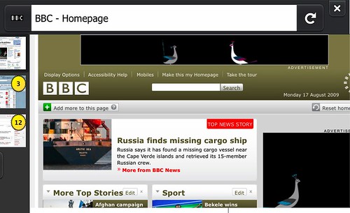
Titlebar
The titlebar is present when the application is first started, and also at the beginning of every new page load, so it makes sense to put things here that are needed at the beginning of a browsing task. It scrolls off the screen as a user pans down a webpage, so it is not a useful place to put items that are needed in the middle of a browsing task.
It contains information about the page you are currently on (page title and further site identity information
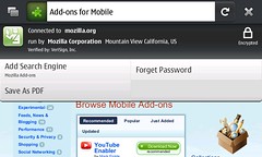
Control Bar
The control bar, just past the right-hand edge of the content area, is home to Fennec's bookmarking and back/forward controls, as well as providing access to the Browser Tools area.
The controls in this area are all focused on mid-browsing to end-of-browsing tasks. For example, a user will tend to bookmark a page only one he or she has read enough of it to know whether it is worthwhile. Similarly, a user will tap back or forward once he or she is finished with the current page.
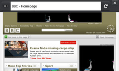
If further detail is need from the user, of if there is a short list of options that a user might want to use to further refine an action, you can use a transient popup (similar to alerts, in a later section). As shown here, in bookmarking, these popups should disappear as soon as the user taps or begins to pan anywhere off the popup.
Tab Bar
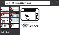
This area of the UI contains thumbnails of all currently open tabs, as well as a button to open new tabs. If your add-on relates to tab management, or if your add-on could live in a permanent tab, you may want your add-on to have a presence here.
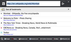
This screen comes up whenever the user wants to go somewhere on the web. The title in the titlebar is replaced with the URL, which is highlighted to make total replacement, rather than URL editing, the easier option. A list of awesomebar suggestions is presented, and this list will update with refined suggestions as a user types. The first item in the list provides access to the user's full list of bookmarks. Finally, across the bottom of the screen is a list of search buttons, to which the user can add more.
If your add-on adds context to the awesomebar, helps users enter URLs, provides navigation suggestions, or is at all related to helping with the task of going to a site or searching, this is the screen to consider.
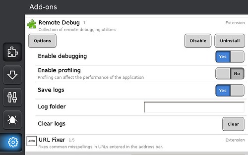
Browser Tools
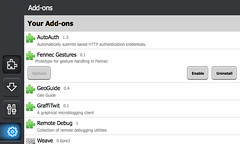
This section of the UI contains Fennec's three "managers" -- add-ons, downloads, and preferences.
Web-content is offscreen when this area is visible, which is why only functionality that does not relate to what's going on in content is here. If your add-on provides function that does not related to which page the user is currently on, this may be a good spot for it.
Notification Bars
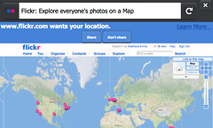
Use a notification bar to ask the user a question related to the site that he or she is currently on. In other words, if the browser or add-on is helping the user to control his/her interaction with a site ("will you allow this site to install software?" or "can this site know your location?"), then a notification bar is the UI component to use. They are attached to the titlebar so that the user knows who he or she is being asked about.
Notification bars will persist, so the user doesn't not have to make a decision immediately.
Try not to use notification bars to give the user information that is not related to current site (i.e. browser or system upkeep questions), or that does not _require_ user feedback. To communicate a bit of information the user may find helpful, but that does not require user intervention, use an alert (next section).
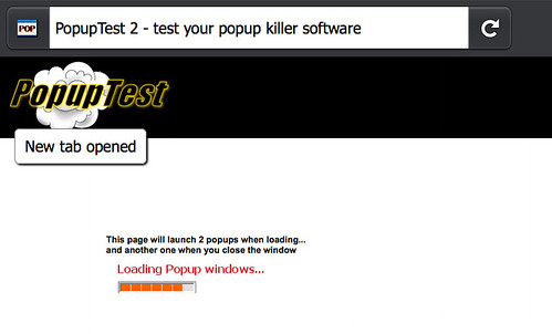
Alert Boxes

These are transient (they pop up and go away on their own) information boxes that Fennec uses to communicate things that the user should know, but doesn't necessarily have to make a decision about. Some examples: new tab opened in background, download started/complete, add-on installed, new update available.
They typically are also used more for messages about the browser or system, rather than about the page the user is on -- for the latter, especially if some action is required (block a popup? remember this password?, etc.), use a notification bar because it is attached to the site-identity-containing titlebar.
If an alert is related to something that is situated in a particular place on a sidebar (tab bar or control bar), try to line the alert up vertically with that thing. Examples: "tab opened" is aligned with the opened tab thumbnail; alerts relating to the add-ons manager, downloads, or prefs are aligned with the Browser Tools button in the control bar.
Use a symbol/icon to associate the alert with the button or area it refers to.
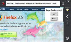
Site Menu
This panel is displayed when a user taps on the favicon (or Site Identity button) next the address bar. It's purpose is to provide more detail and options related to the page the user is viewing.
By default it shows security information, controls to add a search providers and clear site-specific preferences, and commands to share, save, or find within the page.
Add-ons can use the site panel to display additional information or actions related to the current page. For documentation see /Site Menu.
Context Menu
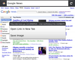
The context menu appears when a user does a "long tap" (touch and hold) on a link, image, or other page/UI element.
Add-ons can add new commands to the context menu. For documentation see /Context Menu.
Bookmarks List
to come
Equivalents for desktop UI areas
That's fine if you're creating something from scratch, but what about bringing your desktop Firefox add-on over to Fennec's different UI-space? What if you're using application menus, toolbars, sidebars, or status bars?
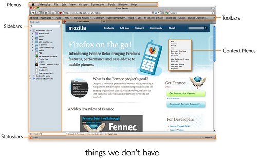
Fennec doesn't have any of these! It's helpful to think about what these areas tend to provide, and then look for ways to accomplish the same ends with the tools that Fennec provides.
- menubars: random access to many, many options
- toolbars: quick actions, quick access to sites, alerts, ambient indicators, search
- sidebars: concurrent/background tasks, tools for content area
- statusbars: quick access, alerts, ambient indicators,
So what can you use instead? Here are some ideas:
- Sidebars -> permanent tabs? The idea behind sidebars is to provide ambient or close-at-hand access to persistent (list of bookmarks, notes) or updating content (like a twitter feed). On a small screen though, keeping it on-screen isn't really an option. Close-at-hand, though, is an option -- and it turns out we already have a handy mechanism for quickly switching between sets of content: tabs.
- quick access to sites -> awesomebar screen Quick access to a site is what bookmarks are for; if your add-on, as part of its set of function, also adds quick access to a site, consider making it a bookmark.
- Ambient indicators -> alerts When something happens/changes that a user is going to want to know about, careful and restrained use of transient alerts could work. The alert can point to something more detailed in another part of the UI.
Or better, ambient indicators -> peek indicators?"
Because you can pull slightly past a page edge but stop before fully committing, at which point the page edge snaps back into place, users can quickly peek past the page edge to check on things that are just out of view. The mockup above shows a scheme where users can peek at a badge on a tab thumbnail to, for example, see if there are any new messages in his or her webmail or tweets in twitter.
What about preferences?
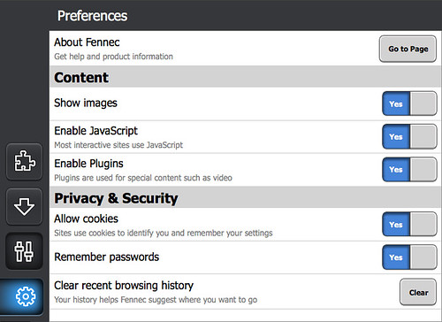
Most add-ons have preferences. On the desktop, some add-ons create a preferences dialog while others use pages in content. Pages in content are still a workable strategy in Fennec, but dialogs are something we've really tried to avoid. To help out add-ons authors, we've created a system to let you put your prefs inline in the add-ons manager:
The following articles explain how to use this system:
- http://starkravingfinkle.org/blog/2009/09/fennec-handling-add-on-options/
- https://wiki.mozilla.org/Mobile/Fennec/Extensions/Options
Then there's the question of number of prefs. Keeping the list short is hard to do, but it's even more important on a mobile device's small screen than on the desktop (where we could all do a better job anyway). Many times, something ends up as a user preference because the designer couldn't make a decision about what the default behavior should really be. Make the effort here -- think about what your user is trying to do and then make a good choice on his or her behalf; if there's really a split amongst your users about what a behavior should be, you'll hear about it .
Fennec tries to do this too. This is the set of preferences in desktop Firefox 3.0 (as of August 2008):
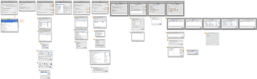
That's seven tabs, one of which contains four sub-tabs (Advanced), over the course of which the user can click on buttons to bring up a further 23 windows or panels, one of which has a further five tabs. I'm not even going to count the individual preferences. This has been cut down to the following in Fennec:
If Fennec can do it, so can your add-on!
The Future
Not all spaces around web content are currently being used. Some potential areas for future use are the following (in yellow):
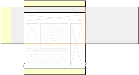
There is also thinking going on about letting certain spaces expand to accommodate more UI here: https://bugzilla.mozilla.org/show_bug.cgi?id=496654