Update:Remora UI Review/Mockups/Home Page/mockups 2007-06-18/comments 2007-06-20
"More Images" Placement
- [fligtar] I really like that all the previews will be accessible from the same page and you don't have to go anywhere else. One problem might be add-ons that only have 1 or 2 previews. There will be quite a bit of whitespace in that row in that case.
- [beltzner] I'm fine with extra whitespace in the "more images" row, and even with putting a placeholder in the spot for the lone image (something like "No image available") as a way of encouraging more screenshots. More screenshots, I say!
The "More Images" section should be absent if there are none to be had. As for whitespace if there are only one or two -- I like the argument that this will encourage contributors to add more. More images are good - I think people use them quite a bit when deciding whether or not to install an add-on.
Reviewing/Rating
- [fligtar] Reviewing/rating is definitely more prominent, however the size of the text box indicates that we're looking for just a few words about the add-on. We've been trying to get users to give more detailed reviews and implementing a guide that will ask for things like pros and cons, what you liked, etc. Maybe that's what Advanced is?
- [shaver] For ratings and reviews, would it make sense for the flow to be:
- "Rate Microfarmer >>" -> reveal of simple star system
- After rating entered: "Your rating: 7 (_change_)
- Add a detailed review >>" -> reveal of guided detailed-review template
That way we'd only show "write a review" to people who have already expressed an opinion about the add-on, and people new to the system wouldn't have the rating/review difference exposed to them right away.
- [beltzner] I actually like the current (implied) rating flow, making it very easy to rate an extension without having to click anywhere to see the control to do so. We might want to only show the text field after a starred rating is submitted, though, perhaps with something like "tell us why!" to encourage people. Justin: do you have more information on the structure you hope to put on reviews? In my experience, people are happy to comment, but only precious few are willing to put a full, thoughtful review into systems. I'd like to support both styles, and maybe give people the choice between the type they want to submit.
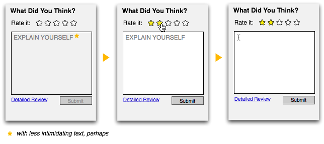
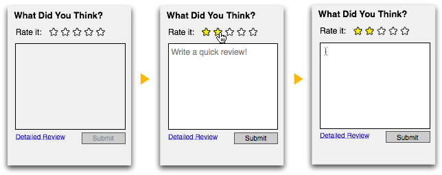
In the name of some progressive disclosure of function, we could have the QuickReview box activate as soon as the rating happens. It gets a little more room here, but I think that getting some small space for *some* kind of low commitment review is important. I've revised the link from the overused "Advanced" to "Detailed Review" -- this would link off to a review pages that offers more structure/suggested content as in fligtar's comment.
or better, actually:
Coverage of install scenarios
- [fligtar] Unfortunately, none of the Install Variants mentioned will work as far as I know. We don't currently have a way to tell if a user has an add-on installed, unless we were to make an AMO extension for that. While we can detect what version of Firefox a user has, we can't bundle an add-on and Firefox dynamically that I know of.
- [Shaver] We could actually tell what user has what extensions installed with some site modifications, because the AMO cookies are sent with update pings. Also, for registered users, we could track it at install time, though they'd have to tell us when they uninstall.
- [Shaver] bsmedberg has a tool for creating Firefox bundles dynamically -- not sure what the space/time requirements are for these, but I think it's worth exploring what that experience might feel like.
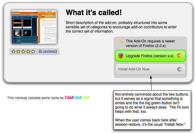
From Shaver's first comment, it sounds like it might be possible to see what extensions a user has, which would allow the latter two mockups. The Firefox bundling tool would allow the "Upgrade Firefox + get update" option -- I'll check into this. Tracking who has what for registered users isn't too compelling for me given its not keeping up with uninstalls and catering to a more sophisticated class of users who probably don't need the help as much.
Even if we can't do the bundling, we could still intercept people like this, perhaps:
Advanced Information
- [fligtar] I realize that this is just a mockup, but eventually we will need to find spots for all the little pieces of data like: add-on authors, version notes, developer comments, download counts (we want these to come back, right?), homepage link, etc. It's a lot of little information that might clutter up the page, but is necessary.
- [shaver] Data like home page link, download/usage counts, language pack availability, version history link, maybe categories and other-app compatibility could be in a "details" ajax-expando, so that we don't have to worry as much about clutter.
- [beltzner] Like Madhava and Shaver, I'd rather put a lot of the developer-centric information behind an expando-widget, perhaps expanded by default per a site pref, but certainly in the first revision of things, put out of sight. One of the things that delights me about this design -- and is embodied in the notes about design priorities -- is the focus on the consumer experience rather than the developer experience. (Also, the Firefox experience more than the Thunderbird experience, which is something for which I don't think we should be ashamed to optimize.)
I think that we're all in agreement here -- the advanced information belongs on the page, but without the prominence of the sections already in the mockup. Expando-widget makes sense -- rather than a site pref setting the default to "expanded" we could instead assume that anyone who's bothered to log in would be happy to have the detail expanded by default and that for everyone else, the detail could be shut by default.
New Questions / Fodder for more work
- [shaver] what would an "experimental" (sandboxed but not dangerous/untested) add-on's page look like?
- [shaver] what would a dangerous/untested add-on's page look like?
- [beltzner] We should figure out what we can take from these designs and implement immediately. I'm thinking that the general layout, basic Firefox version detection (and maybe offer to download Firefox 2 separately if they don't have it and the XPI requires it), the rating system and the new banner (which we need to talk about a bit more) are ripe for immediate work up. Then we can focus on figuring out things like detecting which add-ons are installed (installed vs. active might be relevant, might not be, trying to think that through), bundling with upsold Firefox, etc.
All duly noted. I'll turn my attention to the sandbox/not-much-tested/probably fine/recommended spectrum next.


