User:Broccauley/Fixing TabCandy
"TabCandy" (officially now known as "Panorama" "Tab Groups") is a great idea but, unfortunately, I think it is fundamentally flawed in its current implementation - here is a suggestion on how to fix it.
tl;dr
JUST USE WINDOWS instead of "tab groups", let us have a feature whereby we can label the windows, and have a "Tab Groups"-like interface solely to make moving tabs between different windows easier.
Some Ranting
Over the past few weeks I've been trying to integrate TabCandy into my daily browsing. Here's my verdict: overall I think TabCandy is a great idea to solve a definite problem, and has a LOT of potential, but unfortunately its present implementation is not ready for prime-time; IMO it's odd, non-logical, over-complicated, frustrating to use, non-consistent with existing window management paradigms, actually makes me less productive, and is dangerous. Yes, dangerous - once you let this mess of a monster out in its current form (spouting its own new tab-management paradigms) it will be difficult to get it back in its cage. Therefore, I'd rather Mozilla thought about all the available options much more carefully before this officially becomes part of Firefox proper.
Why did I open this post with launching what might appear as a very scathing attack? Well, let me re-emphasise how I recognise that there is a VERY good idea in here and a *very* nice interface - unfortunately, I feel there is a severe logical flaw in its current form - that would be such a shame, as lost potential like this really annoys me! :)
So what exactly is wrong with "TabCandy"?
Let me try to justify my opinions by looking in detail at exactly what's wrong with the current implementation:
- Once you create a new partitioning with "TabCandy", the non-selected "tab sets" are hidden and go into what I shall dub "The Land of Limbo". Are they still running in RAM and consuming resources? Or are they in a weird suspended state? I shouldn't even have to ask or care about this question -- a good UI should be obvious -- this Limbo state of non-selected "tab sets" just shouldn't exist in the first place, and is confusing by adding an extra paradigm of "hidden pages" and hence an unnecessary extra layer of complexity; it needlessly blurs the previously clear and distinct line between a set of pages that you have open and a set of pages that you have closed but stored in your "recent bookmarks".
I find this concept completely alien -- I like to be in control of what I have open and to be able to see it -- I don't like things being hidden from me -- SHOW ME MY WINDOWS! - Because "TabCandy" hides my pages from me, I am actually forced to go through "TabCandy" to see all my pages; I can't use the more obvious, powerful, exposed, tried-and-tested and consistent methods that I have available to me both from my window manager and from other more obvious areas of the Firefox UI that have existed since FF2. I have to click and open "TabCandy" to edit the "page sets" and can't really see or edit these well by just using the tab-strip itself. Once I start using "TabCandy" I am locked into "TabCandy"'s "walled garden" -- I shouldn't be forced like this to use a separate tool to perform basic page/tab/window management.
- TabCandy forces upon the user unnecessary extra layers of hierarchy between them and the actual page content, adding additional confusion and slowing down the ability to access page content.
- "TabCandy" only works on a per-window basis, rather than showing me the bigger picture of all the web-browsing that I am actually doing. I can't count the number of times that I've had 3 or so windows open and then lose one of these "ghost" tabs into TabCandy's "Land of Limbo" and then have to dig through all the windows to try and find it again (making me actually LESS productive with "TabCandy" than without). This just discourages the existing good practice of partitioning your open tabbed pages into windows.
It seems as if "TabCandy" is trying to solve a problem that doesn't exist -- i.e. making out that it's somehow a problem to have more than one window open at once -- this is not the case with a modern window manager such as that in Windows 7, KDE 4.5, or Snow Leopard -- therefore there is no reason to hide such windows. "TabCandy" actually makes it more difficult to work with several windows than before.
"TabCandy" is therefore taking the tried, tested, more flexible, powerful, and much more simple method of grouping tabbed pages by window, and completely throwing it "out the window" (if you excuse the recursive pun! :)). In summary, "Tab sets" != open windows. - "TabCandy" doesn't really acknowledge or exploit the UI advantages and APIs that are now available in Windows 7. Microsoft went to a lot of effort to fix the mess caused by having a MDI/TDI application in Windows 7 - instead of embracing Microsoft's efforts, Mozilla are now making an even bigger mess with the addition of extra unnecessary MDI hierarchy. Having 5 or 6 different Firefox windows on Windows 7 is really not a problem for the user to deal with, especially if these new APIs are exploited to their full potential.
- "TabCandy" (and modern web-browsers in general) doesn't really acknowledge the fact that users shouldn't actually care about small inflexible UI elements for showing fixed-sized pages called "tabs". The user should care only about the web CONTENT or "pages" that they are browsing.
The new name of "Tab Sets" (whilst better than "Tab Candy") misguidedly still focuses its name on a small inflexible UI control called a "tab".(Edit: This has now been fixed with the excellent new name of "Panorama", however, the Firefox-UI and TabCandy/Panorama instruction video still over-use the word "tab".)
- "TabCandy" completely ignores the advances made in Internet Explorer 8 with its introduction of the simple and automatic coloured tab group indication.
What should be done differently?
So how could things be done differently? Well, first of all, I would split what is currently known as "TabCandy" into THREE completely SEPARATE features which I shall dub for now as:
- "Visualize Pages" = A spatial view and the "big picture" of what you currently have open;
- "Visualize History" = A spatial view and the "big picture" of what you had open in the past;
- "Visualize Bookmarks" = A spatial view and the "big picture" of what you might want to open again in the future.
I shall concentrate most detail on "Visualize Pages" as this is the most important feature that helps to solve the problem of having many tabbed pages open at once. "Visualize History" and "Visualize Bookmarks" are features that can build-upon "Visualize Pages" and hence be added at a later date.
Specification for "Visualize Pages" aka "Pages Panorama"
So let's look at how a "Visualize Pages" alone could address each of the faults mentioned above:
- The mission statement of "Visualize Pages" is: "to provide a visual way to help you view your open pages, and to help you organize your open pages between tabs and windows".
"Visualize Pages" will show you a matrix of all pages that are open: i.e. all open tabbed pages in the current window, together with all other Firefox windows that you have open and all pages that are open within each of these other windows. No windows will ever be hidden. This could also be thought of as Mac OS X "Exposé" in its application-specific mode, except that it will also show tabbed pages, allow you to re-organize pages between tabs and windows, and remember a virtual spatial organization of your groups/windows. - The user will not be forced to use the "Visualize Pages" view to see the logical partitioning - it will be evident on both the tab strip and by the fact that what is currently known as "tab sets" will simply be standard and more flexible windows. Since windows are a the standard way to display programs, all standard OS interactions will be able to be performed on each window. The hierarchy will also be able to be edited from directly in the tab strip, without the user requiring to enter the "Visualize Pages" view at all.
- No forced extra layers of hierarchy will be added between the user and their content. Content will be able to be reached with the exact same levels of hierarchy as present in FF3.
- Any large grey rectangles (currently called "tab sets") that are shown in the "Visualize Pages" view will correspond 1:1 with open windows. Using windows will be the main method that is encouraged to partition tabbed pages.
- Since each "TabCandy tab set" is now just a window, the new Windows 7 Taskbar API will be used to indicate the contents of each window, and show the label given to each window (the label entered in the "Visualize Pages" view).
- The name of the tool now will not contain the word "tab". Throughout the UI the word "tab" shall be replaced with "page" or "tabbed page" wherever practical.
- Internet Explorer 8 's coloured "tab groups" and "quick tabs" features will be integrated.
Specification for "Visualize History" aka "History Panorama"
"Visualize History" will be a new view that can be added to the History library and also possibly linked-to from the "Visualize Pages" view. It will not only show you the name, location, and time of individual pages that you have accessed, but will also show you exactly how several pages were viewed in-relation to each other, exactly as you browsed them. "Visualize History" would show your historical browsing exactly in the same 2D matrix as "Visualize Pages", except with a timeline bar across the top showing the exact time of when the pages had the particular arrangement on display. It would also allow you to look-up an exact time and be able to see how exactly your complete browsing session may have looked, including a visualization of all FF windows that you had open at that time).
Specification for "Visualize Bookmarks" aka "Bookmarks Panorama"
"Visualize Bookmarks" will be a new matrix view that is added to the Bookmarks Organizer and maybe also to the Home Tab (with recently bookmarked pages shown on the Home Tab). It will allow you to not only see the title of a bookmark, but also a fully scalable thumbnail of the bookmark.
Bookmarks may also be grouped into sets that may then be opened into a new window. Pages from this newly opened window may be then integrated into your open browsing session by using the "Visualize Pages" view.
Bookmarking a set of pages should be possible directly from the "Visualize Pages" view. A set of visual bookmarks may be re-arranged and organized in the same desktop-style as in "Visualize Pages". Perhaps their could be a bookmarks "star" icon in a corner of "visualize Pages" where you could drag a window group, or a selection of various pages, in order to add these pages to your bookmarks; viewing these newly added bookmarks in "Visualize Bookmarks" would show the exact same grouping as was present in "Visualize Pages".
The "Visualize Pages" View in Mock-ups
"Visualize Pages" Basics
The main difference between TabCandy and this "Visualize Pages" proposal is that in "Visualize Pages" we simplify everything by making a SET = WINDOW and not window = "a view of a set" as in TabCandy.
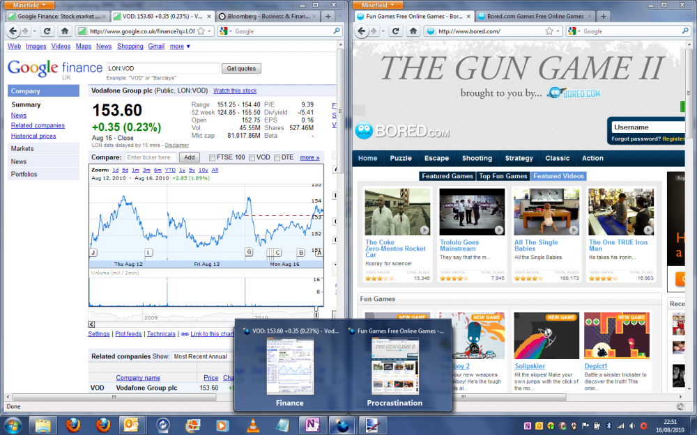
In order to see how this would work in detail, let's take as an example the situation that we are trying to organize our finances, but instead procrastinate by going to bored.com. We then decide that we need to stop procrastinating and come back to our bored.com game later, so want to split off the tabbed bored.com pages into a different window. Our Firefox window looks as follows:

Now, let’s open the "Visualize Pages" view:
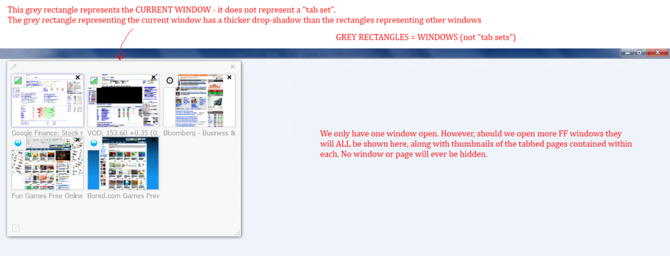
The "Visualize Pages" view shows all pages that we have open. The current window is represented virtually by a grey rectangle with thick drop-shadow, and the tabbed pages within are represented by thumbnails of each page.
In our example we only have one window open, but should we have more than one Firefox window open then all open Firefox windows would also be represented virtually in "Visualize Pages" as grey rectangles (albeit without the thick drop shadow of the virtual current window representation); clicking on a page in another window would switch to that window (possible) and display the corresponding tab.
In our example we now wish to organize the two bored.com pages into a separate window - we therefore drag them out of the virtual representation of the current window, and into their own rectangle representing another virtual window as follows:
We also label one of the virtual windows "Finance" and the other "Procrastination". Note that the thick drop-shadow has now disappeared from what was the virtual representation of the current window - this is because the virtual representation in the "Visualize Pages" view now no longer corresponds to the real current window.
In order for this virtual representation to be realized it is obvious that we will have to create one new Firefox window. This new Firefox window will only be created once we click on the thumbnail that we want to view - this is because new windows steal window focus - we therefore cannot create new windows until we have finished working with the "Visualize Pages" view.
We then decide that we want to see the "VOD" Google Finance page, and so click on the thumbnail for that page. This means that we want the realized "Finance" window to have window focus. Firefox therefore performs the following actions:
- Creates a new window which then takes the window focus and assigns the "Finance" label to this window.
- Moves the three "Finance" pages from tabs in the initial window to tabs in the new window.
- Makes the "VOD" Google Finance page the active tab.
- Assigns the "Procrastination" label to the initial window (now in background).
Note that when the "Visualize Pages" tool creates new windows, then the window which contains the page that the user wants to view should be the last window that is composed in order to obtain the correct window focus (Edit: after looking at the win32 APIs this ordering might not be necessary).
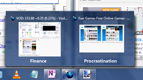
Our two newly realized windows would now look as follows when we hover over the Firefox/Minefield Windows 7 Taskbar icon:
Windows 7 Taskbar Integration
The labels that we gave our windows now show at the bottom of the Windows 7 Taskbar Live Previews for each Firefox/Minefield window. The label can also be edited directly within each Taskbar Live Preview. If no label is specified by the user, then by default windows should be given the label "Window n" where "n" is the number of open Firefox windows. Alternatively, instead of "Window n", the pencil icon could be shown by default.
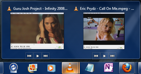
This should be completely possible due to new APIs introduced with Windows 7. Windows Media Player and VLC Media Player already use these APIs; here is a screenshot of VLC in Windows 7 (with some more "candy" for the eye ;) ):
Aggregated window thumbnails could also be generated based upon how the pages are arranged in the "Visualize Pages" view:
The above mock-ups assume that the Taskbar Live Previews are being displayed on a per-window basis, but they also could be displayed on a per-tab basis as follows: 
Note that the above mock-up shows a bar underneath the tab thumbnails to mark each window. This is because I am assuming that the Windows 7 APIs only allow you to draw in the bottom of the Live Preview. The API could be much more flexible than this (I have no idea), so if more flexibility is offered then a better idea would be to represent the window as a rectangle that borders all the tab previews that belong to that window, as below: 
Perhaps there could also even be an option where Firefox could intelligently decide whether to show you live previews on a per-tab basis or a per-window basis depending upon the number of windows + tabs that you have open. This would be possible as the label on the Live Preview makes it obvious whether you are viewing the contents of a tab or of a window.
The same window labelling behaviour could be implemented in Windows XP by showing the "Visualize Pages" label as the window title in the taskbar, rather than showing the title of the active tabbed page. Alternatively, the window title could be shown in the following format: "<Visualize Pages Label>: <Active tabbed Page Title>".
Automatic Display of Related Pages
I said that the lovely automatic "tab groups" feature from Internet Explorer 8 should be integrated. Here's how our above example would look in IE8:
In the above example the "VOD" Google Finance page is the child of the parent Google Finance home page; the child was spawned by Ctrl-clicking a link in the parent - these related pages are automatically given the same tab colour in IE8, and Microsoft calls them "Tab Groups". I think a better name would be "Related Pages" due to the word "group" being ambiguous and the fact that there is an obvious parent-child relationship here. I also do not like how the colours tend to dominate the whole tab in the IE8 implementation. Here's how I think "Related Pages" could be implemented more subtly and with more style in Firefox:
The related page colours are shown as a simple line on top of the tab. This is the same place as the page load bars are to appear - confusion with these page load bars could by avoided by not using the same shade of green as in the page load bar and by not using animation like the page load bar does. The page load bar also is supposed to be getting a glow-effect which would differentiate. On the other hand, maybe you wouldn't actually want to differentiate the page load bar and could make it the same colour as the related-page colour bar for the particular page that is loading!!
Related pages could also be manually re-arranged on the tab-strip in the same way as in IE8.
If we were then to open the "Visualize Pages" view in the above window it would look as follows:
"Related Pages" are now indicated by a thick coloured bar across the top of the related-page thumbnails. Related pages may now be dragged together by dragging on their coloured related-page bar. Dragging the thumbnail will drag the individual page as normal.
Here's how "Related Pages" could also be indicated on the Windows 7 Taskbar Live Previews: 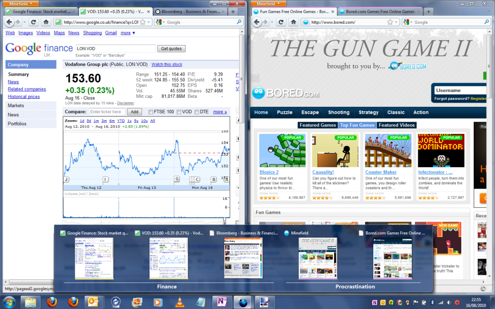
Control from the Tab-Strip
As mentioned, I think that everything you should be able to do in the "Visualize Pages" view should also be able to be controlled from the Tab-Strip. It is annoying to have to open a separate view when you could just manipulate what is sitting right in front of your eyes directly. i.e. there should be no lock-in FORCING you to use the "Visualize Pages" interface.
So how could this be implemented? Simply allow more than one tab to be selected by clicking while holding the Shift and/or Ctrl keys. Right-clicking on a tab that has a coloured "Related Tabs" bar would also give you the option to "Select Related Tabs". Once several tabs are selected you can right-click and are provided with a context-menu as follows:
   Move Selected Pages To
                           New Window
                           ----------
                           Finance
                           Procrastination
   -----------------------
   Bookmark Selected Pages
   Reload Selected Pages
   Close Selected Pages
(as a side note: the existing "Open In a New Window" right-click option on a single tab should really say "Move to a New Window").
Future Feature Possibilities
- "Visualize Pages" could be extended to be able to also show you relationships between pages that are created using a shift-click on a link to open in a new window (or by TARGET="_blank" or a JavaScript pop-up). This could be visualized in the form of an arrow pointing from the parent page in one window to the child page in another window (similar to the visual representation shown in some tools for visualizing foreign keys in relational databases).
- Pages could also be moved between windows from directly within the Taskbar Live Preview.
- Controls added to taskbar live preview to allow the user to choose whether to view thumbnails per-tab/per-window/auto.
Conclusion
I have presented here an improvement upon "TabCandy" which allows users to spatially sort out the mess of having lots of unrelated tabbed pages open at once, yet does so in a way that won't introduce any new and confusing window management paradigms*.
If "TabCandy" is released as it is at present it will become one of the most controversial Mozilla features ever. When "TabCandy" went into the mainstream IT press a few weeks ago, reaction was far from overwhelmingly positive. Take, for example, the comments over at The Register.
It doesn't have to be this way. I want Firefox 4 to succeed and so spent the time to write this. I only hope you at Mozilla will pay some attention to this and all the details that I have presented here.
- No extra layers of confusion!:
Number of levels of hierarchy which the user is forced to wade through before reaching the actual open page content of interest. With TabCandy
With Visualize Pages View
- Additional TabCandy Interface;
- Set;
- Window;
- Tab;
- Page.
- Window;
- Tab;
- Page.
- No "ghost pages" in "limbo"!
- No hunting for such "ghosts"!
- No confusion between an open page and a bookmark!
- Powerful feature expandability in the future with the addition of "Visualize History" and "Visualize Bookmarks" features!
- No lock-ins!
- Group pages by tabs and windows as we're used to!
- The "big picture" of your entire open browsing session!
- Manipulate using the interfaces you are used to!
- Automatic hinting as to which pages are related!
- True Windows 7 "candy" and OS integration!
- Faster to partition your tabbed pages into windows:
With TabCandy
With Visualize Pages View
- open "TabCandy";
- drag out your pages into the new set;
- choose the set you want to see in the current window;
- open a new window;
- open "TabCandy";
- select the set that you want to view in the new window.
- open "Visualize Pages" view;
- drag out your pages to propose to create a new window;
- select the page that you want to view.
- Faster to switch to another "tab set"/window from another application:
With TabCandy
With Visualize Pages View
- click on the Firefox taskbar button, making sure that is ok to hide again the current tabs in view;
- open TabCandy;
- choose the set you want to see.
- hover over the Firefox taskbar icon and choose the window that you want to view.
- Organize that tab mess!
You know you want to ;)
* You could argue that "IE8 Tab Groups"/"Related Pages" is a "new paradigm", but it already exists in IE8 and received widespread praise. It is also a simple, automatic and subtle indicator that can be easily ignored. It doesn't mess-up the existing window management model and doesn't hide pages or confuse.
Broccauley 13:42, 18 August 2010 (PDT)
