Mobile/Archive/Virtual Keyboard: Difference between revisions
m (Dria moved page Mobile/Projects/Virtual Keyboard to Mobile/Archive/Virtual Keyboard without leaving a redirect) |
|||
| (10 intermediate revisions by one other user not shown) | |||
| Line 26: | Line 26: | ||
== Designs == | == Designs == | ||
Proposals | |||
=== Search Flow === | |||
==== Proposals ==== | |||
* Proposal A [Pflippp] https://wiki.mozilla.org/Mobile/UI/Designs/TouchScreen/Fennec_1.1%2B/Option_A_for_Awesome_screen_layout_revision | * Proposal A [Pflippp] https://wiki.mozilla.org/Mobile/UI/Designs/TouchScreen/Fennec_1.1%2B/Option_A_for_Awesome_screen_layout_revision | ||
* Proposal B [Pflippp] https://wiki.mozilla.org/Mobile/UI/Designs/TouchScreen/Fennec_1.1%2B/Option_B_for_Awesome_screen_layout_revision | * Proposal B [Pflippp] https://wiki.mozilla.org/Mobile/UI/Designs/TouchScreen/Fennec_1.1%2B/Option_B_for_Awesome_screen_layout_revision | ||
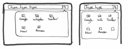
==== Starting Point (common) ==== | |||
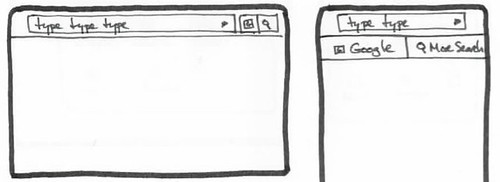
Before the user has started to type, the screen shows the pre-typing awesomelist and the category selectors. Important: we shouldn't bring up the VKB immediately on coming to the awesomescreen; an additional tap on the entry-field should be required. | |||
http://farm5.static.flickr.com/4096/4815779686_8fe982d69f.jpg | |||
==== Initiating Searching ==== | |||
===== Variant 1 ===== | |||
Category bar gets replaced with horizontal-scrolling list of search engines. This shows up as soon as the user starts typing. Awesomebar results come in below. | |||
http://farm5.static.flickr.com/4101/4815161491_88441b6fd5.jpg | |||
Issue: this doesn't deal with the issue of taking up a whole row with a VKB present in landscape. | |||
===== Variant 2 ===== | |||
http://farm5.static.flickr.com/4075/4815163579_2ec1867244.jpg | |||
===== Variant 3 ===== | |||
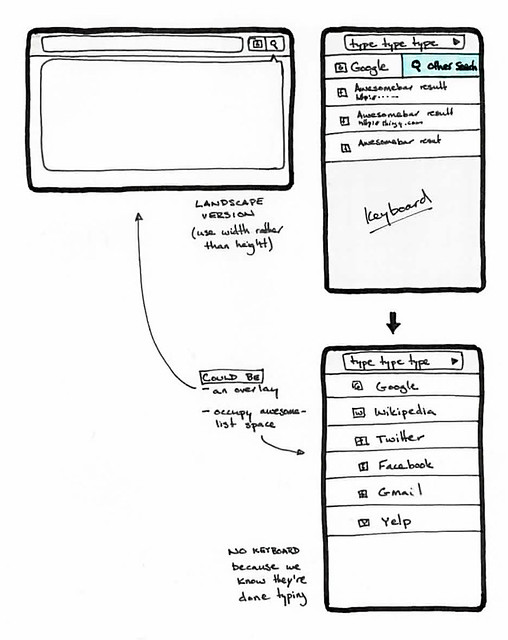
In most of these variants, we try to minimize the size of the search trigger UI (i.e. a button). We can get a bit more room by having the placement differ between the landscape and portrait orientations to take advantage of the width or height, respectively. | |||
http://farm5.static.flickr.com/4143/4815789102_4be0e05208.jpg | |||
more detail: | |||
http://farm5.static.flickr.com/4135/4816601312_07923e5959_z.jpg | |||
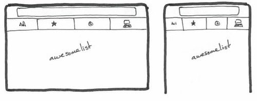
==== Selecting Search Engine ==== | |||
===== Variant 1 ===== | |||
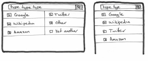
Awesome list gets replaced with a list of search engines. | |||
http://farm5.static.flickr.com/4121/4815791294_a90139876e.jpg | |||
===== Variant 2 ===== | |||
http://farm5.static.flickr.com/4119/4815170749_14a0da5424.jpg | |||
== Goals/Use Cases == | == Goals/Use Cases == | ||
Latest revision as of 16:42, 11 April 2013
Summary
We're not implementing our own soft keyboard - Fennec will use the native soft keyboard on all platforms.
This project is to make sure that our UI is usable and effective even when a softkeyboard is deployed and so is taking much of the screen real estate.
In practice, this will be the result of three design areas:
- in general, only bringing up the keyboard when it's actually wanted (not prematurely, if the browser is making on-screen suggestions first)
- making sure that our UI is not obscured by the on-screen keyboard
- altering the mechanism by which people select a search engine, so that it's only on screen when it has to be -- this is so that we can use the sliver of the awesomescreen that is visible (esp. in landscape) when the user is typing for awesome-suggestions.
Current Status
Next Steps
Related Bugs
Team
- Project Lead:
Designs
Search Flow
Proposals
- Proposal A [Pflippp] https://wiki.mozilla.org/Mobile/UI/Designs/TouchScreen/Fennec_1.1%2B/Option_A_for_Awesome_screen_layout_revision
- Proposal B [Pflippp] https://wiki.mozilla.org/Mobile/UI/Designs/TouchScreen/Fennec_1.1%2B/Option_B_for_Awesome_screen_layout_revision
Starting Point (common)
Before the user has started to type, the screen shows the pre-typing awesomelist and the category selectors. Important: we shouldn't bring up the VKB immediately on coming to the awesomescreen; an additional tap on the entry-field should be required.
Initiating Searching
Variant 1
Category bar gets replaced with horizontal-scrolling list of search engines. This shows up as soon as the user starts typing. Awesomebar results come in below.
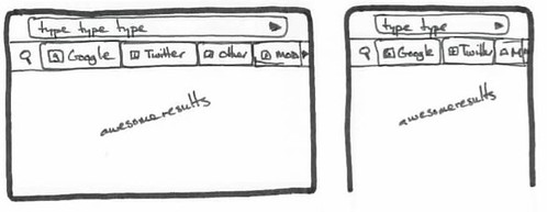
Issue: this doesn't deal with the issue of taking up a whole row with a VKB present in landscape.
Variant 2
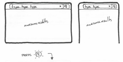
Variant 3
In most of these variants, we try to minimize the size of the search trigger UI (i.e. a button). We can get a bit more room by having the placement differ between the landscape and portrait orientations to take advantage of the width or height, respectively.
more detail:
Selecting Search Engine
Variant 1
Awesome list gets replaced with a list of search engines.
Variant 2