Mobile/UI/Designs/TouchScreen/Fennec 1.1+/Option B for Awesome screen layout revision
OBJECTIVES
- To make Fennec more compatible with different kinds of displays (wide/narrow), device orientation (landscape/portrait) and text input methods (hardware/on-screen), which are characteristics of mobile devices.
- To keep the basic functionality of the Search engines similar to the current version of Fennec (1.0 beta) but relocate them and make them to take less space in the UI, so that Awesome bar could be used successfully also with On-screen keyboards etc.
FUNCTIONALITY
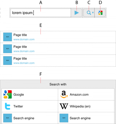
Awesome bar/view would consist of following elements:
A) Text entry field for web address or search phrase
B) Go button
C) Button for opening a dialog with a complete list of integrated Search engines
D) Search engine shortcut
E) List of web pages suggested by browser
F) Dialog with a complete list of integrated Search engines
The user could enter a web address or free form text (e.g. search phrase) into the text field (A) and then tap the Go button (B) or a Search engine (D) to start opening a web page. If the desired Search engine was not promoted by the UI, the user could tap the Search engine selection button (C) that would open a dialog (F) with all installed integrated Search engines, and then the user could start a search with the desired engine by tapping the list item. The UI should promote the last used Search engine or engines.
The UI would support showing a list (E) of matching web pages (available from bookmarks and browsing history) below the Awesome bar while the user is editing/entering text into the text field (A), but it could not support showing a list of last search strings entered by the user or search phrases suggested by a Search engine... Well, this is exactly the same thing what happens with the current version (1.0 beta) of Fennec. Anyway, the user could start opening a desired web page by tapping it in the suggestion list (E), so s/he is not required to type complete web address etc to open a web page (in precondition the page is available from browsing history or bookmarks).
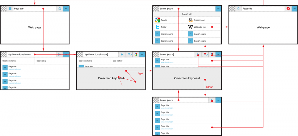
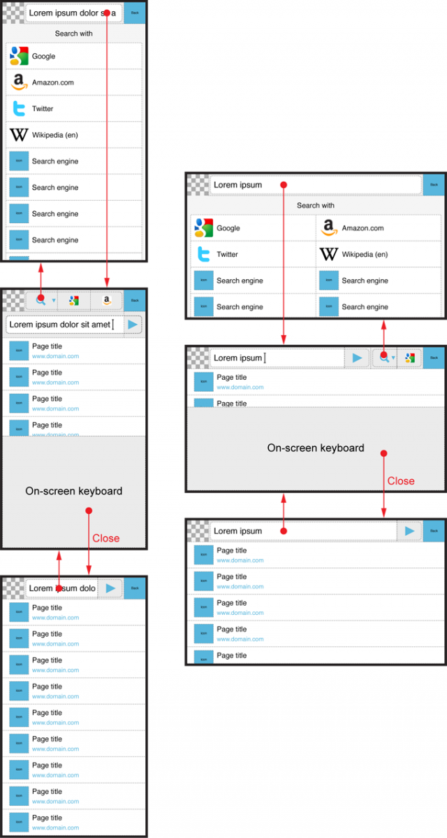
What is different to current version (1.0 beta) of Fennec, is the location of search engines and the functionality to show and hide options based on user interaction and thereby optimize the view and maximize the number of options relevant for the usage at a time. See the UI flow below:
The Awesome bar would show
- Go button (B) always, except when the user has opened the UI for selecting a search engine (F).
- Search options (C and D) only when the focus is set to text field (A).
LAYOUTS
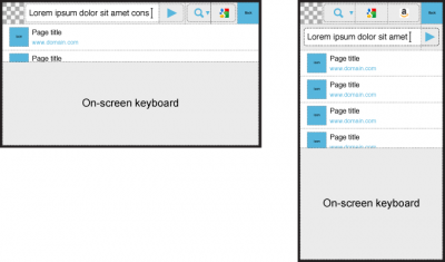
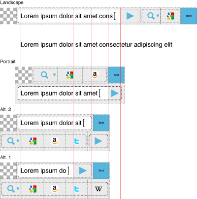
The main change to the current layout of Fennec (version 1.0 beta) is to move the integrated Search engines from the bottom part of the view to the top part of the view, so that search functionality would be instantly available also with on-screen keyboards (except full-screen on-screen keyboard). When the Search engines are in the top bar, they don´t take space from the suggestions and can be associated (more clearly) to be connected to the address/text field.
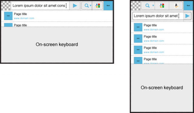
In wide screens (and landscape orientation), the Awesome bar would take one row. In narrow screens (and portait orientation), it would take two rows and provide as wide text input field as possible (so that the user had better view to what s/he is typing and thereby could detect errors such as misspelling easier).
See the figures in the table below for the layout, when the user has accessed the Awesome view but has not edited the text inside the address field yet. In these preconditions and when the address editing field is empty, the browser would display options for going to Bookmark and History views and a list of web pages the user has visited most frequently below the Awesome bar.
| Keyboard |
Focus NOT set to Address field |
Focus set to Address field |
| Hardware |
see image below |
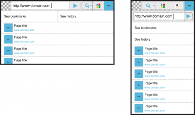 |
| On-screen |
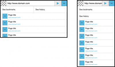
|
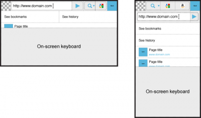 |
See the figures in the table below for the layout, when the user has started to edit the text inside the address field either with Hardware or On-screen keyboard. In these preconditions, the browser would hide the options for going to Bookmark and History views and show a list of web pages matching with the text entered by the user.
| Keyboard |
Focus removed from Address field |
Focus set to Address field |
| Hardware |
see image below |
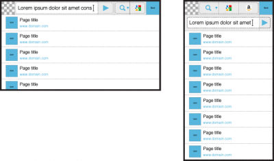 |
| On-screen |
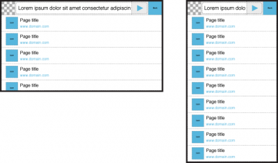
|
|
See the figures below for the alternative layouts of the Search engine selection dialog/list.
See the figures below how the layout would change based on user interaction.
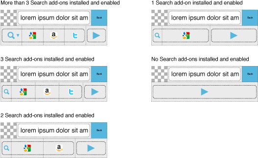
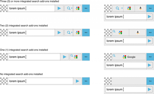
See the figures below for the system how the Awesome bar could adapt to the different number of installed integrated Search plug-ins. The UI should show at least one Search engine shortcut for instant use in addition to option for opening dialog (or view?) with all Search engines.
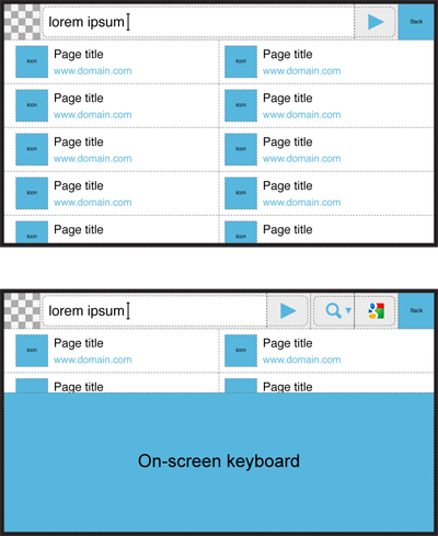
Again. The UI would be able to show 2 times more suggestions in the view at a time, if Fennec displayed the suggestion list in two columns instead of one as it does now. It would benefit the user especially when s/he was entering/editing text with an On-screen keyboard in landscape orientation.
ALTERNATIVE LAYOUTS FOR PORTRAIT
What bothers me is the location of Search engines in the portrait layouts presented above in this post. It would be more natural and/or logical, if they followed the address editing field similarly to Go button. The main reason to put the Search engines above the address field is to make the address field as wide as possible and thereby provide the user with best possible view to what s/he is actually typing and help in detecting problems such as mispelling or missing words etc. Also, the bigger the text input field is, the easier it is to interact with it with touch screens.
If the search engines and possibly also the Go button would locate below the address editing field (that would be the topmost element in the view), the address field would get smaller as shown by the figure below:
Alternative 1
Search engines would be placed below the address field and Go button. The location of Search engines would be logical but the text input field is getting small (maybe too small already) and the UI starts to look a bit silly if only a couple of Search had been enabled.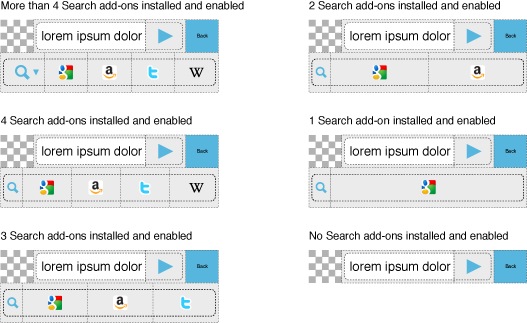
Alternative 2
Search engines and Go button would be placed below the address field so that it can take all space available for it on the topmost row. The concern of this solution is whether the users would find the Go button, if it was not tightly connected to the address field (as it generally do in desktop browsers).