Talk:Firefox/3.7 Windows Theme Mockups
Suggestions
- Extremely good point: why is there still a separate stop/reload button? one is always grayed out, what a waste of space.
- Go, Stop, Reload would be better as one button, in the place of the Go button.
- When something is being typed in, show the Go button
- When a page is loading, show the Stop button
- When the page is fully loaded, show the Reload button - Don't use Google Chrome buttons for configuration and control current page on Windows XP, use the same menu as Vista/7?
- What is the Page button for?
- A Chrome like Omnibar would be good (In this case, Awesome bar + Omnibar)
- What happened to the status bar?
- Maybe the favicon next to the awesome bar could be replaced with the quick bookmark button, as the favicon is also seen on the tab bar.
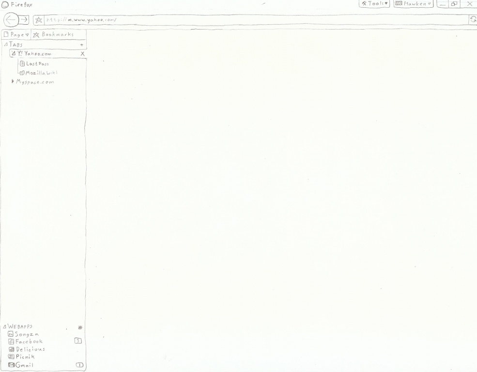
- Someone just added a drawn concept to the main page, where the tools button and another button (I assume the page button) is in the titlebar. This would be a good idea. It would give the website much more space.
--Sonnygauran 03:55, 21 July 2009 (UTC)
- Wouldn't it be nice to assign "hot edges" to the firefox? (Love the screenshots btw)
- When you hover your mouse to a specific edge/zone, the relative UI only shows up. This allows the browser to maximize all available space.
- Hovering your mouse over the top edge shows the tab bar.
 After hover:
- When the mouse nears the titlebar, the main menu shows on top of the tab bar.
- We don't need to use both the tab and menu at the same time. ;)
- The right edge shows the vertical scrollbar.
- The bottom edge shows the horizontal scrollbar.
- Hovering your mouse over the top edge shows the tab bar.
- An alternate view for the tab bar hover:

- When you hover, and have a hotkey assigned:
- When you hover to any part of the browser and hold the Ctrl, the top-left "fans-out" similar to an OSX dock, or just displays at the top edge, the Navigation Toolbar buttons like back, refresh, etc.
- Holding Ctrl + right edge doesn't show the scrollbar, but shows the outline of the document.
- Headings (h1, h2, h3) are shown as small glyphs as well as anchors with labeled internal and external links.
 We can use glyphs to show document outline
- Headings (h1, h2, h3) are shown as small glyphs as well as anchors with labeled internal and external links.
- When you hover your mouse to a specific edge/zone, the relative UI only shows up. This allows the browser to maximize all available space.
Mindless robotic praise
I am in love. Unlike both the Fx 2 and 3 redesigns, I feel absolutely no "out-of-placeness" at first sight. Well done! Bielawski 16:16, 21 July 2009 (UTC)
Position of the Buttons: 4 proposals
I like the "Initial Windows Theme Mockups for Firefox 3.7" very much. Here are some proposal/suggestions.
1°) Il like the "tool" button on top right. Personnally, I always use an extension named "compact menu". And I think that this is more or less the same idea: to hide the traditional menu (File, Edit, etc...) and to group all the commands inside a unique "tool" menu. It make the User Interface more clean.
2°) I like the "page" button concept. Great idea. I have remark regarding its position: Actually the "Page" information are like attributes from the URL. So I think that the position on the right of the menu (link in XP screenshot) or ~like a new tab (like on Vista/7 screenshot) are a bit confusing. So I would suggest to put the "Page" button just near the URL box. It seems more logical.
3°) Regarding the button "star" (= "quick bookmark this page"). I have the same proposal: it shall be located just near the URL box because this is an action related to the current page.
4°) I like the idea to be able to display/hide quickly the personal bar. For me this action is similar than opening a new tab. Except that this new tab has to be preloaded with an URL already bookmarked by the user. So, my sugesstion is to treat is in a similar way than the ["+" new tab] button. On the right or the near the ["+" new tab] button.
Please look at the proposal on attached file
Regarding the display/hide quickly the personal shortcut bar, I have another suggestion: when pushing this button, the system could display kind of "bubble" on the forgound with all icones of adress bar (like in the Mac Dock, please look at the 2nd screenshot).

An easier way to do it could be to dispay the personal bar in the same way that the password bar, just on top of the page with a little translation movement from the page.
A last thing : I REALLY like the rounded corners in the URL & Search fields. Please make it available on XP also.
--Freeman31, 22th July 2009 0:22 UTC.
Tab Animations
It would be nice to have tab animations when the user grabs a tab, and rearranges it on the tabs toolbar. An example of this is in Chrome and Safari, where the tabs move themselves accordingly to where the user holds the grabbed tab at the moment. This makes the reorganization of tabs look more smooth. However, there should be an choice in the options page where the user can allow/disable these animations. Also, animations should be added for when tabs are torn from the toolbar, and are either used to make a new window, or join another window's tabs. These animations are also found in Chrome and Safari, and add a nice touch to the browsing experience. These animations would make the browsing on Firefox look more smooth and seamless. --Lmaoxlong 23:53, 21 July 2009 (UTC)
Criticism
I feel this design attempts to combine Safari & IE7/8 UI and while quite beautiful, it does not reflect the personalization aspects that make Firefox so great. When you add 6-10 addons (or more) with their related UI additions, have bookmarks toolbar visible for convenience of top 10-12 visited sites a click away, etc etc. The design falls short. I believe this is a case where form should not supersede function. Also: what of Royale Noir for XP?
Keep focusing on OS Integration
I have 3 critics :
- Google Chrome is not an example to follow. Please forget using its icons and colors, and try something more firefox-customed.
- To extend glass effect in Vista/7 below toolbar is a very good point. It helps in OS integration, and should have been done in 3.5.
- To remove menu bar in XP is an heresy. To use these icons in XP is an heresy. Keep the current theme for XP : it feels much more integrated in the OS. In XP : there are menu bar, the button are colorfull (Luna theme).
OS Integration must be the first point to focus while developping a theme.
Do NOT combine search and address bar.
I really hope that me saying this isn't needed, but, combining the search bar and the address bar is a horrible idea. I have several custom search options in the search bar that I use regularly. If it was combined into the address bar, I'd be forced to search with one specific engine every time. This would be a huge inconvenience to myself, and I'm assuming many other people that also value making their time more efficient.
As to combining the go, refresh, and stop button, that's unnecessary as well. The go button should be removed, but stop and refresh should stay where they are. Personally, I use hot keys, and never click the buttons, so I take them off already, but sometimes I reload a page in the middle of it loading because my internet hung and the page didn't load properly, or is timing out. A quick mid-load refresh remedies that, and wouldn't be possible if it showed a stop button since it would still be loading. It's just an extra step if I had to stop it, and then reload. It may sound minuscule, but if you have to do that several thousand times, that adds up pretty fast.
Unorganized
Fida Mehran: Re: 'What do you think of something like this?': I think this somewhat dampens the professional look of a world class browser. As a theme for personal use as a personal preference is okay, though.
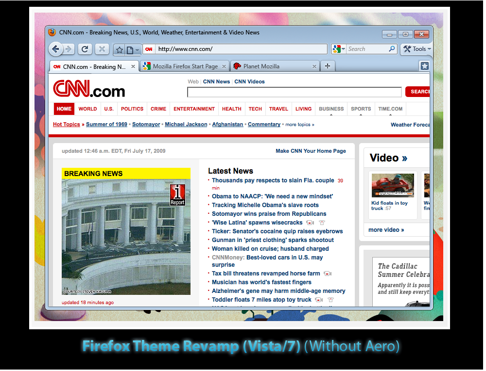
In the Vista/7 mockup without Aero, there are two stars, one beside the Tools menu and one beside the Page menu. I'm assuming this is an oversight? (What do the stars indicate anyway -- bookmarking UI?)
The Windows XP interface actually looks cleaner than the Vista/7 mockups, with all icons neatly laid out on one line. Very Google Chrome-like. I like it, but some others may feel it dilutes Firefox's distinctive look. Also, not having the "Page" menu means more valuable horizontal real estate is actually available to the user's tabs.
The biggest issue I have with this interface, though, is the Search box. Right now in Firefox 3.5, it's Back/Fwd and friends, the address bar and the search box. Adding more UI chrome to the right of the search box adds clutter and diminishes the the importance of the search UI (almost literally - the search is squeezed into a smaller size, almost like it's an afterthought.) Is an omnibox-equivalent planned for v3.7 that'll replace the search box outright? --Prasenjeet
Guys, love the new design but seriously - I am with Prasenjeet - you need to remove the 2 UI search boxes. There should be the so called "omnibox" - it doesn't make sense anymore to segregate both the address bar and the search box - they should be one and the same.
This will greatly enhance the user experiences by not having to type "addresses" into one and "searches into" the other. The best thing about chrome - is how great this feature is. It makes it so much easier to simply search for things and interact with the browser.
Get rid of the search box and replace it with an "omnibox" - and you have a winner.
While I agree that general searching is sometimes handy from the address bar, I don't totally agree with removing the search box. One of the benefits of having a seperate search box is that you can add all kinds of different search providers. For example, if I want to search for a product on Newegg, I have the little drop-down to select Newegg. If I am looking for a book based on ISBN from Amazon, I can just select the search provider. This kind of searching is tedious with Chrome.--Mawcs 17:39, 22 July 2009 (UTC)
- You can still do this with the omnibox; you preface the search with a letter or two designating the desired search provider. It's not quite as easy to discover, though. --Jamesgecko 18:33, 22 July 2009 (UTC)
Please, don't get rid of the search box. Buttons that are used are functional, not "clutter", and I urge our designers to remember that this is a GUI, not a painting. You seem to be going down the same road IE did with it's now clumsy, yet 'uncluttered' interface. LESS IS NOT MORE when you're trimming muscle, not fat. The first thing I'd do with your revamped theme is restore the home button, and see if I can restore the File/Edit menu bar. People use the "Find" function in open pages all the time- don't bury it. Overall, though, very nice design, but I'd rather see improvements to the bookmark utility, particularly the ability to search tags like a database.
My two cents: Keep the search box. One of the design interfaces that I loathe with Google's Chrome is the integration of the search bar and address bar. I like the current function of FireFox that clearly separates the two functions. I do like the proposed positioning of the tools. I think it's an excellent user-friendly upgrade.
The spacing of the tabs... and look. That... I'm not sold on. One of the reasons I don't use Opera is that I really hate their tab management. It never... works... like I think tabs should work. The other problem is massive tab management. I quickly took some screen shots of Opera's latest Linux offering, Google Chrome's latest Linux offering, Google Chrome's lastest Windows offering, Firefox 3.0.0.6 on Linux, Firefox 3.5 on Windows, and Konqueror from KDE3 : http://picasaweb.google.com/je.saist/BrowserTabs# : None of the browsers really handle massive tab counts in ... an intuitive manner. Opera comes the closest by retaining the browser tab image even with a ludicrous number of tabs... but just wait until you start moving around in the tabs and trying to close them.
I think "massive" tab management needs an overhaul in design. Exactly what that overhaul is... I'm not really sure. I think a double layering of tabs with "more tabs" button under the "tools" button might be useful. Actually, I do know what I'd want. It's also in the picasaweb link. City of Heroes manages powers by having a clearly numbered power tray with arrows pointing to the left and right that allow players to select powers. Apply that sort of formatting to the tab bar. Once a user hits the limits of a tab, a new hidden bar opens up, allowing the user to slide bars back and forth. One of the other additions to CoH is the ability to have a power bar disconnected from the main set. Something like this also might help with massive tab management, enabling users to separate the tab bar from the browser screen.
And now I'm probably dreaming beyond the scope of Firefox 3.7
Zerias
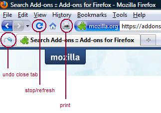
Must have buttons.. forward, backward, stop/refresh combined, home, print, and undo close tab.
Don't need the url go or the search go buttons.
Please don't get rid of the menu bar and the status bar or combine the url and search box.
I really don't like how IE has the buttons spread all over the place and how IE has the menu bar under the navigation bar. I hope we stay away from the IE UI.
Here is what I believe to be the most useful setup:
I don't know about the page and tools buttons.. I would keep them as optional and not in the default setup. I don't think I would use them much.. the default setup should show the most useful buttons.
The bookmarks bar toggle looks like a good idea. What happened to the url drop down?.. keep that.. maybe make it an option to remove.
Thanks,
Tesla
I really like the new designs at the begin of this page. Maybe it's possible to create a vote.
Your new proposed Firefox 3.7 UI is interesting. However it look too much like Google Chrome,and I think that will make Firefox look bad as a browser. Personally I feel that it is a must to have the search bar in Firefox.(which is the reason why I chose Fx over IE 6) I feel that the location bar and the search bar are fine the way they are.
Jason


