Update:Remora UI Review/Mockups/Home Page/2007-08-18 revisions/
Jump to navigation
Jump to search
Flow Overview
Thought-provoking diagram to come.
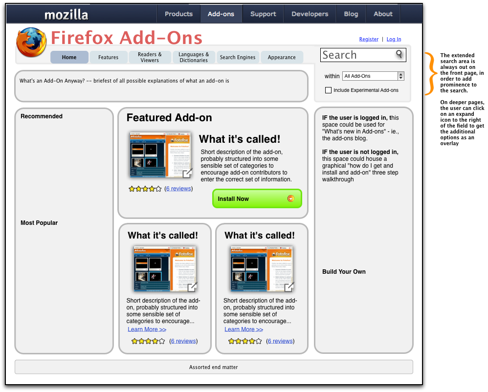
One of the basic questions regarding the front page (and the navigation of the rest of the site) is what top level navigation it shares with the rest of the mozilla.com site.
AMO, as a site with its own internal structure, can sit comfortably within the Add-Ons section of the mozilla.com top level navigation, with a couple of changes to the current scheme (see items in orange, below):
All three issues are within the grey area hanging off of the top-level blue bar.
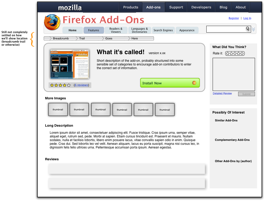
- Breadcrumb trail - this area is insufficient to allow as many levels and the complexity of the AMO site; navigational context can be provided through AMO page content
- Search Field - this search looks like it is for searching the entire mozilla.com site, which is not what we want here. The field is also not nearly as prominent as we'd like to make search for AMO.
- Register | Login - again, with these links here, it looks like the user will log in to or register with the entire mozilla.com site, which is not the case.
Front Page
Category Page
Sub-category Page
Add-on Details Page
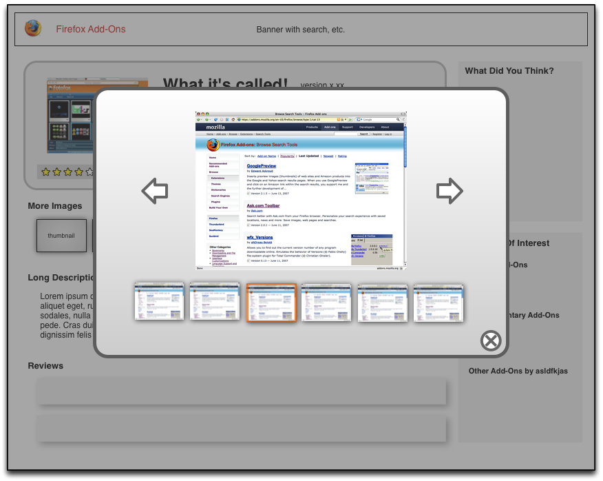
Image Viewer
Some examples of what these could look like:
- Click on a thumbnail image for a great transition effect: http://www.panic.com/coda/
- Slimbox, a Lightbox clone: Slimbox Look at the multi-image version
Neither of these contains thumbnails of the other images in the set when an image is displayed -- this is something that we'd want to do, though.


