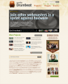
Drumbeat/website/front
Iteration 2.19 Jan 7
Your notes & feedback for iteration 2.19
Carlo, jan 8
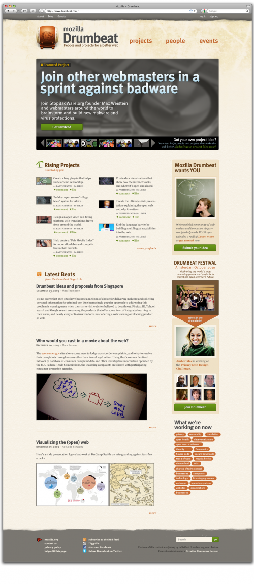
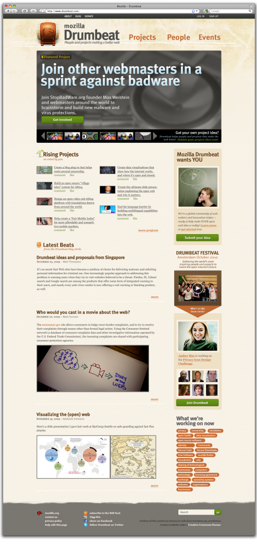
- header
I'll talk about the header in the proper wiki page, anyway I like it a lot more. Good job Ned!
- Typekit vs websafe
even though I love typekit fonts more, as they are substituting tags with canvas or images processed by js, we should reduce it to the minimum. My bad I'm speaking about this now, but Trellon is right a bit. Plus I think we should write down a small font style guide to understand how to behave in the whole website. Something like h1 is going to be typekit'd, h2 Georgia 16px #4c4c4c and so on, do you get my point? It's clear that we're going through serif as a websafe font for the whole website, but let's standardize it now. One small addition: I'm a little worried for the color fulfillment of the main headline. It's a gradient with effects. As far as I know typekit is not able to add such effects and coloring to substituted fonts. This means that every featured project headline has to be an editorial image. And this slows down its production. What do you think?
- Rising projects block
I don't like too much the way projects are shown there. I'd prefer to have some kind of highlight of a project's box. I think a border-bottom could do the job. I also don't like too much the comment-like block. I think that project teaser font size description should be that size and it's ok, while participants and comment-like font-size should be 2px lower. I also don't like that much the icons, but this is a matter of different tastes :)
- Latest beats block
Here the only thing i think it's missing is a "# comments" aside from more link. If we want to go really social, we should provide a link for retweeting and facebook-sharing the article too. A good trick could that those links, before sharing it, goes to the full article.
- Right column.
Something we need to add, I think, according to the consideration about a dashboard-ish project page, is a small block that leads user to understand how drumbeat it's growing. Something like a "counter" of projects, participants, funding and so on. Maybe a total one for each of those metrics, but I think this lets users understand that Drumbeat is a living project. I'd position this right beneath the submit your idea block. Or right above the tag cloud.
- footer.
I'll talk about this in the proper wiki page.
Previous iterations
Your notes & feedback for iteration 2.16
Matt
* change "as rated by you" to "as voted by you" Done
- not sure if this is clear enough, or still requires a line of explanatory copy on how to interact with / get involved w. projects. e.g., vote for ones you like, or roll up your sleeves and get more involved.
- update tag cloud to use real current tags.
- as per Nicholas' note, it's important this tag cloud be a useful snapshot of the 10 - 15 things we're really working on. not a confusing info-dump.
Nicholas Reville (Dec 21):
1. i think the mission statement of the site ('mozilla drumbeat
connects...') feels buried in it's current placement. i expect a lot
of people will be coming to the site wondering what it is, and i think
having that tagline in the header or above the featured projects would
really help.
Done!
2. i am kind of a skeptic on tag clouds as a form of navigation. (snip)
(if we want to guide people to cool topics, why not have a hand curated list of 5 or 10 interesting tags?)
Agreed. Unfortunately, this mock-up doesn't include our actual current list of what we think these 5 - 10 tags should be -- which is tracking here.
3. maybe the 'submit your own project idea' button should be a lot
bigger, not so much to attract more contributions, but to communicate
to viewers that the concept is something that people contribute to and
is open.
Tried to big it up even further with the "Drumbeat wants you" feature. The image that's there right now is placeholder -- got a good image of a real live person or community member, instead of stock?
4. it's not clear to me whether i can click on the featured project or
where to click. maybe a green 'learn more' or 'get involved' button
on the featured projects would help.
Done!
Mark Surman:
- Top page still doesn't really reflect Carlo's post-web site thinking. My sense is that mostly comes at project page level -- and outside the site.
- But, in v2.0 of front page, I expect we'll have alot more (social) content from across the web.
Matt: feels like we still need to address this.
- e.g., should we include the #drumbeat twitter stream on the front page? maybe associated with the blog entries? could be two blog entries + twitter stream?
