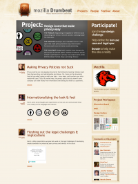
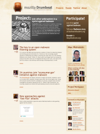
Drumbeat/website/project page
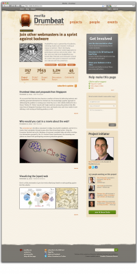
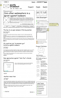
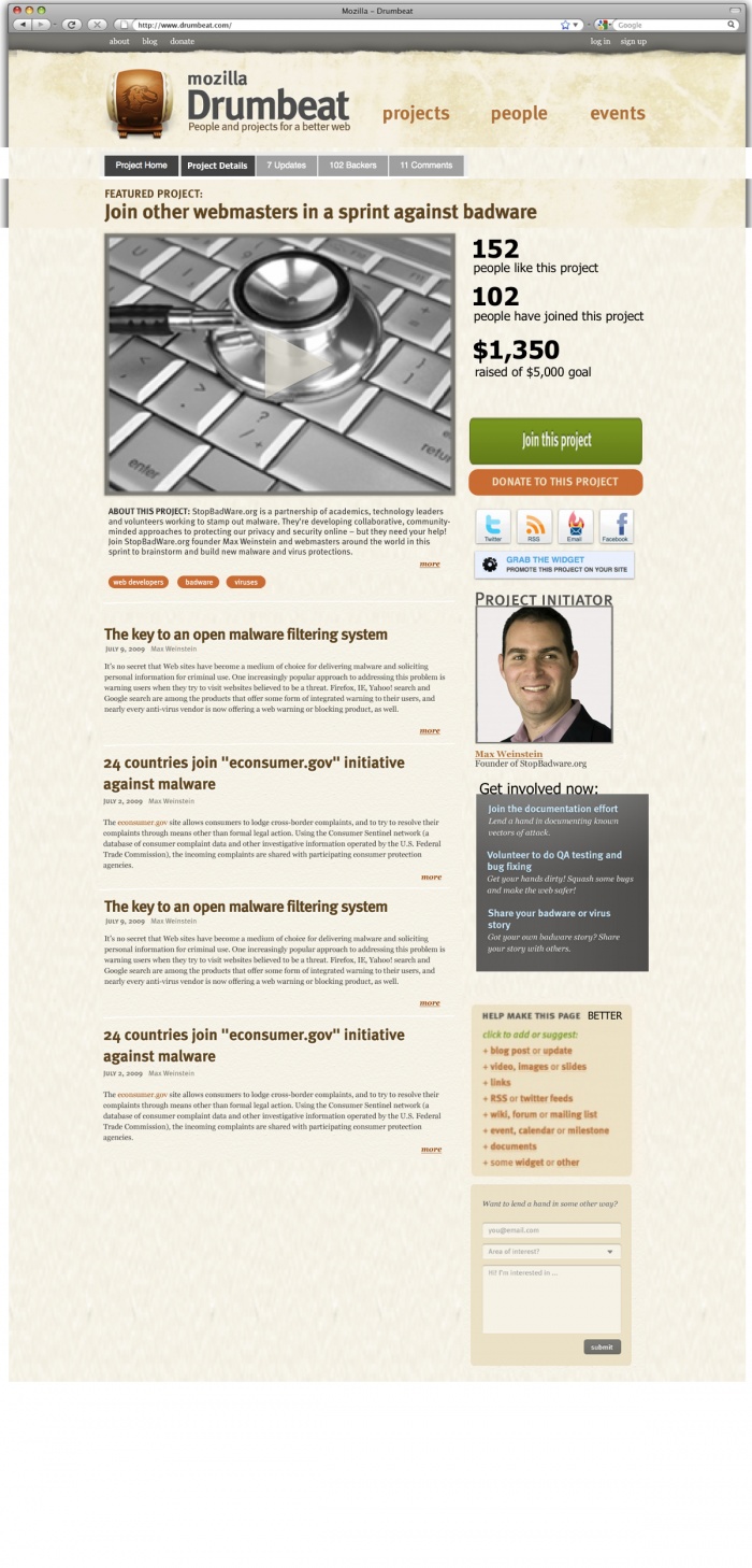
Project Page mock-up iteration 3.0 Jan 17
Mock-up only -- still needs design.
Notes & Feedback for next iteration
Matthew, Jan 13
1) "Join" vs. "Donate"
- Once you've joined the project, I propose that the big green "join" button be replaced by a big green "donate" button -- in the exact same place / style etc.
2) Project nav tabs across the top
- Carlo, I know you felt that some of the info in the top tab is redundant given the metrics space in the upper right corner. But after thinking about it more, I think they serve different functions and are therefore ok.
- If you want to mock up an alternate treatment, please go for it -- let's produce multiple versions / choices based on your inspiration.
3) "Get involved now"
- This section feels weak. These are project-specific asks, and important.
- One option would be to move them higher up in the right-hand column. But I like the warmth, personal connection, and human element of having the project admin's face there... it humanizes the page.
- we need a more compelling label. something that implies: "urgent to do's this week". something that really gets across that these are NOT generic asks. They're specific participation asks.
- We should make the participation asks orange, in keeping with the convention we're trying to establish for links on the site
- icons might help set this section off. we need more weight and energy into this section somehow.
- not convinced a grey box is right way to go. feels overly dark and heavy.
4) "Like vs. Join"
- This design doesn't include a "like this project" button. Somehow it felt weak here... and took away clean emphasis on "Join" and "Donate". I dunno though -- thoughts? Do we need it on this page and if so where?
5) "Make this page better"
- we talked about simplifying this box -- can you make suggestions?
6) Project Metrics
- I took out "x days to next milestone" from the project space. But I kinda regret it.
- I removed it because having FOUR things in the metrics space seemed to be too busy. It's compelling for those projects that do have a timeline / milestone, though. And many projects won't have a "donations raised" metric, which frees up space... see what you think.
Carlo, Jan 11:
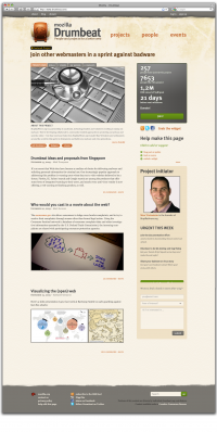
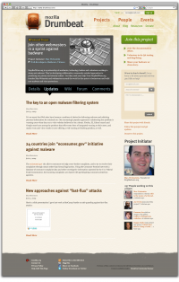
I designed some updated mockups
in this one what it's changed is a clearer distribution of elements, in terms of availability before the fold. So the first screen one has is with all the elements of participation handily distributed. And a bolded summary on top.
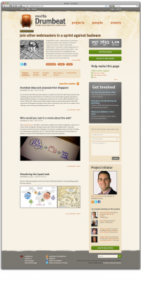
This is a small variant of the previous one, with the Action buttons on the same row.
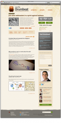
In the last of the mockups I tried to render the summary right above the project related menu, leaving a more Ned-y Get involved menu. I just made shorter the tools available at a first glance, which comes in handy better than all of them
Carlo, Jan 8:
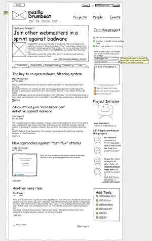
- according to a small speech yesterday with Matt, I added a small "dashboard" block counter in the wireframe I'm attaching here.
I put it there, and most of all I agreed putting this in, because we should convince ppl that project are not only there as a showing purpose. They should be there as living entities, and should attract ppl engagement. Also, I think that the Join button is needed but its behaviour has to be like "become fan" in facebook's. This because we want ppl to engage immediately, I guess.
Previous iterations
Notes & Feedback for next iteration
Notes from Trellon
Add or suggest
- limit this to "add"
- want to avoid situation where site admin has 50 blog posts to approve
- if someone has an idea, fill out a form, gets sent to project admin
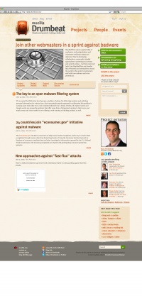
Integrating & popping the call to action items more Matt (dec 28)
- This iteration tries to solve a problem with the participation asks in the top right-hand column. So far it feels like the action items have been cut off and isolated from the rest of the content.
- By stretching the project headline across the full width of the page and eliminating the dark boxy background from the project description, hoping that it now feels more integrated, and that the action items at the right jump out more.
- Having better / real participation asks may help too!
Carlo December 22,2009
Change "read more" link to right
Usually the read more link is bottom right to the post, and I think it's clearer like that.
Done!
Change author / post date
Also for the author and post date i think we can save some space if we gather them in the same line, hightlight it a bit better.
Add "share icons" to each post preview?
- Carlo suggests adding share icons to each blog post preview
- Matt: suggest adding them to each post at the full page view / detail level, not preview level? So that it doesn't become overly crowded or busy?
Improve right-hand "action" column buttons & icons On the right column also, while i like a lot the "join" which is engaging enough for users, i think it's a bit misleading to have the same icon for three different actions, and also i think we should organize and gather better the menu items there.
- Agreed about icons. Thoughts for improvement?
- We can't easily have custom icons by participation ask, because these will constantly change and be unique to each project.
Change right-hand column order
- we're dividing project related menus into two part, with a "contact form" in the middle, which is a bit unclear why, to me.
I think we should organize a little better all the project related actions (aligning this to the big project block on top) and leave the contact for beneath it.
Better now?
