Support/Kitsune/KB/Audit
SUMO is pretty awesome already. I was tasked with taking a fresh look at how it could be made better. This is reason #1 why I'm loving my new job.
During my first month as the Support Content Manager I spent a lot of time examining the current state of SUMO from the point of view of both a Firefox user and a SUMO contributor. I also spent some time looking at how other companies handle support and doing some user experience testing (notes and videos here). I based my findings and recommendations on my own experience teaching and writing about technical issues along with guidance from resources like Creating Passionate Users and Don't Make Me Think.
"Everything should be made as simple as possible, but not simpler." - Albert Einstein
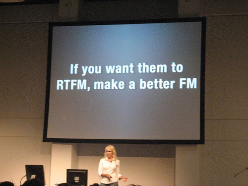
View the slides from a presentation of this information
These are the four areas I found that most need work
- Article Tone ≠ Rainbow Dolphins - The front page of mozilla.com has, as one of it's images, dolphins in a rainbow of different colors. It's whimsical and fun. You can't say that about the KB articles.
- Too much thinking required - A major goal of UX design is to make things obvious to the user - to make doing the "right" thing easy and doing the "wrong" thing hard. There are a number of places where the SUMO site is not obvious at all and others where it's downright confusing.
- Missed Teachable Moments - There are a lot of missed opportunities to teach users more about Firefox. In addition to solving people's immediate problems we can also teach them some new skills. Ideally, this results in the user being able to get more out of Firefox and the web with less reliance on SUMO.
- Contributor Experience - When you discover that there is a community of people behind SUMO and you look for information about joining it, you'll find that the documentation could certainly be friendlier and clearer. Also, there are more things we can do to make the work of contributors easier and more enjoyable.
Article Tone ≠ Rainbow Dolphins
Firefox is made just the way you like it... by RAINBOW DOLPHINS!

Contrast that with the intro to the Safe Mode article:
Safe Mode is a special Firefox execution mode that can be used to troubleshoot issues in Firefox. In Safe Mode, you can reset some settings or disable add-ons that might be the source of the issue. By comparing Firefox behavior in normal mode to its behavior in Safe Mode with various items disabled, you may be able to diagnose issues.
Here's a Creating Passionate Users article about conversational language:
"But here's what's weird--your brain wants to pay more attention to the party conversation than the formal lecture regardless of your personal interest in the topic.
Because it's a conversation.
And when your brain thinks it's part of a conversation, it thinks it has to pay attention... to hold up its end. You've felt this, of course. How many times have you sat in a lecture you really needed and wanted to pay attention to, but still found it hard to stay focused? Or how about the book you can't seem to stay awake for... finding yourself reading the same paragraph over and over because you keep tuning out--despite your best effort to stay with it?
But here's the coolest (and for me, the most fascinating) part of all this:
When you lecture or write using conversational language, your user's brain thinks it's in a REAL conversation!"
Your user's brain wants a conversation!
Too much thinking required
From "Don't Make Me Think!"
"Don't make me think!" I've been telling people for years that this is my first law of usability. And the more Web pages I look at, the more convinced I become.
It's the overriding principle – the ultimate tie breaker when deciding whether something works or doesn't in a Web design. If you have room in your head for only one usability rule, make this the one.
It means that as far as humanly possible, when I look at a Web page it should be self-evident. Obvious. Self-explanatory.
I should be able to "get it"– what it is and how to use it – without expending any effort thinking about it.
Just how self-evident are we talking about?
Well, self-evident enough, for instance, that your next door neighbor, who has no interest in the subject of your site and who barely knows how to use the Back button, could look at your site's Home page and say, "Oh, it's a ___." (With any luck, she'll say, "Oh, it's a ___. Neat." But that's another subject.)
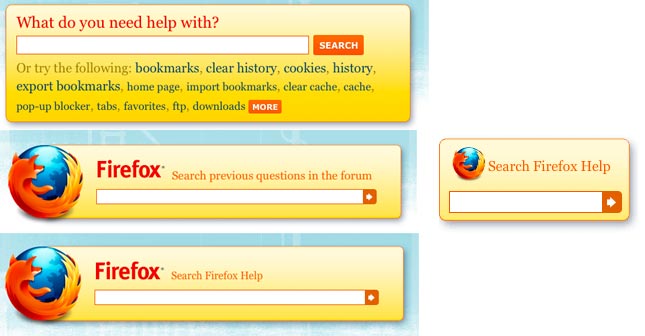
Which one these doesn't belong?
These are the search boxes located around SUMO. The one in the middle only searches the support forum. The other three search both the KB and the forum. Also, the small search box appears in all the sidebars, so some pages have two different kinds of search boxes on them. It took me about two weeks to discover this.
Where am I?
The nice navigation menu in the upper right hand corner of the start page disappears when you click one of it's links. What's more the pages it takes you to are named something other than what you clicked on. The result can be utter confusion.

Are all results equal?
The search results page could do a lot more to help the user find what they are looking for.
- Which are articles and which are forum threads?
- Is that a popular article?
- Is that question answered?
One size fits all?
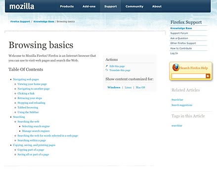
Currently all of the KB articles are structured the same way even though we have different kinds of articles with different objectives. This browsing basics article, for example, screams for a big giant video at the top of the page.
Other possibilities
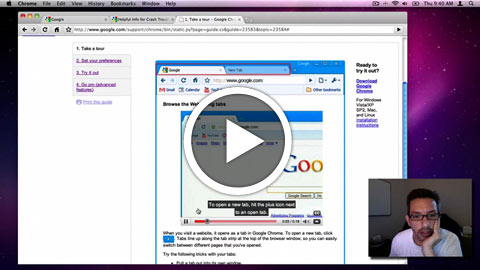
I like this idea from the Chrome support site. I think it's pretty poorly designed but the tabbed interface idea is worth investigating. You'll also see css and javascript callouts with notes on images that explain interface elements and link to videos demonstrating their use.
- Here's the page I'm talking about.
- This is also similar to an idea on Microsoft's site where additional or advanced information/steps are hidden in a collapsed div.
- Here's a video of me walking through it (Ogg video 3min):
Missed Teachable Moments
"A developmental task is a task which is learned at a specific point and which makes achievement of succeeding tasks possible. When the timing is right, the ability to learn a particular task will be possible. This is referred to as a 'teachable moment.' It is important to keep in mind that unless the time is right, learning will not occur. Hence, it is important to repeat important points whenever possible so that when a student's teachable moment occurs, s/he can benefit from the knowledge." - Robert Havighurst
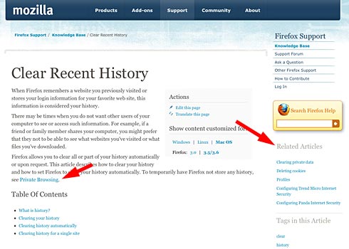
Related Articles/Further Information
The places where we link to related articles or additional information are a kind of teachable moment opportunity. Currently a user has to look pretty hard to find them...
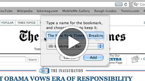
What if we combined the power of these videos and put them everywhere?
- Apple has a nice Safari video explaining it's top features (Ogg video 4min)
- Here's a fun and engaging Firefox video that highlights features but doesn't go into enough detail (Ogg video 1:45)
If we had some videos with the step-by-step completeness of the Safari example done in the fun, conversational style of the Firefox video we could put them in key places and articles where they could be the right information at the right time - a perfect teaching moment.
Contributor Experience
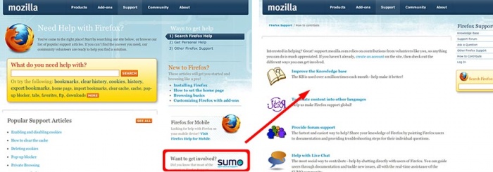
SUMO depends on a community of volunteer contributors. There are subtle cues referencing this fact all over the site. The problem is that they are subtle and with the way that we all hurriedly scan pages you can easily miss them entirely. I think it's an amazing thing that SUMO is powered by a community and would love to see that fact infused in a bolder way.
Revamp the documentation
When you discover the SUMO community your first stop is the How to Contribute page which is not particularly inviting. Besides missing a header it's just a list of stuff. It should tell a story - who we are, why we're passionate about what we do. It would be great if it did that with a video. In addition it needs some specific and visually identified steps that a new contributor should do to get started - Watch this video > register > talk to these people > learn how to make your first contribution.
- Make it friendly - tone should = rainbow dolphins
- Make it clear - don't make me think!
- Use video - make it personal
Make contributing fun and easy
The current SUMO site with it's long load times and often byzantine procedures makes contributing a chore for some. We should have a system that not only performs it's functions adequately but is also a joy to use.
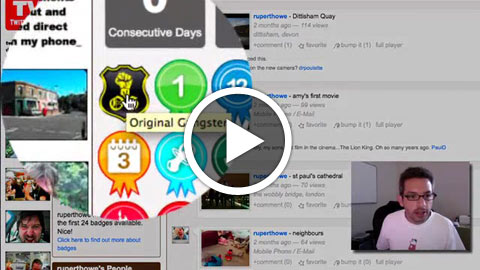
- Badges, Points, Reputation, Stats - I'd love to have some automatic way to recognize contributor achievements. It would be nice to try to inject a little bit of fun or whimsy into answering questions. Also, keeping track of your own achievements gets addicting (see Nike+ and Foursquare as examples).
- SUMO Video Converter - It's one thing to ask people to contribute text but it's another thing altogether to ask for special encoded videos. It would be great to have a super simple, no fail theora (or VP8!) encoder for screencasts. Miro makes a desktop app and Firefogg is an addon - both are open source and basically add a GUI to ffmpeg2theora. We should have a SUMO (app or addon) that optimally encodes things for the KB with drag and drop simplicity.
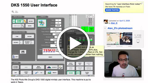
- Screenshots with Flickr-like notes - Instead of having contributors mark up screenshots in an image editing tool, we could build a notes tool right into the article editor.
Things we can do now
Article tone
These are part of our Q2 Helpfulness tests
The current KB articles do a good job of speaking directly to the user and answering their questions. We'd like to test what impact changes to the language of the article have. For this test we'll work on rewriting each article, making these changes:
- Remove unnecessary information - There are almost always lots of tangential pieces of information related to a topic that could be presented. We should look to remove or not include anything that isn't necessary to solve the problem and get the user on their way.
- Use non-technical terms where possible - As SUMO contributors we're familiar with many technical terms and abbreviations. We shouldn't assume that people using the KB are familiar with any of these terms. We should explain things in as plain and simple language as possible.
- Use a conversational or friendly style - The articles should read more like your friend is explaining something to you and less like you are sitting in a lecture.
Contributor Experience
- Revamp the contributor documentation - It should tell a story - who we are, why we're passionate about what we do. It would be great if it did that with a video. In addition it needs some specific and visually identified steps that a new contributor should do to get started - Watch this video > register > talk to these people > learn how to make your first contribution.
- Make it friendly - tone should = rainbow dolphins
- Make it clear - don't make me think!
- Use video - make it personal
- Mozilla main navigation - Make Community > Support link to the How to contribute page.
- The support community link from Mozilla.org just takes you to the forums - it should also link to the How to contribute page.
Overview videos
If we had some videos with the step-by-step completeness of the Safari example done in the fun, conversational style of the Firefox video we could put them in key places and articles where they could be the right information at the right time - a perfect teaching moment. To start with we should create these videos:
- Getting started with Firefox - think browsing basics but focused on Bookmarks, Tabs and the Awesome Bar.
- Shopping safely with Firefox - this video would focus on the features that Firefox uses to keep you safe while shopping - website identity information, phishing warnings, private browsing and clearing recent history.
User focused blog - Get More Out of Firefox
This is another way to create teaching moments. This would be an external blog that collects the overview videos along with great tips for getting the most out of Firefox. This is not the super technical things like messing around with about:config but easy tips that we all learned from living and working with Firefox.
Here's two examples from Deb Richardson's blog:
Things to flesh out in the PRD
SUMO "Workflow"
- Fix the site navigation so that it's clear where you are and where you should go next (support funnel)
- Make the search results more informative.
- Distinguish between Articles and Forum Questions
- Rank articles in some way (helpfullness, popularity)
- Identify forum questions that have been answered
- Make search box functions obvious.
- Add ways to easily browse the site instead of search
- Categories on the start page (part of Q2 helpfulness tests)
Article Templates
- Develop templates for specific types of articles.
- Embed videos directly in articles where appropriate (part of Q2 helpfulness tests)
- Make related items and search more visible on article pages (part of Q2 helpfulness tests)
- Explore ways of simplifying the display of article information, i.e. tabs.
Contributor tools
- Badges, Points, Reputation, Stats - I'd love to have some automatic way to recognize contributor achievements. It would be nice to try to inject a little bit of fun or whimsy into answering questions. Also, keeping track of your own achievements gets addicting (see Nike+ and Foursquare as examples).
- SUMO Video Converter - It's one thing to ask people to contribute text but it's another thing altogether to ask for special encoded videos. It would be great to have a super simple, no fail theora (or VP8!) encoder for screencasts. Miro makes a desktop app and Firefogg is an addon - both are open source and basically add a GUI to ffmpeg2theora. We should have a SUMO (app or addon) that optimally encodes things for the KB with drag and drop simplicity.
- Screenshots with Flickr-like notes - Instead of having contributors mark up screenshots in an image editing tool, we could build a notes tool right into the article editor.
