Update:Remora UI Review/Mockups/Home Page/2007-09-12 revisions/: Difference between revisions
Jump to navigation
Jump to search
No edit summary |
No edit summary |
||
| Line 1: | Line 1: | ||
== Notes on the mockups == | |||
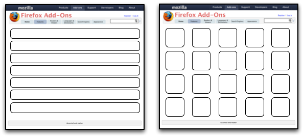
* The purpose of all of the mockups is primarily to demonstrate layout -- colors, branding, and icons are just placeholders | |||
* By their nature (as slightly higher-fidelity than wireframes), these mockups are a little "cartoony." Areas, type, and icons are probably larger than they need be in a the real final version, and, because of this, more should fit on the screen in the end | |||
* Many of the mockups make use of icons from the [http://www.famfamfam.com/lab/icons/silk/ Silk icon set from FAMFAMFAM] | |||
== Earler Versions == | == Earler Versions == | ||
*[[Update:Remora_UI_Review/Mockups/Home_Page/2007-08-18_revisions/]] | *[[Update:Remora_UI_Review/Mockups/Home_Page/2007-08-18_revisions/]] | ||
Revision as of 18:24, 12 September 2007
Notes on the mockups
- The purpose of all of the mockups is primarily to demonstrate layout -- colors, branding, and icons are just placeholders
- By their nature (as slightly higher-fidelity than wireframes), these mockups are a little "cartoony." Areas, type, and icons are probably larger than they need be in a the real final version, and, because of this, more should fit on the screen in the end
- Many of the mockups make use of icons from the Silk icon set from FAMFAMFAM
Earler Versions
Flow Overview
Old

Revised

Front Page

Category Page


Full listings page
Details Page

Rating UI

Search Results Page

Recurring Features
Image Viewer

"Smart" Download Buttons

An alternative if bundling is not possible:

Longer-term ideas
Theme Browser
Two-Pane Design

Three-Pane Design
