Update:Remora UI Review/Mockups/Home Page/2007-09-12 revisions/
Jump to navigation
Jump to search
Notes on the mockups
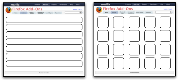
- The purpose of all of the mockups is primarily to demonstrate layout -- colors, branding, and icons are just placeholders
- By their nature (as slightly higher-fidelity than wireframes), these mockups are a little "cartoony." Areas, type, and icons are probably larger than they need be in a the real final version, and, because of this, more should fit on the screen in the end
- Many of the mockups make use of icons from the Silk icon set from FAMFAMFAM
Earler Versions
Flow Overview
Old

Revised

Front Page

Category Page


Full listings page
Details Page

Rating UI

Search Results Page

Recurring Features
Image Viewer

Some examples of what these could look like:
- Apple now has the kind of viewer with thumbnails I was thinking of on a number of their pages. See here for example: Example page (click on preview at right)
- Click on a thumbnail image for a great transition effect: http://www.panic.com/coda/
- Slimbox, a Lightbox clone: Slimbox Look at the multi-image version
"Smart" Download Buttons

An alternative if bundling is not possible:

Longer-term ideas
Theme Browser
Two-Pane Design

Three-Pane Design
