Drumbeat/MoJo/hackfest/berlin/projects/uberproject
Project Name: Uberproject (working title -- name suggestions welcome)
Project Lead(s): Jordan Wirfs-Brock, Neil Dawson, Saleem Khan, Chris Keller
Big Goal for MoJo Hackfest: Working prototype of a) data surfacing b) data visualization
Key steps toward goal:
- Input search terms, run through Little Sis API and Sunlight Foundation API, output data on people and connections (Chris)
- Visualize people and connections with Javascript dataviz library (Jordan)
- User experience design -- what can you do with the data once it's visualized? (Neil)
- Understand and construct use case(s) (Saleem)
Pending needs: Help from anyone who is familiar with Javascript data visualization libraries (like the Javascript InfoVis Toolkit, d3.js, Processing.js, Highcharts etc.) -- get in touch with Jordan.
Link for more info: TK
Link for demo: TK
Link to source code if applicable: GitHub repository
Related #hacktoberfest projects:
- MetaMetaProject by The Collective Ninja Horde (For more info talk to Dan Schultz)
- PLESPER by Laurian Gridinoc
- Reveal by Tathagata Dasgupta
Update, end of day 1 (9/26/11):
- Codified project idea
- Made action plan
- Identified next steps
Tasks for day 2 (9/27/11):
Chris
- Built out search page to query Little Sis API. Able to query with help from Matt of BBC.
- Built out return of API query.
- Visualized query of API.
Neil
- Wireframes for (at least) the 6 main steps
Jordan
- Find a good example of a complex news story that has lots of entities (people, places, organizations) that can be visualized with network diagrams
- Pull those people/places/organizations (this can be done manually for now -- wish list is for Open Calais of MetaMetaProject to do this eventually)
- Run them through Little Sis and Sunlight Foundation (with help of Chris)
- Make a (quick and dirty) mockup of what a visualization of the context and relations
- Implement the visualization mockup using a Javascript visualization library (probably d3.js or Javascript InfoVis Tookit -- need to decide) [Note: For this can use the code Chris already started writing]
Saleem
- Identify possible information source/inputs to test the scenario
- Extract facts, data points to explore
- Identify use case(s)
Tasks for Day 3 (9/28/2011)
Chris
- Working to get Jordan tech assistance and data she needs to visualize data.
- Pulling data for Jordan.
Neil
Jordan
Saleem
- Develop use case(s) based on real-world scenarios
User Interface (Neil)
Jargon
"Jargon bad" - Gunner.
- Entity
- A thing; a place, a person, an object.
- Peter
- Pie
- A thing; a place, a person, an object.
- Relationship
- An interaction between entities, a thing that happened
- Peter ate pie
- Pie choked peter
- An interaction between entities, a thing that happened
- API
- A friendly interface that gives us information we'd like, based on the information we give it
- We feed it 'Peter' and 'Pie Corp.'
- It tells us 'Peter is the CEO of Pie Corp.'
- A friendly interface that gives us information we'd like, based on the information we give it
Overview
This is a tool for creating quick and easy network visualisations. Why would you do this?
- As a journalist
- Get the story out of your head and into a tangible format
- Discover new angles (by finding hidden relationships)
- Collaborate with colleagues (or the public) to build a version of events everyone can agree upon
- As an interaction designer
- Build a super-quick visualisation for a breaking news story, in lieu of a bespoke visualisation
- As a consumer:
- Build upon existing nets to set the facts straight
Some of these people are awesome with computers. Some aren't. This needs to be super simple and make use of standard interface concepts so it's immediately clear how to use.
The visual and verbal language of this webapp is kept deliberately abstract, so it doesn't just have to be about people. It could be a timeline of every lego set ever released. It could be your itinerary plan for a festival. It could be lots of things we haven't thought of.
Process
At first, I thought it worked like this:
- Provide source
- Extract entities
- Manually filter
- Draw hidden relationships (with APIs)
- Visualise
- Share
...but as time went on I realised that the user need not go through the process in this order, or even tackle all these steps.
They can do some or all of these steps in just about any order. Some people might not even use the timeline if they just want a static network diagram! We're not dictating how this tool should be used.
Mockthrough
See what I did there?
The user can begin in a few ways:
- Use the 'dot' (entity) and 'line' (relationship) tools to create a network by hand
- Import from an unformatted source and extract entities and relationships to create a starting network
- Import from preformatted source to create a starting network
- Import another user's network to build on it
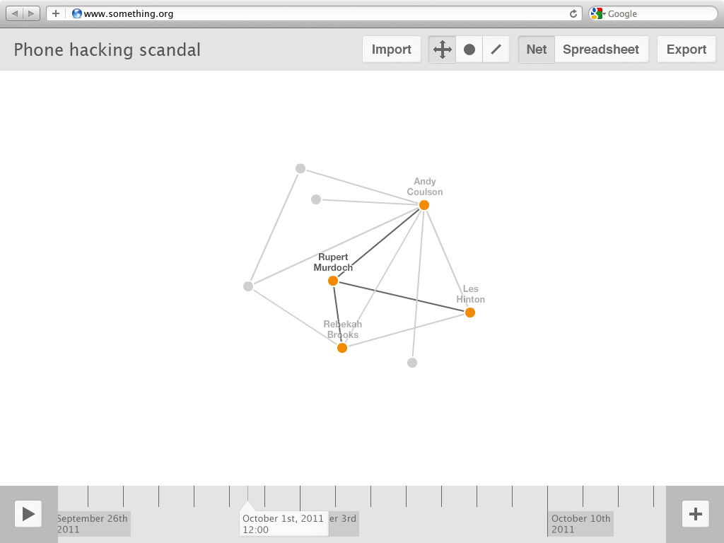
Here we see a network already underway (the network itself is borrowed from this BBC visualisation):
The main interface elements are:
- The toolbar - along the top, home to most controls
- Visualisation title - can be edited simply by clicking.
- Import - brings up a dialogue box offering various import options (from URL, file upload, text dump etc).
- The three grouped controls are 'Move', 'Dots' (entity) and 'Lines' (relationships).
- Move - clicking and dragging dots moves them around. Dots and lines can be selected then deleted with a keypress. Clicking either also brings up an inline property editor (see mock 3)
- Dots - clicks make dots. Dots don't stick around unless you at least fill out their name.
- Lines - Clicking two dots creates a relationship between them. Lines don't stick around unless you at least fill out their name.
- The two groups controls are for different views.
- Net - displays the visualisation in the form shown above.
- Spreadsheet - Converts all of the data from the visualisation into editable table form - good for newbies who are used to Microsoft Excel.
- Export - brings up a dialogue box offering various export options.
- Network canvas - the centre area.
- The network diagram is shown and manipulated here.
- The timeline - this can be scrubbed left and right to move backwards and forwards in time (see mock 2).
- Play - Does as you'd expect, dots and lines won't appear until their specified time.
- Playhead - can be scrubbed left or right to change the contents of the canvas.
- Expand (plus symbol) - brings up the group/time editing panel.
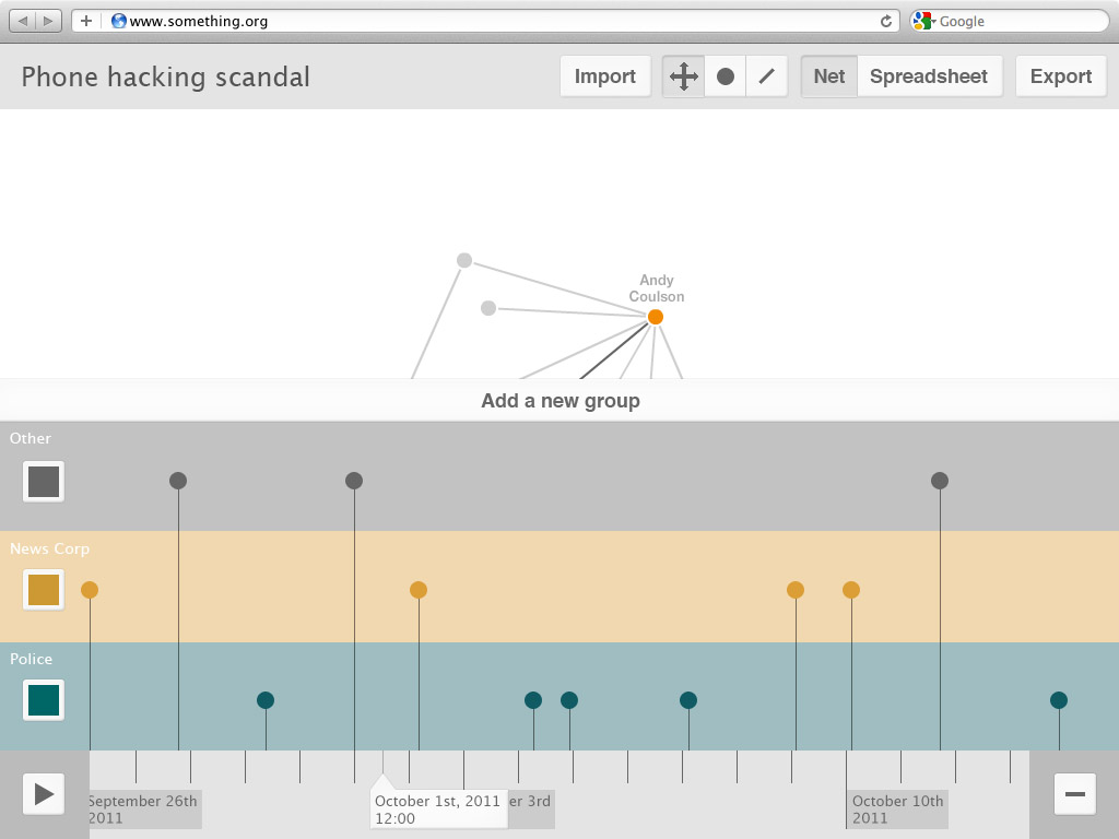
Here we see the groups and timeline panel expanded:
Dragging entities and relationships vertically groups them, changing their colour. Clicking the coloured box to the left brings up a colour-picker, clicking the name of the group allows editing of the title. Clicking the wide 'Add a new group' button at the top of this panel creates a new group.
Dragging entities and relationships horizontally changes their 'arrival' time, i.e. when they will appear in the visualisation when it is played.
This panel makes it quick and easy to restructure the visualisation. I like it because it reminds me of sheet music!
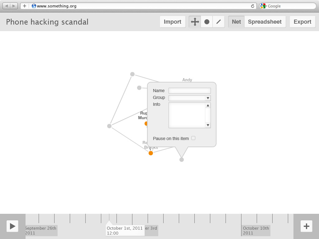
Clicking on a line or dot while in 'Move' mode will bring up this inline property editing panel for precise tweaks.
Things that aren't obvious
- 'Export' would bring up a dialogue box with a multitude of sharing options: a straight URL, Facebook/Twitter/G+ buttons, video, XML, text, PowerPoint, CSV, embed code...
- Hovering over an entity or relationship on the groups panel will highlight it on the canvas, and vice versa
- Relationships will also be represented on the group/time panel - they need their own icon
Oversights and planned changes
- Add a remove button for groups
- 'Export' would perhaps be better named as 'Share'
- Drawing relationships should have its own button, rather than being lumped in with the import process. Users should be able to make of use this feature at any time.
- 'Import' and 'Export' should be gathered together under a drop-down menu - a home for extra functionality. They would be joined here by 'Invite' (for collaborative editing) and 'Find relationships' (which would bring up a dialogue for selecting and trawling relevant APIs for relationship data).
- Add in start and end date/time fields in the title bar to set the range of the story
- The inline editing panel should have a field for precise date/time entry
Thanks
- Chris and Jordan for the awesome brainstorming sessions as we sewed our ideas together
- Chris for our conversation on the relationship between entities on the timeline and the net
- Jordan for making me realise there are a multitude of ways to use this system
- Saleem for our conversation on the topic of user collaboration
- Rhiannon for her thoughts on clustering


