Pancake/French Toast/UX
Design
Design Approach
Job-to-be-done
Every good app is designed around a core job. This job is the reason a you open the app.
On devices like iPad and iPhone, the importance of the job-to-be-done is critical. Where one app ends and another begins hinges on the job you need to do.
French Toast's job-to-be-done is:
“Help me find what I’m interested in”.
Everything in Pancake is designed around this job. It’s what the user hires Pancake to do.
From that starting point, a few complimentary jobs become immediately obvious:
- “I want to collect things I find”
- “I want to organize what I’ve collected”
- “I want to share my collections”
- “I want to follow what I find”
...Not to be confused with “give me something to read”. This job-to-be-done appears to be similar, but has very different implications.
Find + curate: active, creative, goal-oriented, lasting.
vs
Read + consume: passive, aimless, disposable.
An app’s core job-to-be-done determines the way you approach it’s design.
Two apps may have similar features, but different core jobs, demanding a radically different approach to the user experience.
Design themes
We've designed French Toast around some core user experience principles:
Don't do what I say, do what I mean
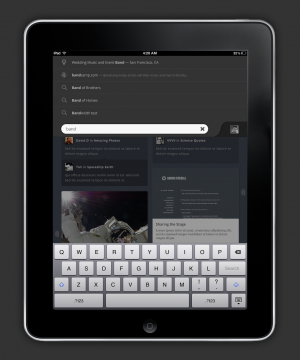
Do use search and intelligent interpretation to help users arrive where they want to be. Don’t present the user with tedious, error-prone tasks. That’s what computers are for.
You call the shots
Pancake learns to deal you a good hand, but you always hold the trump card. If you don’t like the way Pancake organizes things, you can change it. If you like your desk messy, Pancake won’t mess with it. Pancake is polite. It will never fight you.
Search is about exploring
Google search feels like a spreadsheet. Boring.
Exploring is fun on touch devices.
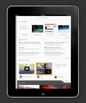
Let’s make search results dashboards for your question. Terms are intelligently interpreted to display custom widgets, tailored to the data.
Search tabs allow the user to view the results through different lenses.
Don't type, tap
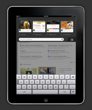
Typing on touch devices is hard. If the user has invested time in typing out a search, we make sure they don't have to do it all over again.
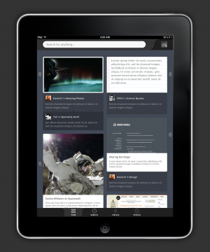
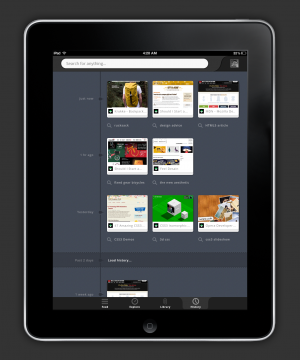
A search timeline offers an easy way to hop between searches. Pinning makes it easy to curate the things you do find, and share them with others.
No blind decisions
Don’t force me to choose before I understand what I’m choosing.
What does a blind decision feel like? Try installing a typical Facebook app:
 Computer: "I want access to your private life"
 You: "Why?"
 Computer: "..."
 Computer: "Skip this?"
 You: "Yeah, definitely skip this."
Or, take folders: I have to create the folder before I have something to put in it. Tags avoid this problem by presenting the choice at the moment you need it.
Choices should always be in context.
Privacy is tied to identity
People aren’t angry at Facebook because data is public. People are angry because they don’t know what is public.
It’s not about public/private. It’s about having a simple, trustworthy mental model for what you look like to others.
When I say privacy, I mean how do others see me?
Good privacy is making it straightforward to understand what is associated with your identity. Privacy means showing you exactly what you look like to the world.
Everything in Pancake is anonymous, unless you broadcast that you like it (pinning).
Cross-pollination
Social features in Pancake are about finding new and interesting things on the web by following people and Boards.
Tutorials suck
Good UX is self-teaching. It introduces you to concepts in the app one-by-one, building on previous experience. There should never be a moment where you don’t feel productive.
The first time you launch the app, it should present you with just one concept: the core job-to-be-done.
As you use the app, further concepts unfold. Building a user experience this way tells the user what the app is about, and how it fits into their lives.
Doing this without sitting the user down for a tutorial is a bit of an art form.
Content is King
The content is what you came here for.
When you’re browsing content, the rest of Pancake should fade to the background, and leave you with the best possible viewing experience.
This means full-screen browsing + native media viewers. Special views for special content.
First-run and self-teaching UX
Good UX is self-teaching. It introduces you to concepts in the app one-by-one, building on previous knowledge. Doing this without sitting the user down for a tutorial is kind of an art form, and it's crucial to get it right.
The first time you launch the app, it should present you with one concept and that concept should fit the job-to-be-done: "search". As you use the app, further concepts unfold. Here is our initial first-run path:
- Search (nothing else is really on the screen)
- Search dashboard loads, search tabs on the left.
- Click on a result, viewer launches.
- Home (search appears in timeline)
At this point, we've familiarized the user with the 3 levels of Pancake.
